Close Up Abstraction
Project brief:
For this project I want to go towards the 'minimalistic' side of close up abstraction and try to create simple but powerful shots. However, I will try to respond in various different ways by going by diverse categories such as textures, colours and methods of decay and change. I would also like to explore assorted artists for inspiration and ideas. I might also try using different lenses such as the macro lens to emphasise the abstractness and also make it unclear what the object is.
For this project I want to go towards the 'minimalistic' side of close up abstraction and try to create simple but powerful shots. However, I will try to respond in various different ways by going by diverse categories such as textures, colours and methods of decay and change. I would also like to explore assorted artists for inspiration and ideas. I might also try using different lenses such as the macro lens to emphasise the abstractness and also make it unclear what the object is.
One artist that really portrayed a good sense of close up abstraction is Colin Winterbottom. Most of his work is taken close up and in a minimalistic style which makes it almost completely unclear what the base or object is. I liked his work because it adds an impression of attractiveness and elegance because it is so close to the corroded or broken material that it no longer has the impact of unappealing.
Colin Winterbottom work:


closer analysis
|
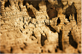
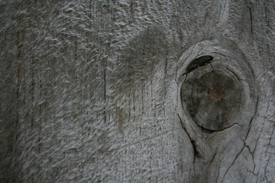
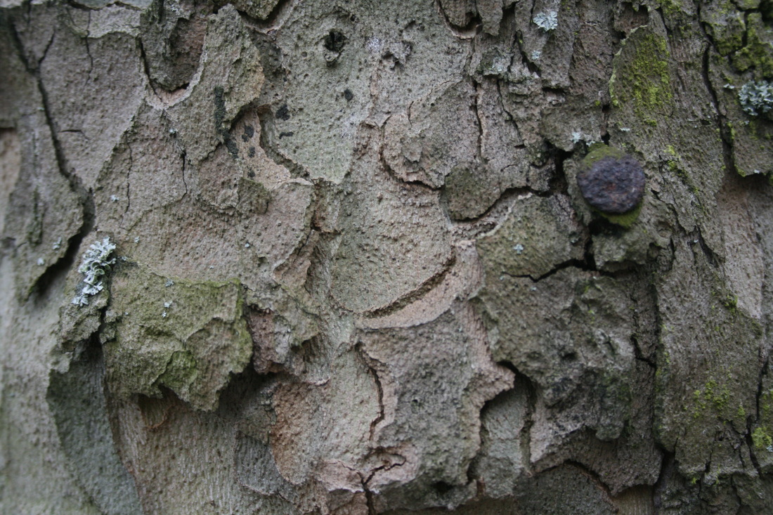
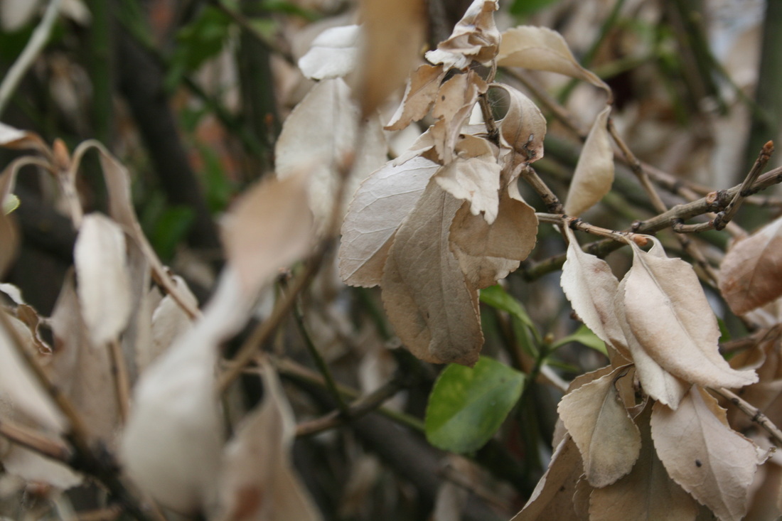
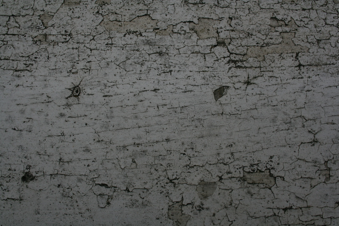
This shot is an extreme close-up of the bark of a tree, the shadows reveal that the sun is shining from the top right and this also creates depth within the photo. During the process of this shot the photographer must have found the 'just right' amount of light to create the intricate detail and display all the different depths of the photo. I think the photographers intentions were to show that with certain objects, if you look closer theres more detail and beauty to it. This photo could help me develop my work by experimenting with different exposures and lighting.
|
|
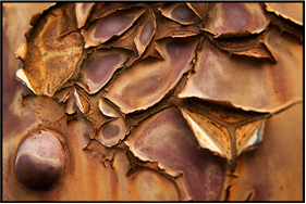
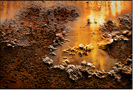
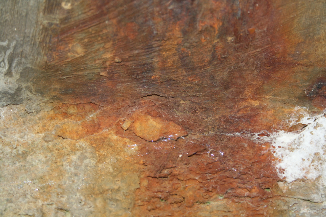
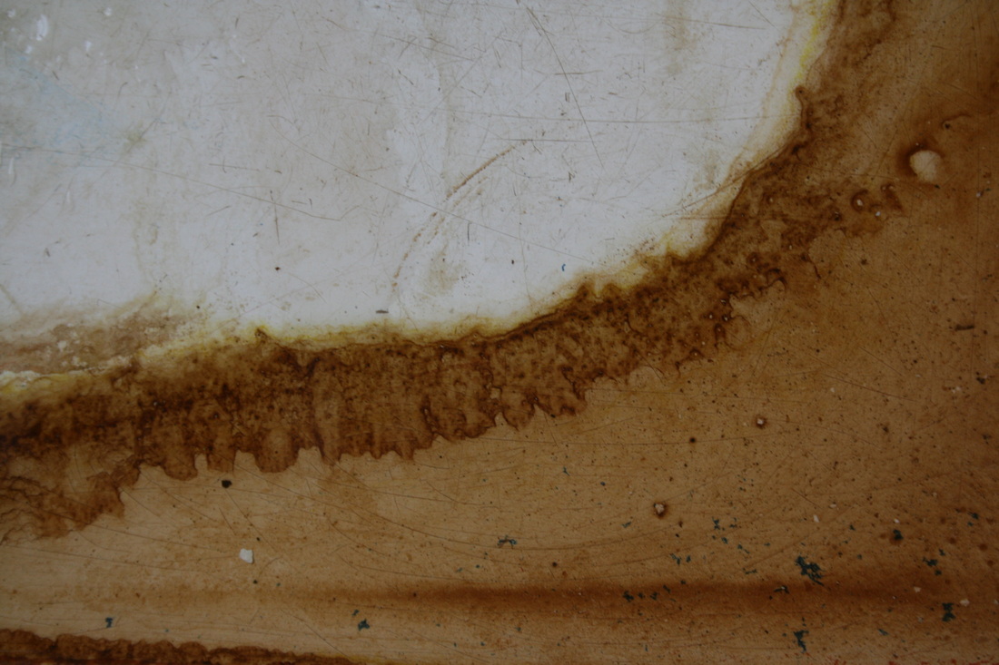
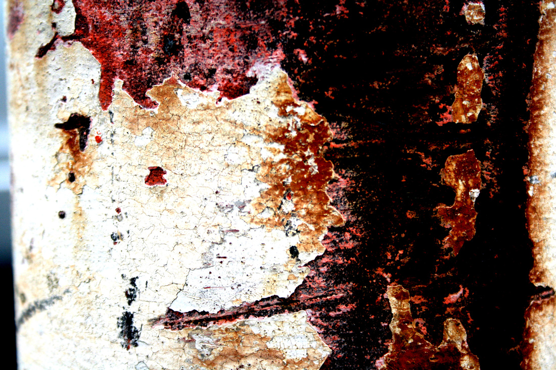
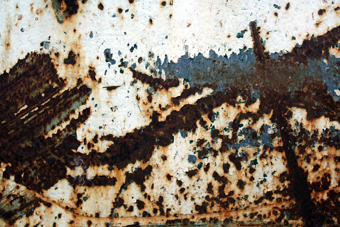
This picture is of a rusting metal, the erosion has turned the metal into a yellowy - orange colour. This effect makes the shot more attractive to look at. To get the right shot the photographer must have found the area of the decaying object that was most interesting. I think that the artist is trying to portray the decaying process into something more elegant.
|
These photo's come under the section of 'Elegant corrosion' by Colin Winterbottom. Most of these shots are abstract close-ups of some form of decay, however one is an extreme close-up of a tree trunk but all pictures have the same idea of 'peeling' or 'layers' in common. The name 'Elegant corrosion' think refers to taking an abstract object or idea and making it more attractive to look at by taking a zoomed in shot.
Response to Colin Winterbottoms work:
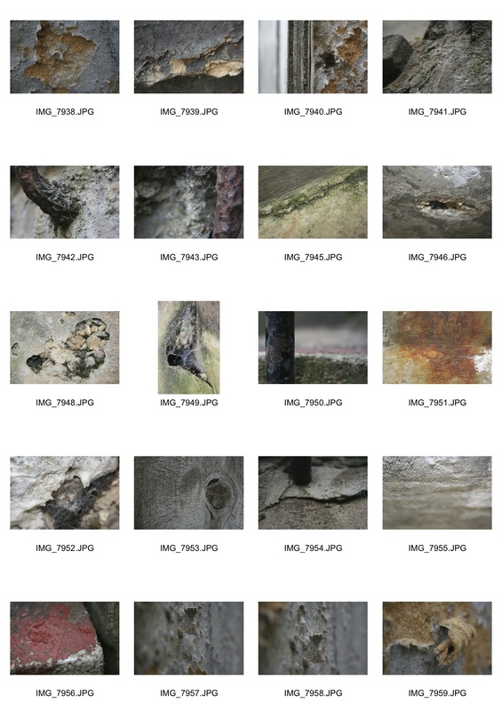
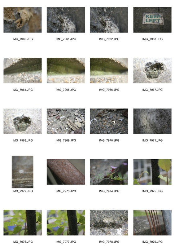
For this response I went around my school and tried to find crevices and eroded or destroyed areas where i could take similar shots to Colin Winterbottom. I concentrated on getting abstract angles, similar to Colin Winterbottoms work.
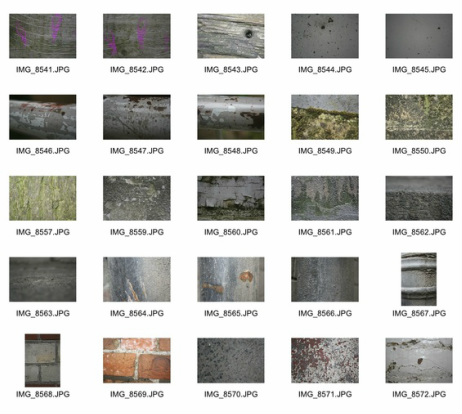
all pictures
|
|
my best chosen shots
|
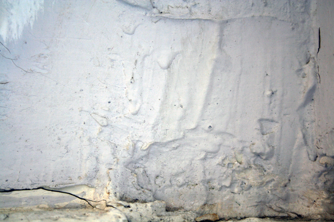
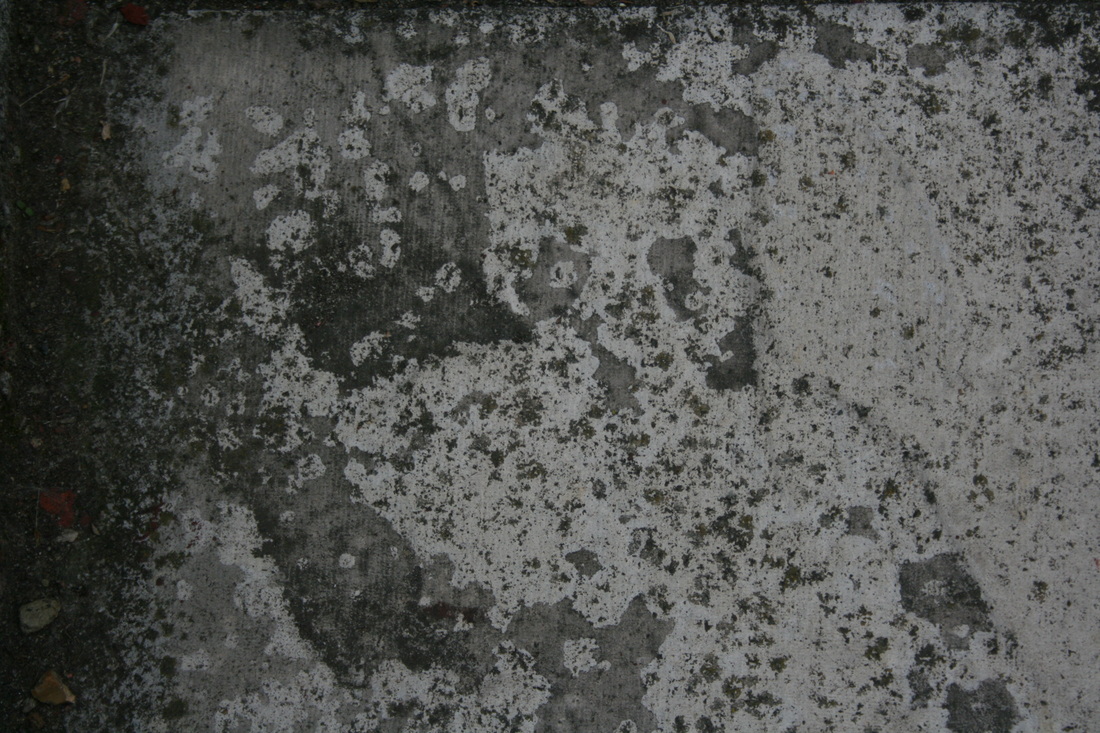
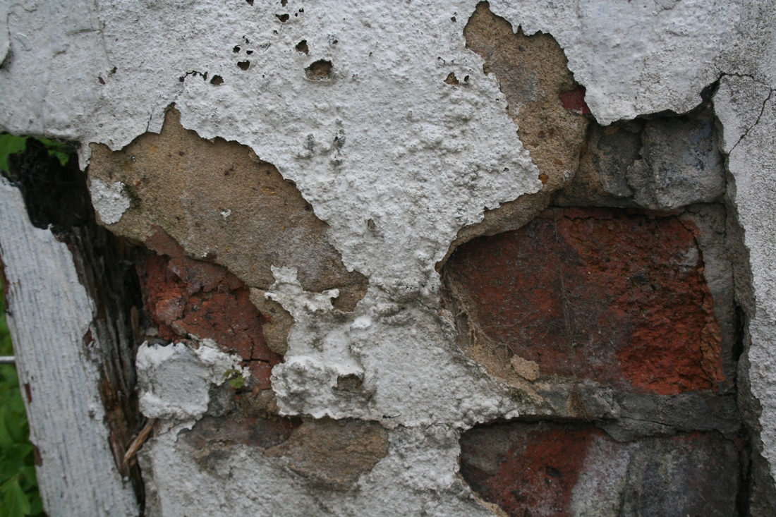
This was one of my best chosen shots because I think it expresses a good representation of abstractness as the image is unbalanced and is taken from a straight on perspective. The grey and beige colours in this image also give an abstract sense as it reveals an absence of colour and only has an abundance of monochromatic tones. This creates an impression of deceptiveness of the environment and how it has such a bland complexion in some areas.
|
|
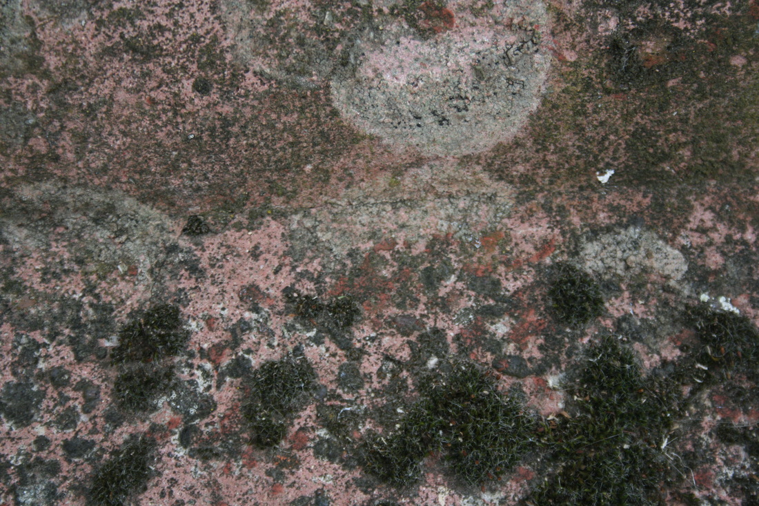
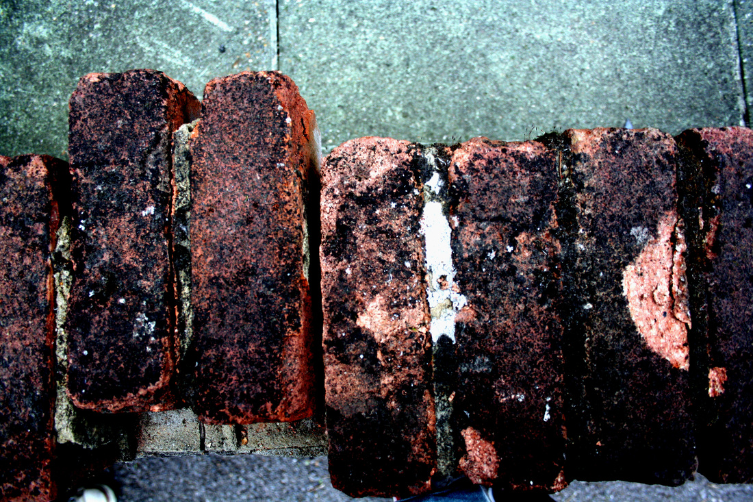
I liked this shot because the object fills the whole area of the image leaving no space for recognition of the shape or size. This then creates a sense of mystery of the commodity and also of the whole image. The colours in this photo have an ambiance of strength as it has a lot of shades of red, orange and brown, and these are predominant over the the tones of white and beige. These colours also create an autumnal effect which relates to the idea of dying and falling and as the gradient of the surface here seems to be crumbling and falling off it links in well.
|
|
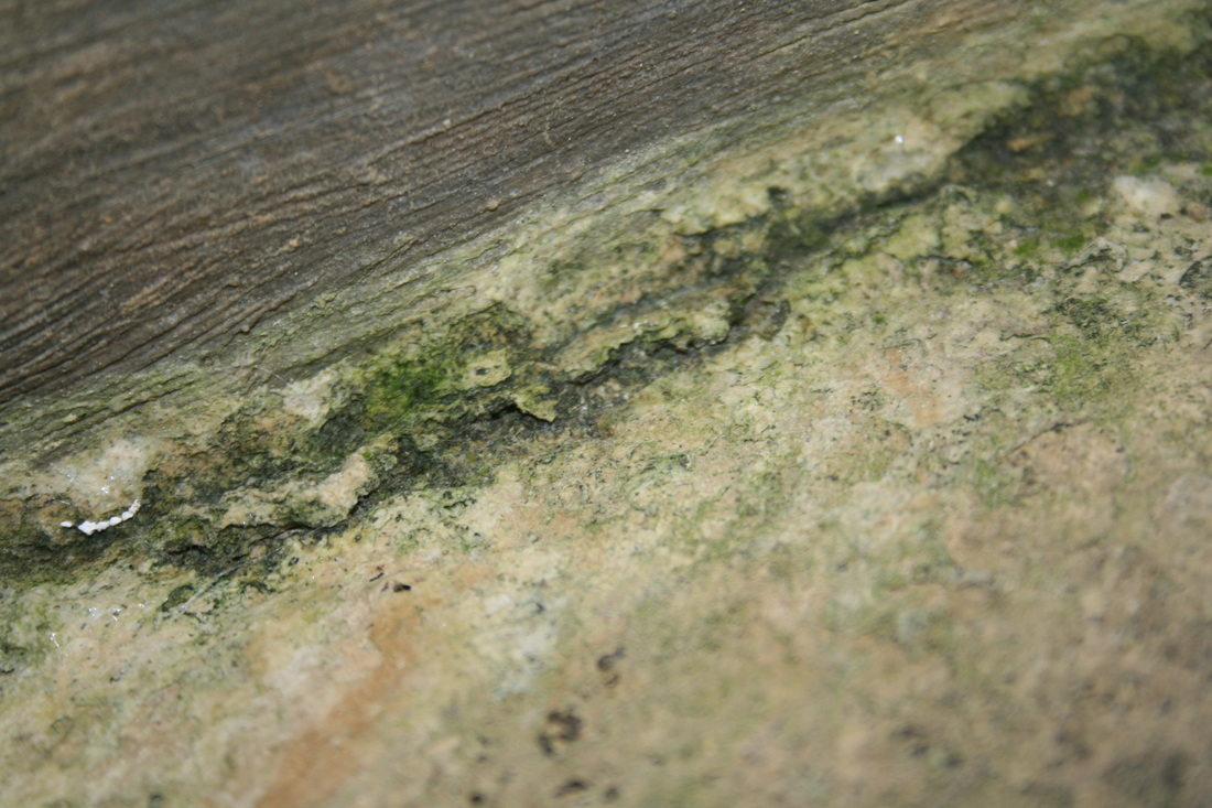
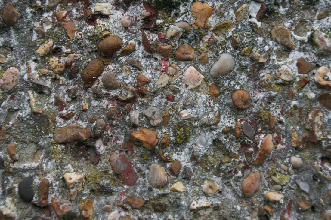
Lastly, I chose this image because it portrays a good presentation of abstraction. I previews two different textures on the same surface and the focal point is set on the division line of the two gradients. Unlike the two previous shots, this one taken from a slight angle rather than forward on. This adds an element of abstraction as it creates a depth of field between the minor chips and outstanding edges. This shot consists of green, brown and beige colours which makes it natural looking and a gives it a form of natural decay and corrosion.
|
I was overall pleased with my initial response and it gave me a good idea on how to create these abstract looking shots, however, I want to have another attempt but in an inside location. For this response I walked around the inside of my school and found lots of areas, mostly walls and floor, that were worn down or had stains which produced effective abstract shots.
Artist research:
|
Barry Lewis
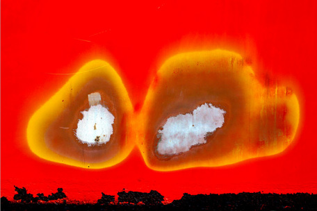
I liked some of Barry Lewis' visual noise project because it contains a lot of shots consisting of bright and vibrant colours as well as also presenting decay and wearing away. This shot has a lot of strong colours such as red and black present making it very abstruse. The image focuses on the two wearing away circles in the centre which consist of a transition of different colours, getting weaker as you get closer to the middle of each spot. This shot is different because it focuses more on peeling and layering of the coats of paint on the wall. Each layer unveils a new colour and texture which adds depth and intrigue by which creates mystery. This is because is makes the viewer wonder how and why each coating was taken or peeled off. The colours here are very bright and luminescent. The blue here resembles the sky as its placing is at the top of the shot, and the green could also resemble a grassy area, so together they sort of form a landscape. |
I liked the thought of using bright and vibrant colours and so I took another route and looked for objects which gave off a more artificial and vivid look.
Another response (inside)
|
For the inside response I chose these images and edited them on photoshop by increasing the contrast which enhanced the colours and sharpness. This gave the shots more an effect of ageing and decay. A lot of these images have a factor of abstractness which I liked and also give them a minimalistic look. I also liked the bold colours which contrasts to my previous responses which used a more natural source of decay. This meant that they had darker and deeper colours compared to these. I like using both the artificial looking tones and also the natural colours so I may develop my project further to combine both.
|
Best chosen shots
|
|

After this response I would like to try and combine the idea of vibrancy with natural decay.
|
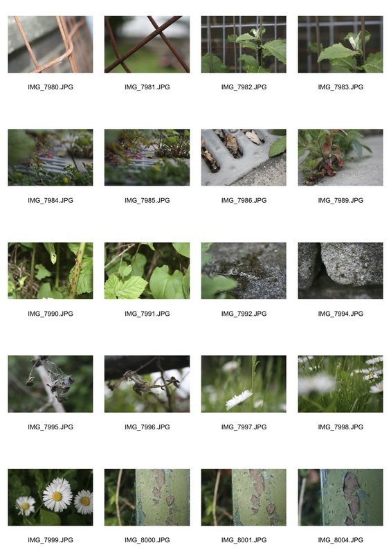
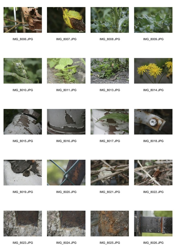
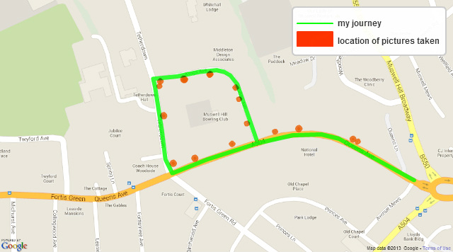
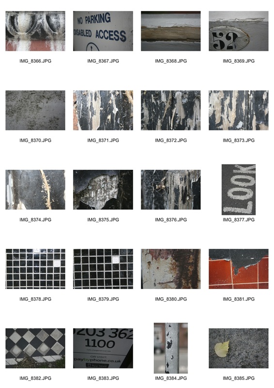
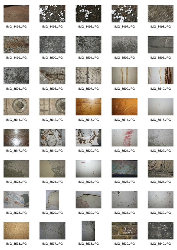
For this response I decided to go on a short journey around the area where i live. I drew out where i took the pictures and the places i walked around.
|
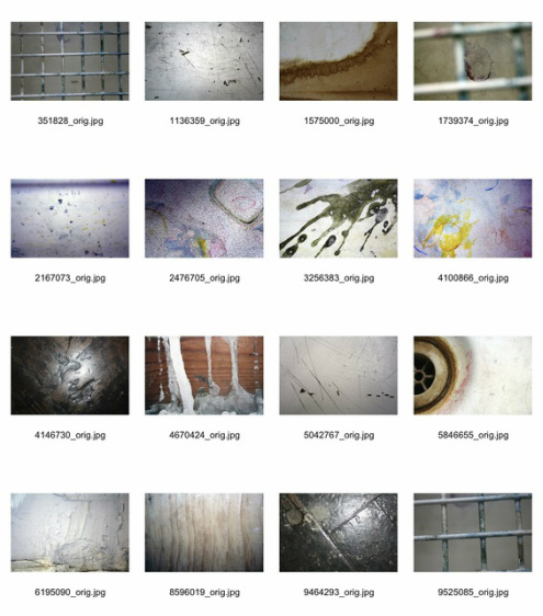
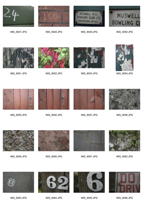
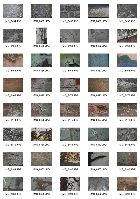
all pictures
|
|
best chosen pictures
'layers' |
'Splatters' |
'ageing' |
'hook' |
'chipping' |
'peel' |
'brown' |
'moss' |
'pebbles' |

'contextual' |
'depth' |
'ware' |
The following pictures are the ones I chose to develop my project further.
|
'Contextual'
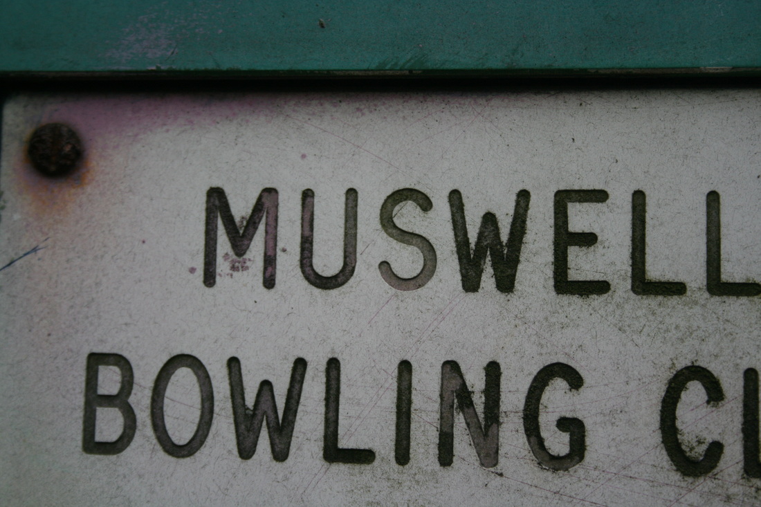
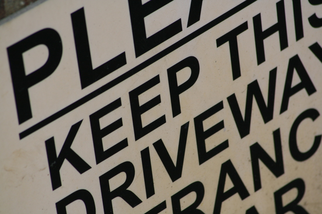
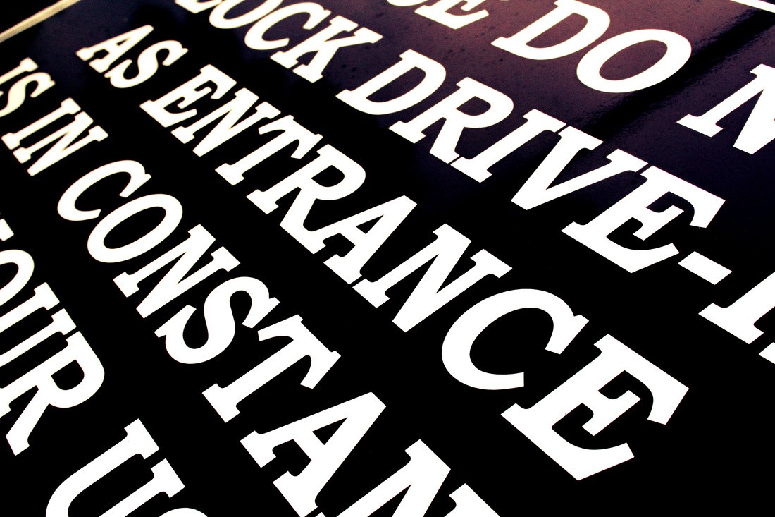
I chose this picture because I liked the way the shot was taken from an abstract angle and you can't really tell what the text says. I also like the idea of having a 'contextual' factor in my pictures. For the process of this picture you just have to get a different angle which is not straight on to make it more 'abstract'. |

|
'Chipping'
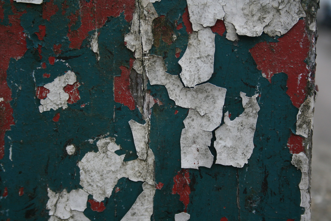
I like this picture because it's a very obvious example of decay and ageing, the peeling of different layers of coloured paint creates a layered effect which I think looks really interesting. For this process, unlike the shot from above, I took the picture from straight on to make the peeling of paint stand out more. I think the colours also go really well together and don't clash too much. |
|
'Unbalanced'
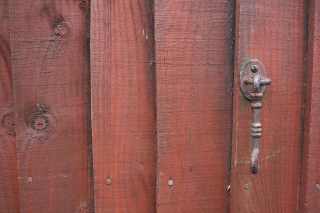
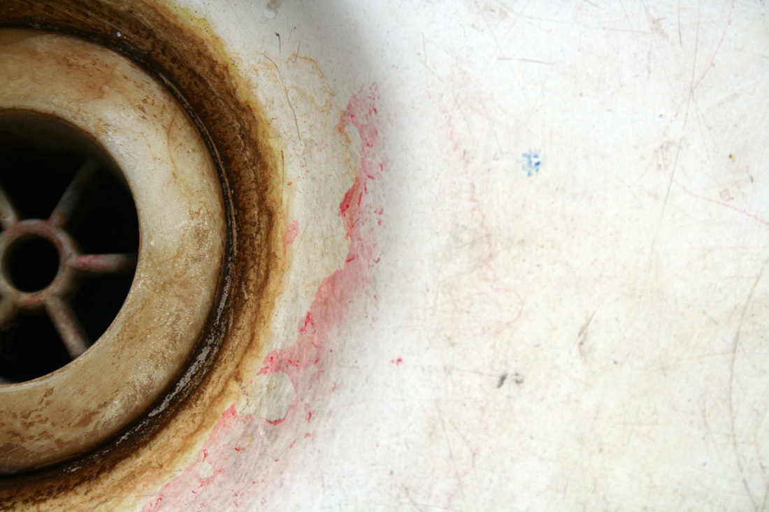
I chose this picture because i liked the look of the unbalanced factors in his shot, one side is almost completely white and the other has a lot of detail and more colour. This picture is also a good example of the 'ageing' look as it has a lot of brownish colours around the brim of the plughole where the water has been left behind. This shot was also taken from straight on, and has a very contrasting look. |
Artists
|
Barbara Crane
This image has a very specific depth of field as it only has that slim boundary in line with the emerging black coned object in focus. The object is far to the left on this photo making it an unbalanced shot, this is interesting because it complies with the rule of thirds. This placement is important because it makes the shot aesthetically pleasing due to the intriguing distribution. |
|
Maya Hiort Petersen
This photo resembles to my 'chipping' photo. In this picture the artist has used a bright mint colour paint chipping from a certain object, similarly, my shot also has used bright colours chipping. However, the only main difference between my picture and this one, is that my shot has many different coloured paints chipping. I feel fairly confident in developing , my project more into this direction of 'decay'. |
further developed photo shoot
|
|
contextual

These three pictures were my favourite out of all of my 'contextual' responses. I used photoshop to change the contrast and brightness. All of these images above have high level of contrast and a low brightness to make the colours stand out more and to also darken the darker colours such as black and blue.
chipping/decay
The three images above are my best ones from my chipping/decay as they all give a sense of ageing and erosion. These shots, like above, are all adjusted to have a low brightness and high contrast. My favourite shot of all is the one in the middle. This is because it creates a sense of surprise because it shows a outer layer of tile which looks quite strong and unpealable.
unbalanced
These three 'unbalanced' shots from above were all used with different objects and materials, however they all resemble the theme of unbalance, i also really like that they are all different because it shows contrast and similarity in different scenes. Like the contextual and chipping, these pictures were edited to high contrast and low brightness.
|
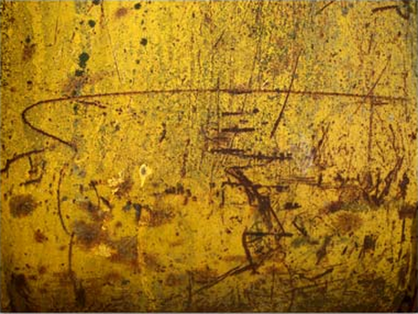
My favourite shot
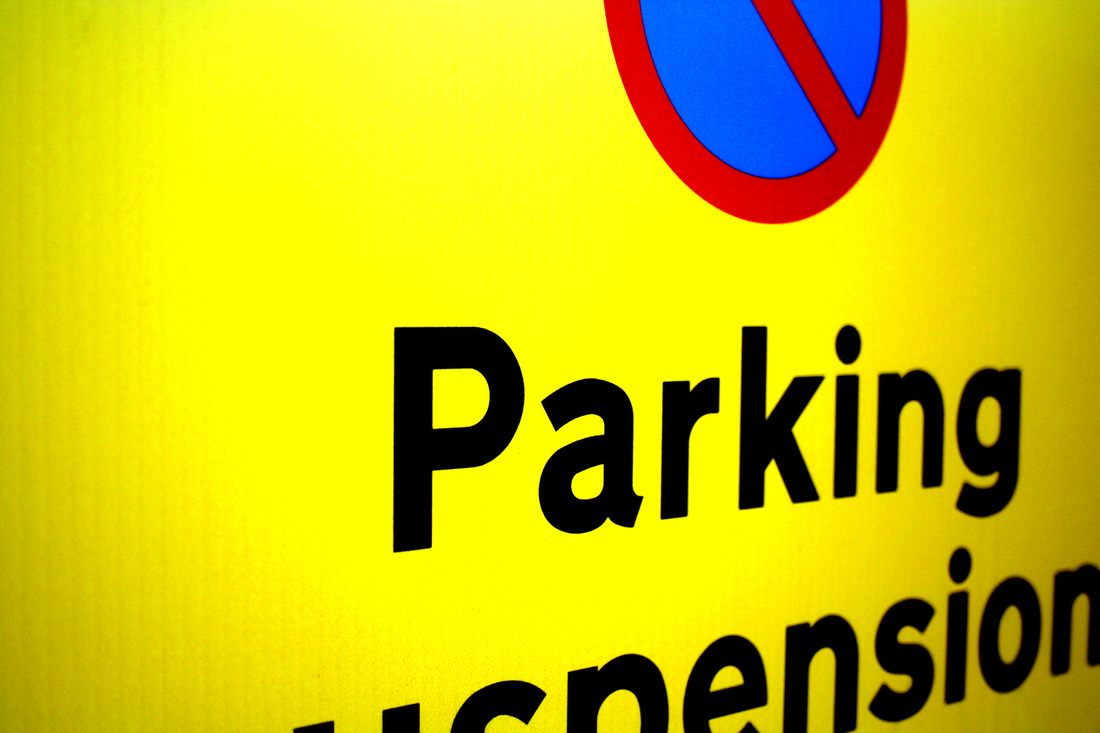
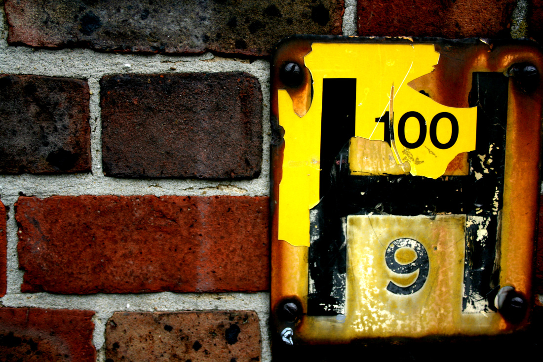
I really like this shot because it represents all of my three keywords 'contextual', 'chipping and 'unbalanced'. the numbers on the yellow surface show the 'contextual' side of the image. The shot, however, was taken from head on which doesn't really show an abstract angle. but it still has a sense of abstraction. This shot also shows an element of chipping/decay as the bright yellow is is being chipped off the darker back ground yellow colour on the sign. decay is also shown in the 'dripping' effect of the rust on the sign, the brown colour gives a sense of ageing and erosion. Lastly, this shot shows a theme of 'unbalanced' as the sign is not centered. The yellow sign is edged to the right which creates an abstract effect as the other side of the frame is occupied by a simple pattern of brick. |
After doing this shoot I decided I want to work on only one element and I have chosen to do 'ageing' as I really liked that element in the picture above. To develop this theme I did some research into the following artists:
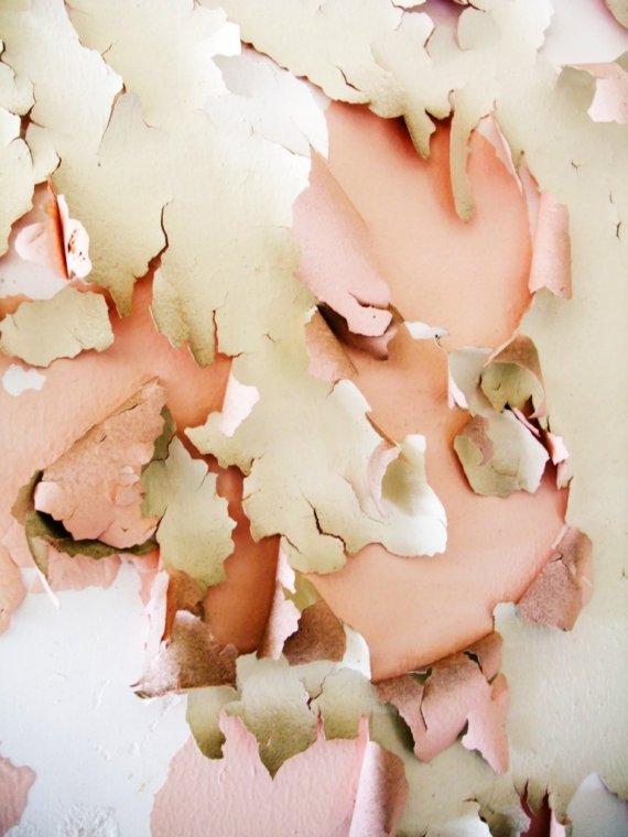
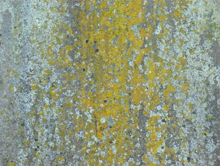
Irina Souiki - abandoned beauty
|
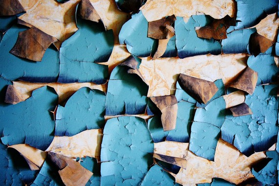
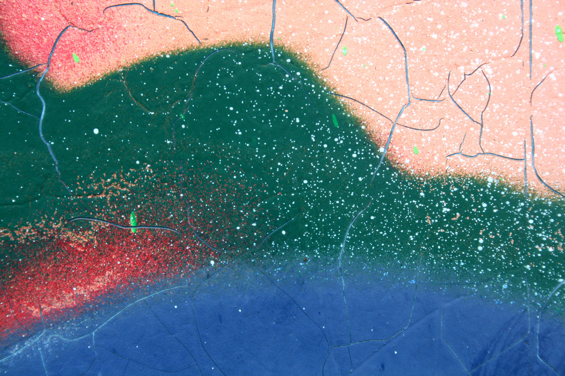
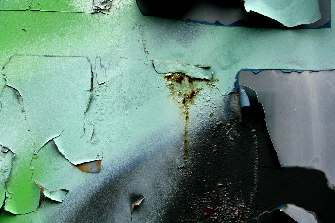
This piece 'abstract peel' by Irina Souiki in her gallery 'Abandoned Beauty' contrives the theme of ageing as it shows a peeling wall, almost completely untouched. The stained wall behind the peeling wallpaper shows that this process has been going on for a long period of time evoking the idea of ageing. Once again, here the bright blue contrasts with the brown and creme making it stand out. I really like the idea of contrasting colours and i feel that this will help me develop my project further.
|
|
This shot 'Underskin' by Souiki gives the sense of ageing by using similar colours. The view point of this image is coming from down left to emphasise the peeling of the layers. The shot also conveys the sense on depth as it shows the underlying layer as well as the top one. Adversely to the shot above, this shot uses similar, pastelly colours which actually creates a more youthful tone than the pictures before. I think the intentions of the artist were to create a different aura compared to the other images which were more negative as they were more contrasting and dark and this one is more light and 'healthy'. This shot helped me also think of more comparative ways to develop my project.
|
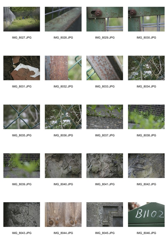
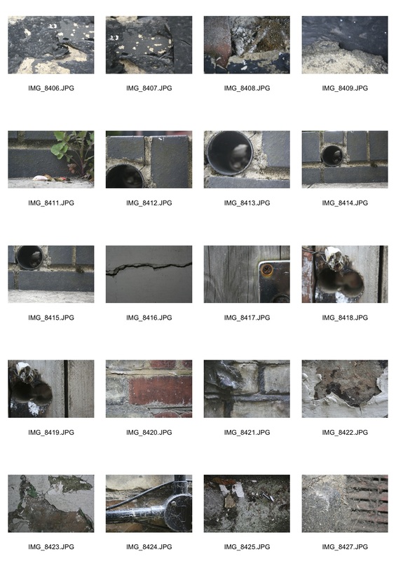
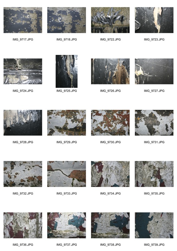
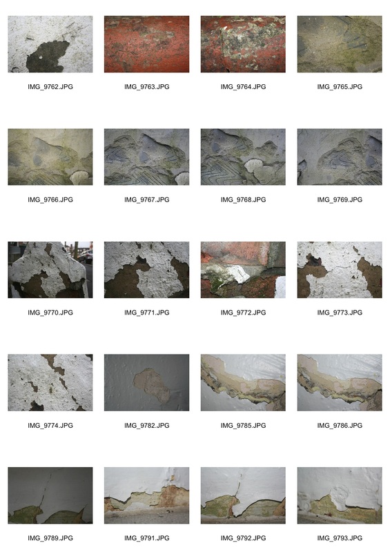
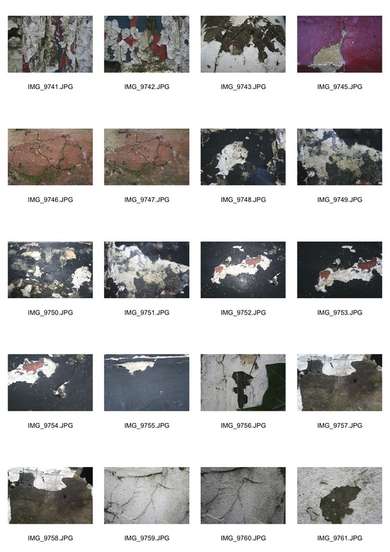
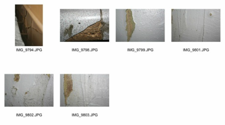
After researching Irina Souiki and abandoned beauty I wanted to focus on just chipping paint and so I went around my local area to find some 'abandoned' or 'neglected' property which may be corroding or breaking down. Here are all of my shots:
|
|
Jazz Green
|
This shot by Jazz Green really evokes the idea of ageing and decay. In this picture Green has taken an image from straight on, this puts the focus on the whole shot, capturing every detail. In order to do this, Green must have found a patch of where the erosion was most colloquial in order to capture an interesting shot. The colour also adds an element of interest in this shot as the lime green/ yellow colour brings a splash of colourisation into the grey and light blue chippings. I feel that this shot has .helped me expand on the angle of which I take my pictures.
|
|
This image taken by Jazz Green also conjures the theme of ageing. This shot has several scrapes and scratches which invokes the idea of rusting as the canyon of each scratch has a brown discolourisation. The shot also has several green and red marks resembelling bruises which shows ageing as it has been left to decay. I really like the bright yellow contrasting with the darker colours such as brown and orange as it creates a sense of deterioration. This shot helped me figure out what sort of objects i want to take pictures of.
|
Response to Jazz Green
|
|
The following four shots were the ones i liked most out of my last shoot.
|
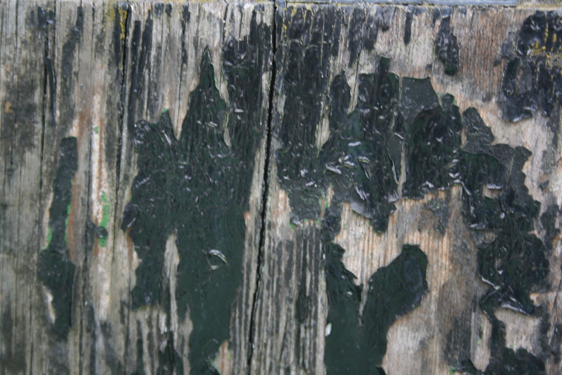
This was one of my favoured shots because the colours in this shot create an interesting abstract image. This is because the cracks in the paint link together each colour and bring them together. The colours also somehow all compliment each other, the pale cream and the green don't quite 'clash' but they make each other stand out. This is also happening in the red, blue and pink. The cracks also resemble different segments in the shot, however the colours overlapping these different segments show unity and linking. This picture gives a sense of 'ageing' as the cracks almost appear like 'wrinkles' in a persons face. This shows that the paint has weathered a lot f different environments.
|
I chose this picture because it coincides with Jazz Green's splattered picture which i analysed above. In this picture I chose an area of interest for me which was a place where there were a lot of different textures and colours. This shot consists of three different layers of blue, red and white. I liked these colours because they work well together like the US, Uk and French flags. The splatters of different colours show that each part of this floor has been warm away at different stages. This represents the theme of 'ageing'. I also liked how at the top left corner the amount of wear has acumulated more than anwhere else. This could show how this part of the floor was used more which also shows how some places erode more depending on the amount of use they get.
|
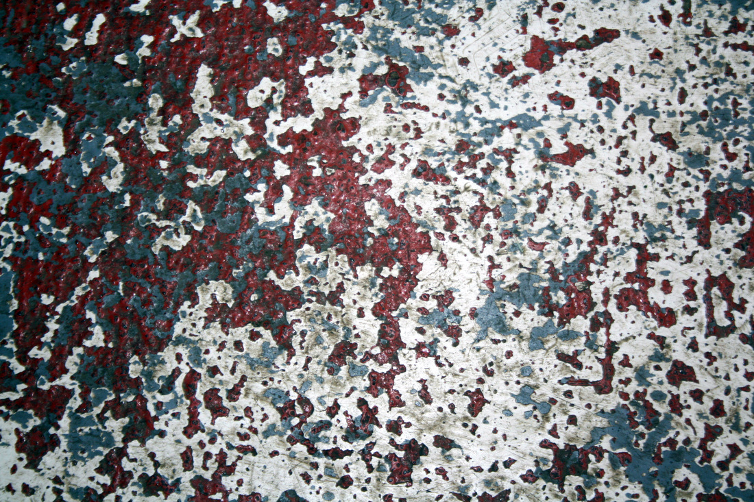
This picture was chosen as one of my favourite because it is comparable to Jazz Green's second photo which I analysed above. Similar to that photo, this one has several different scrapes and scratches which shows erosion and ageing because of the decay which has been left. This shot, however,has splashes of colours such as blue and yellow. This shows the layering that has peeled or eroded from the object. This also evokes the sense of 'ageing'. This is because it shows how much it has 'survived' from . The dark brown contrasts with the white and yellow to show a 'grungy' kind of look which resembles decay.
|
This was one of my favourite shots because it echos some of rina Souiki's work. This is because the peeling shows ageing and decay. In this image, the graffiti is peeling off a metal container which almost looks like it's being pulled off. This is significant because the graffiti itself has been a human cause so the look of being pulled off shows the effect of human consquences. The three main colours of this shot are green, blue and black which all contrast with each other. However, the green and blue and similar colours which resembles Souiki's second piece which I analysed where the change is more subtle. Also, Similarly to Souiki's first piece i analysed, the black contrasts with the lighter colours to create an 'ageing' look.
|
Developing the shots above
For my development I want to combine the ideas of both 'peeling' and 'splatters'. To do this I want to combine the second and fourth pictures from above using photoshop.
For my development I want to combine the ideas of both 'peeling' and 'splatters'. To do this I want to combine the second and fourth pictures from above using photoshop.
Process:
Bring up your first picture.
Create a new layer and insert second picture.
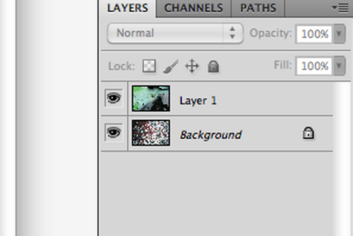
Select both layers.
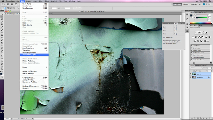
After selecting the layers, go to Edit > Auto-Blend Layers...
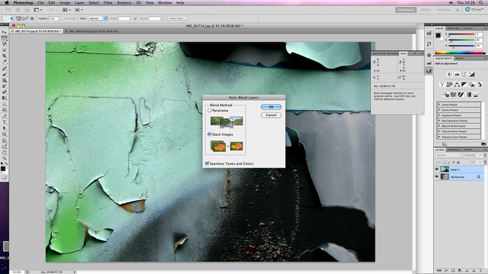
When this pops up, Select stack layers to combine the two pictures.
Your new image should then be created.
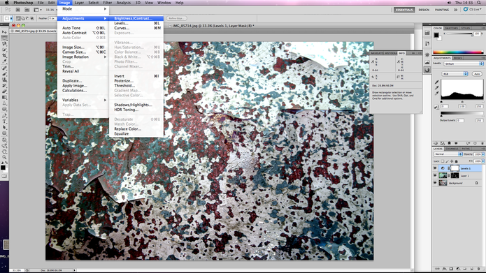
To slightly adjust the Brightness and Contrast go to Image > Adjustments > Brightness/contrast...
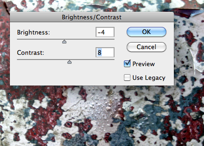
you can then select how much you want to adjust.
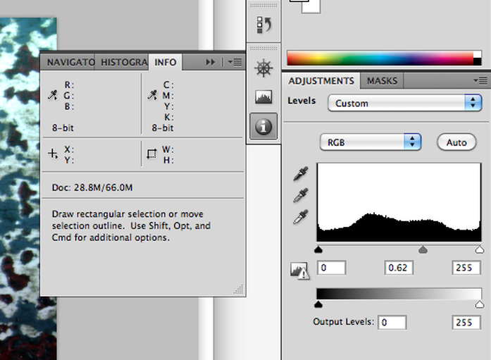
You can also do this by dragging the small arrows on the graph to the right of the screen.
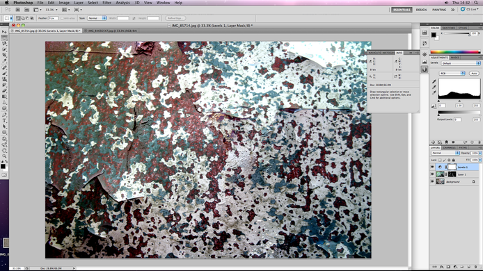
Finished piece
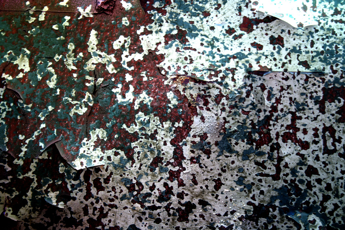
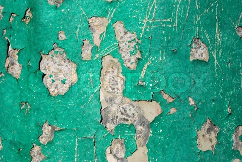
For this I combined peeling and splattered elements of 'ageing'. I did this to reveal the different forms of decay and erosion in the theme 'ageing'. I did this firstly by looking into artists who did close-up abstraction, this then soon developed into pictures more with the theme of decay and decadence after researching into photographers such as Maya Hiort Petersen. After exploring my chosen themes of 'contextual', 'unbalanced' and 'chipping' I narrowed it down to the key theme of 'ageing'. After my shoot on the influence of Jazz Green and Irina Souiki, I chose four of my favourite shots and then narrowed it down to two which had in common the idea of 'ageing'. I decided to combine these two to create my developed piece which showed an overall view of my projects theme 'Close-up abstraction'. This image had all the elements of which I intended to include which are peeling layers and splatters. This photo creates a sense of unreality and ageing as it has peeling splatters, which is uncommon as i could not find any objects with both of these appearances.
