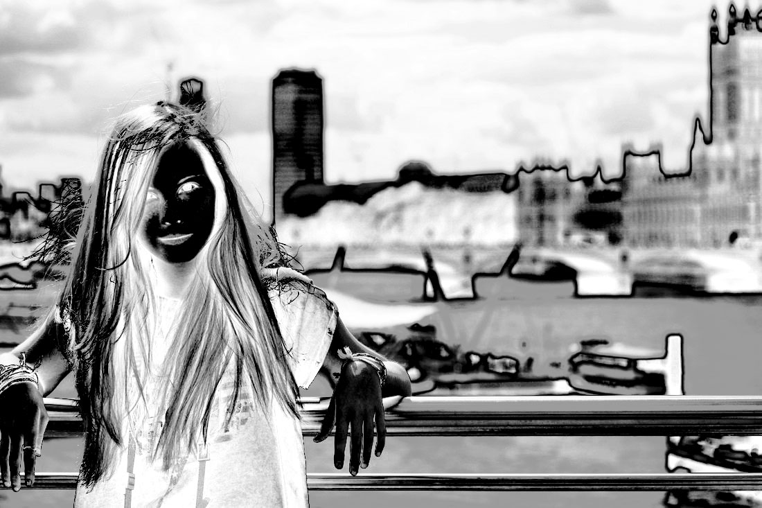
portraiture
Digital brainstorm

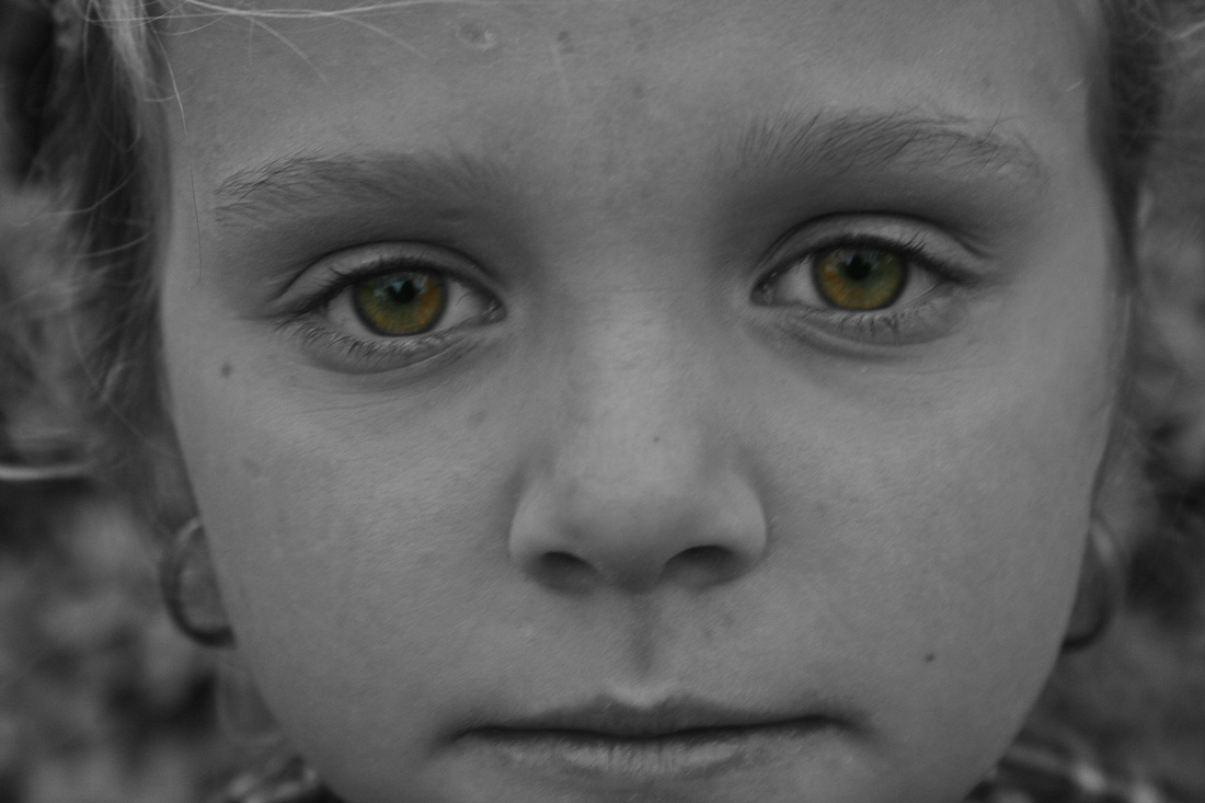
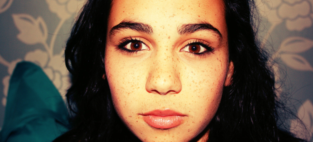
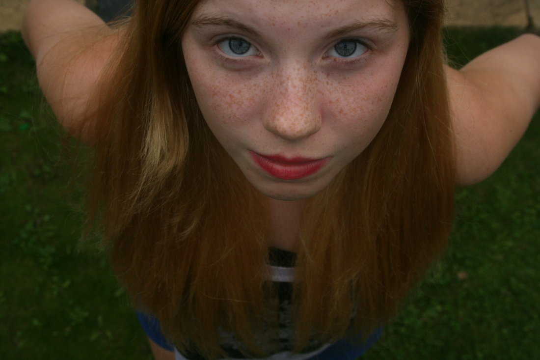
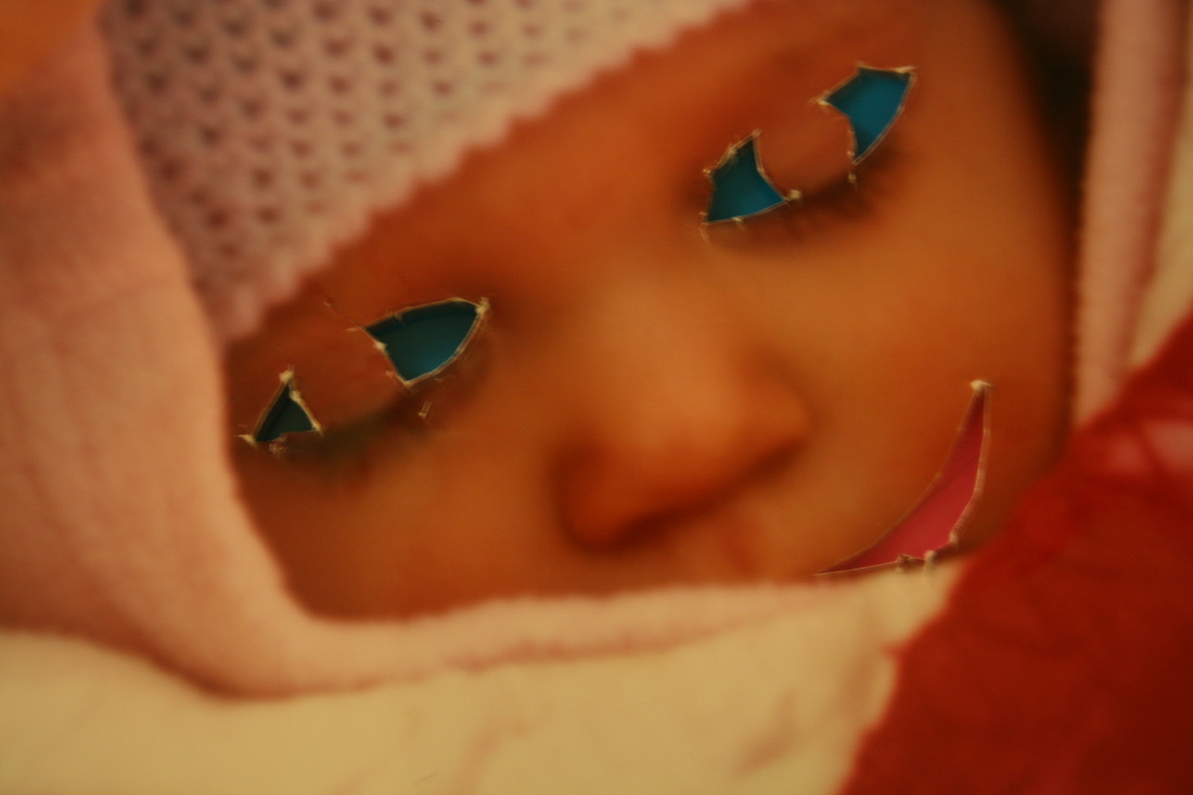
Close Up
|
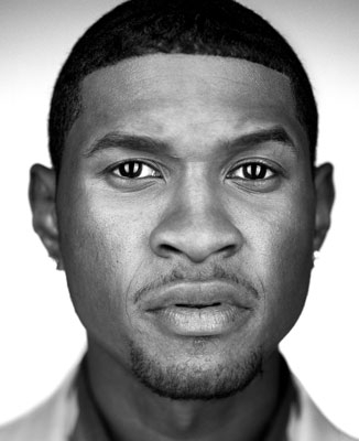
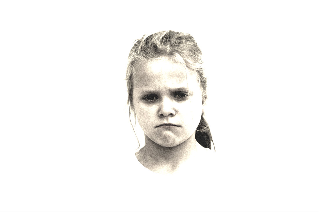
These are my close-up shots. I like the first one because the image is very crisp and clear, also the emphasis on the coloured eyes create a contrast to the monochrome. The photo is very rugged looking and i also favour that aspect of the image because it hasn't been airbrushed to fix every little detail which creates a more natural look.
My second shot is also quite crisp, but in contrast to my first image, the subject of the image is wearing makeup so the look isn't as natural. However, the eyes in this image are also emphasised as they are the first thing you see when you glance at the photo. |
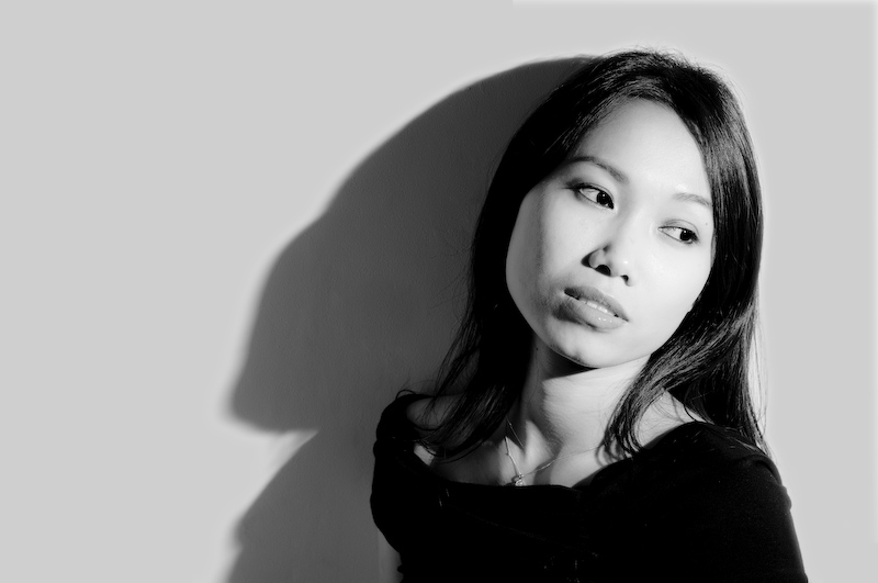
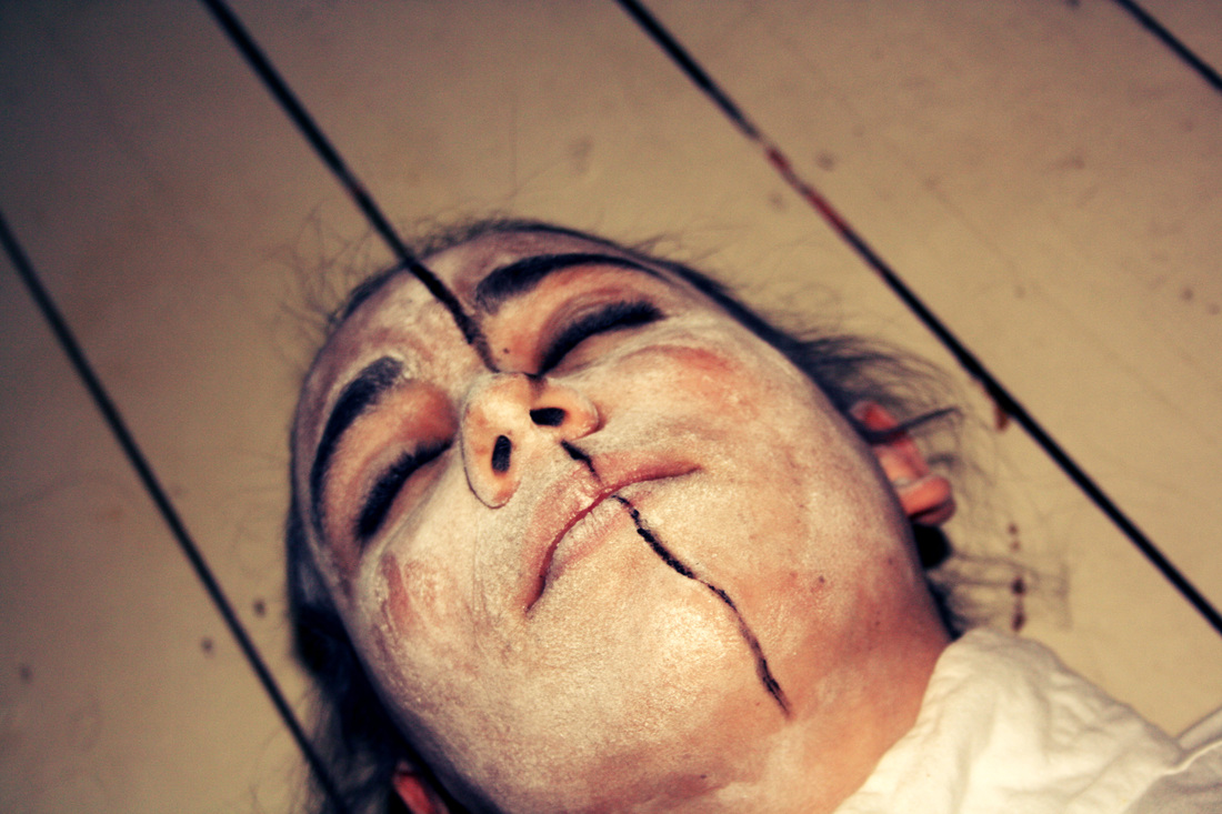
Extreme Angle
|
Both of these images are taken from above. I prefer this angle better because it's more flattering than taking the picture from below. This is because the emphasis is on the eyes rather than the chin and around that area. I like the first shot because the picture is very simple because the subject is centred and the back ground is only one simple pattern. It's also very simplistic because of the black and white so theres no dominant colour standing out.
However, The second shot is different in almost all these aspects. The back ground is almost completely grass, however, the top bit changes to floor tiles. This shows that there isn't a 'clean' back ground. Also, the colours are very defined and strong in this photo. The red lipstick stands out the most on the subject as it's the strongest colour. |
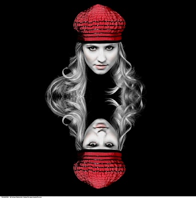
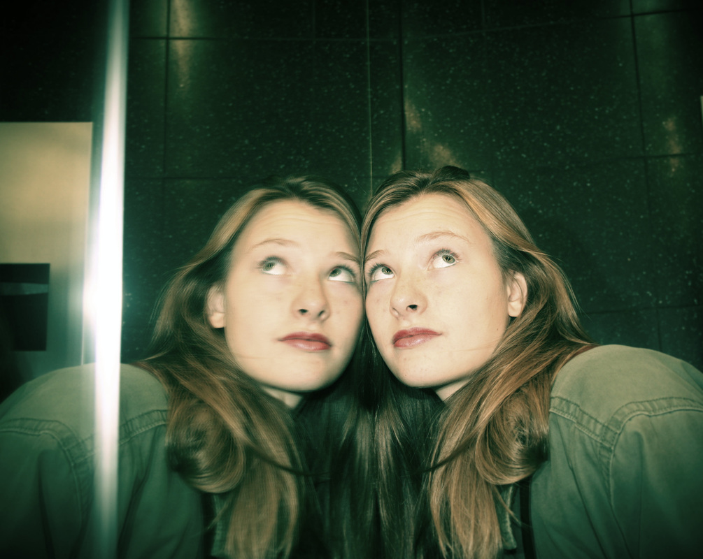
Symmetrical Portrait
|
I like this image because you can tell which side is the reflection. The left side is slightly fuzzy, in comparison to the right side which is much clearer. This shot also has a lot of shades of green present, which relates to the unrealistic factor of having a duplicate person. The green creates a sci-fi look along with the trick of the light on the left side of the image which resembles a sword like figure.
|
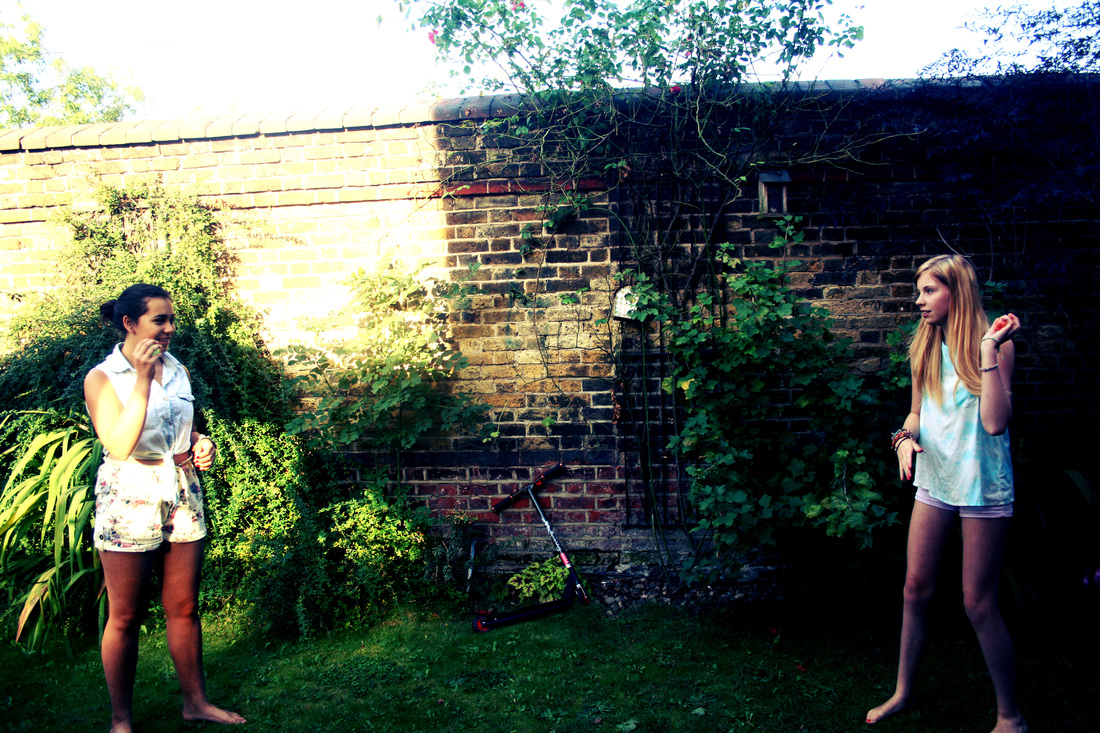
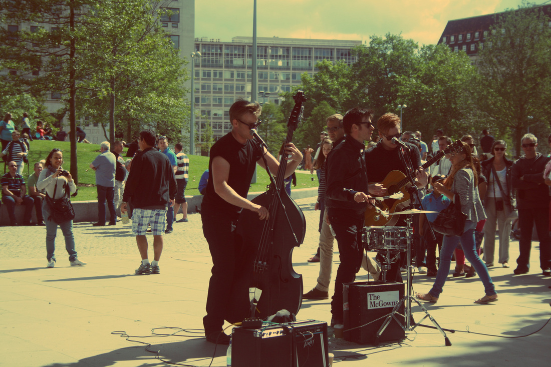
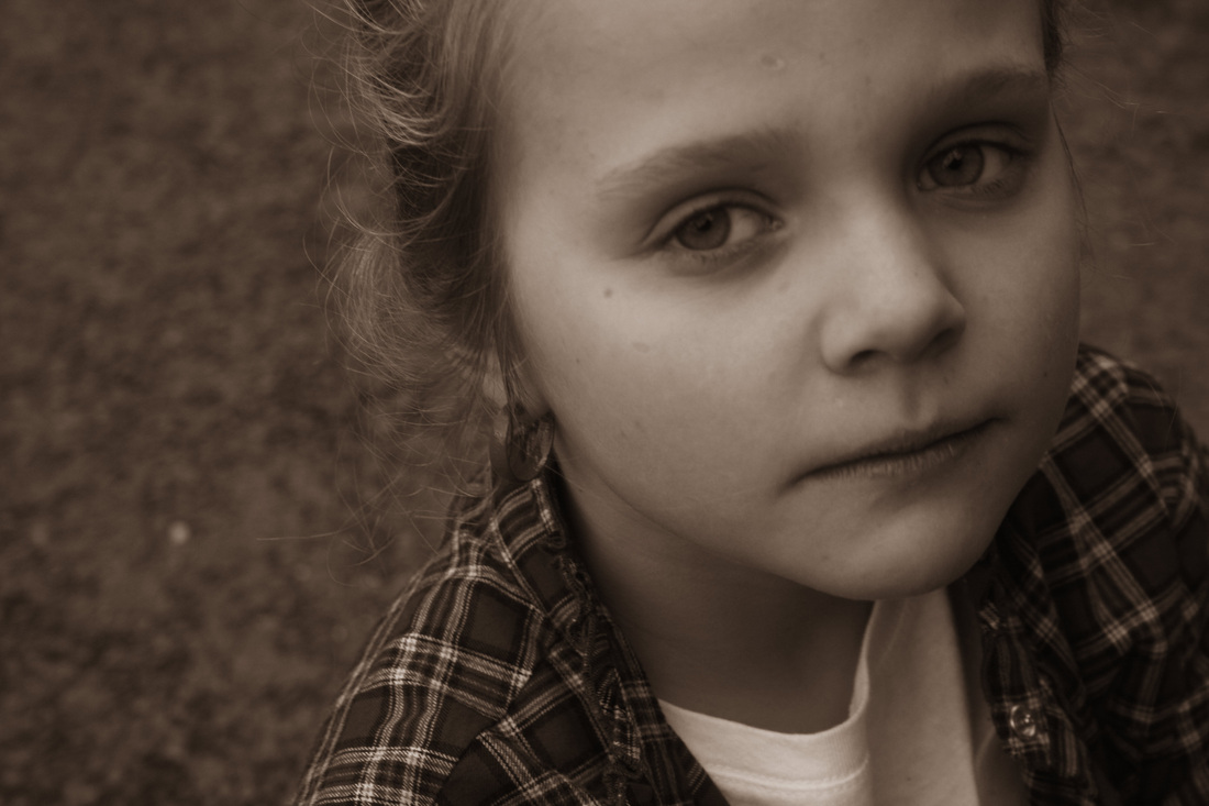
Balanced Portrait
|
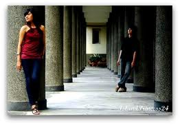
Both of these images are very different in having different amount of people, the colours that stand out most and the atmosphere present. The first image shows only two people who are approximately the same height, this is what makes the image balanced. However, this image also has an element of unbalanced factors. This is because The strongest amount of light is only present on the left side of the image. The right side of the shot is more shadowed, this creates a contrast in both sides of the photo, making it unbalanced.
The second photo however, has many different people in contrast to the first shot. Also, The majority of this shot has people on the same level, except some are on a bit higher ground in the bak ground. The colours in this shot are also more dulled out rather than sharpened like in the first shot. |
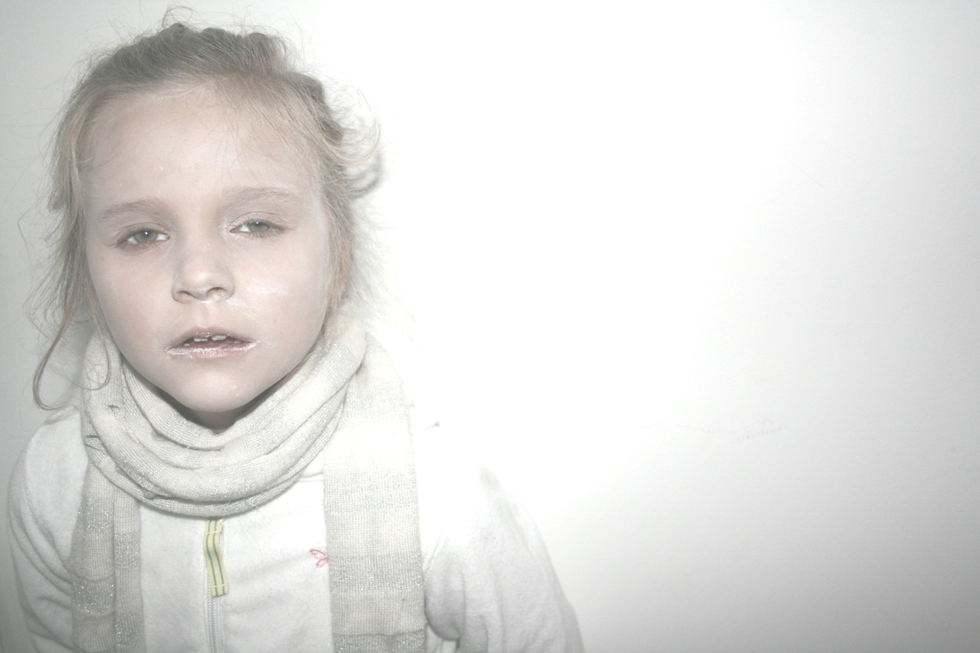
Camouflaged Portrait
|
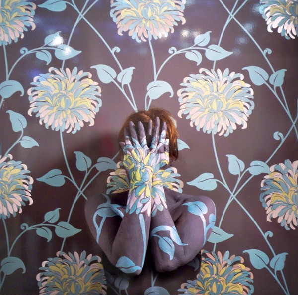
These two shots of 'camouflaged portrait' are very different. I chose the first one because I felt that regardless of the the makeup not being done that well throughout, the transition from the floor to the subjects head flows quite smoothly. I had to edit the shot to try and make the two cream colours the same shade. I also adjusted the contrast to match the black colour in the cracks of the floor and also the black in the subjects hair.
In the second image i tried to camouflage person into a plain white wall. Along with the white clothing and white powder makeup, I used photoshop to tone up the brightness and lessen the contrast. This made the shadows in the image less visible and also made some of the shades of white in the subject closer to the white shade of the wall. |
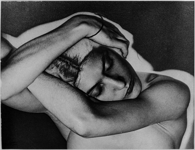
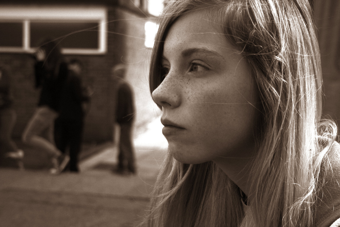
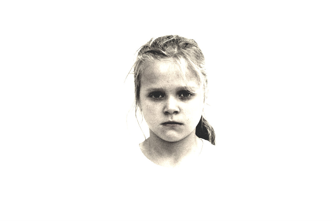
Sepia Print
|
My sepia prints are quite similar as they are both close-ups. I think i like the effect of having it closer up in sepia rather than further away because the depth of field is intensified by the browny shades.
The first image is almost a straight on view from the person in the shot, the eyes are looking straight into the camera so they become the centre of view for the person looking at the image. The subject is also expressionless in this shot creating a tension as the image is not positive or negative. However, the dark shades of brown make the image look more 'sad' than 'happy'. In contrast to the first shot, the subject in the second one as a profile view. There is the same effect of the negative feeling coming from the image because of the colours and emotionless subject. |
Masking Pattern
Solarised
|
Studio Portrait
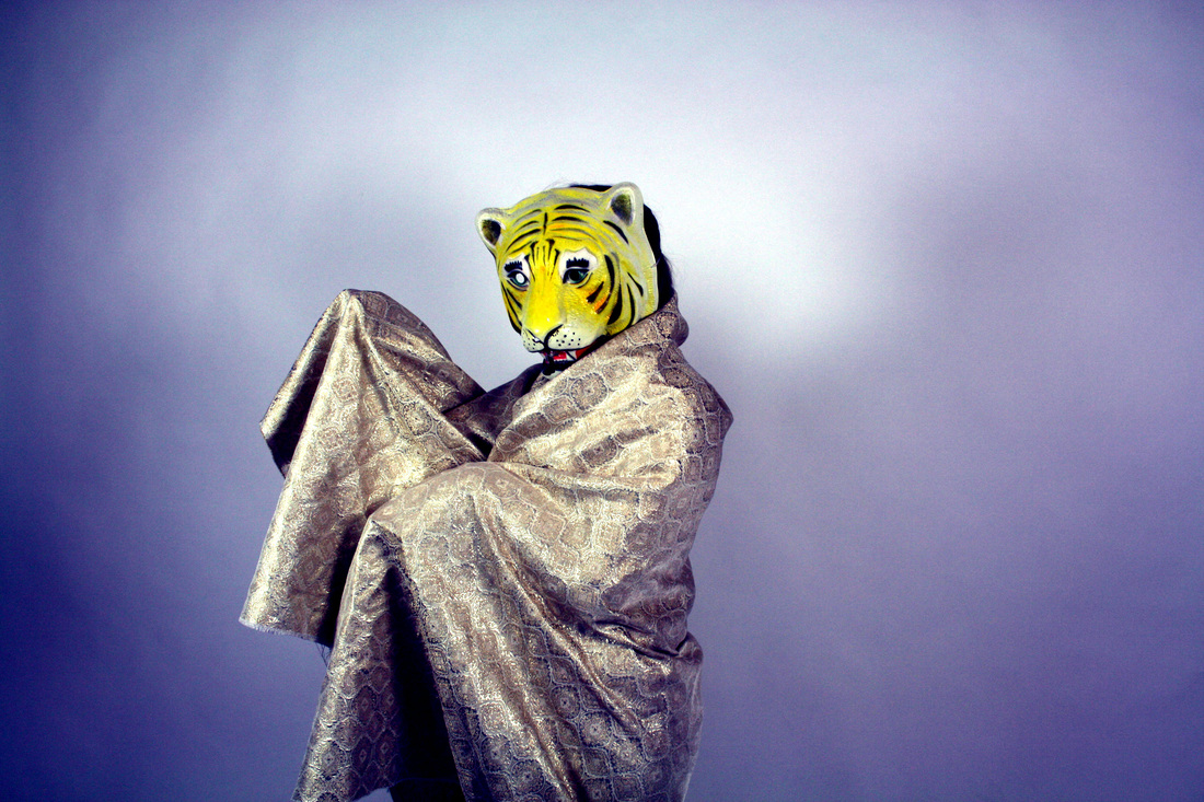
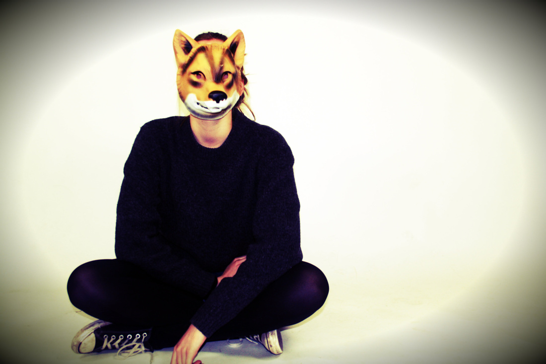
|
Transformations
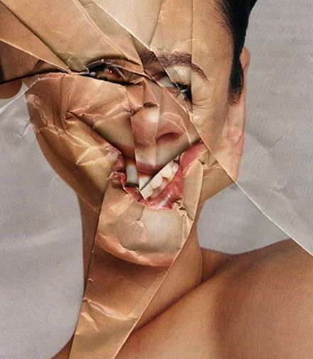
Stephen Shanabrook
Stephen J. Shanabrook has deformed once beautiful models into hideous creatures for his "Paper Surgery" photograph collection. By twisting and crumpling images of models in magazines, Shanabrook alters our perception of them. Many of his works play with the concept of beauty and ugliness and this collection is surely no exception.
|
I find this transformation especially interesting because it evokes a sense of curiosity due to the viewer wondering how the original picture initially looked. One of the key viewpoints in this picture is the models smile, the paper being folded to this position creates an obscure look. This creates a controversial twist on society's look on a models perfection and also disturbs their expectations. The eyes are also mostly cut off or are molded into an ambiguous form, i think that this represents a similar message as the smile in the shot. The overall directive of this image is to change the perceptions of a model and make the viewer think about their attitude towards magazine models.
|
|
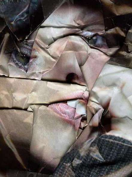
This Piece by Shanabrook is not much indifferent from the last one, however it has a few variations.
|
My response
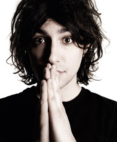
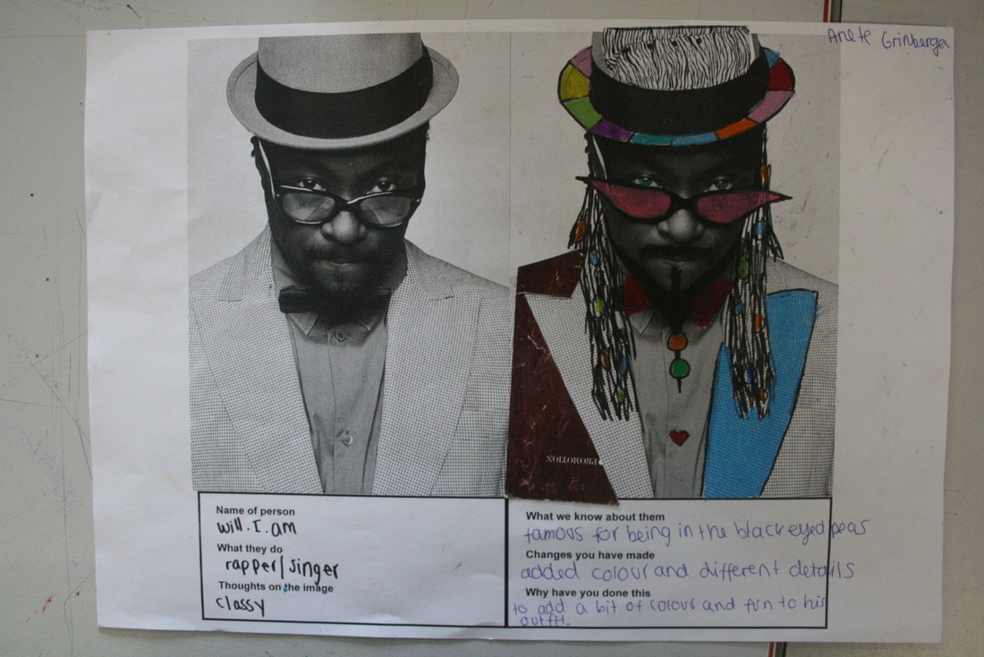
Rankin Destroy
John Rankin Waddell, working name Rankin, born 1966, is an English Portrait and Fashion photographer. He set up a project where he got some celebrities to 'destroy' a picture of themselves.
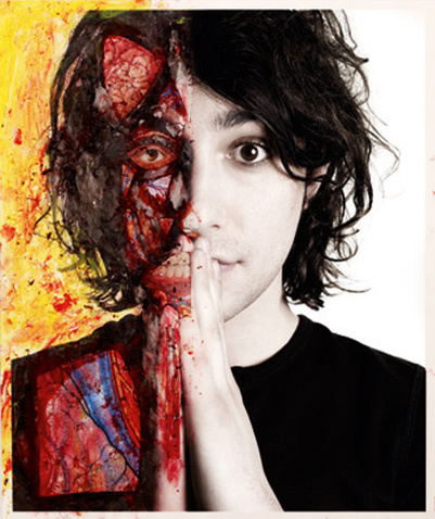
‘Destroy’ by Alex Zane
Professional inkjet print on archival paper / pen & ink Edition 1/1 Framed 20 x 24 inches 2009 |
|
‘Destroy’ by The Hoosiers
Professional inkjet print on archival paper / digital illustration Edition 1/1 Framed 2009 |
|
My response
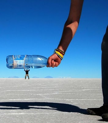
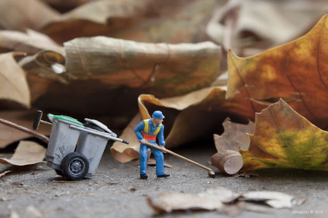
Slinkachu - Little people
|
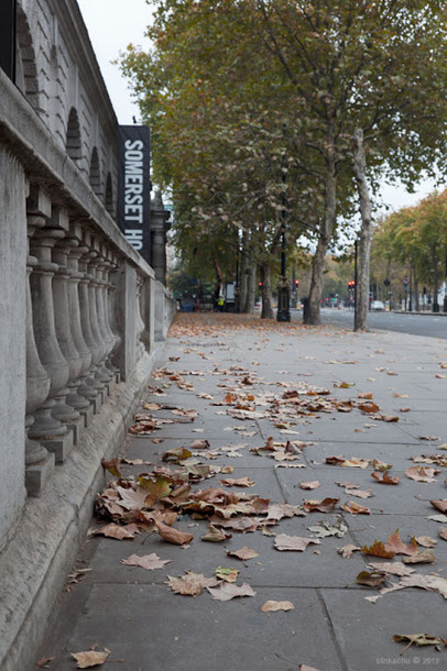
Dead Leaves, 2012
In this scene, there is a small man sweeping obviously very large leaves. However It looks extremely realistic, as the angle is at the same level as him , creating the illusion that you are a passer by. In the second picture your supposed to try and spot the bin man, but it is very difficult when you realize how small the bin man is. In this photograph, the artist uses a street in Embankment,London with some scattered leaves. He also uses a very small bin man figure and rolling bin. I think that the artist is trying to portray the fact that there are many workers out there such as street cleaners which are not recognized and appreciated by the public. Street cleaners have a huge role in keeping the streets of London clean. The large leaves represent the amount of work that one street cleaner has to do, and his size shows how many people realize how important he really is. Additionally, there is a street cleaner in the background of the picture which creates irony. |
My response
|
|
