Forces
Project brief:
For this project I'm going to be exploring the theme of 'Forces' of different kinds. I want to research into different kinds of ways that the word 'forces' can be interpreted. I am especially interested into delving into the theme of forces of nature because I haven't had the opportunity of specializing in just nature shots. In this project I'll be using the internet for research and also exhibitions if I can find any appropriate ones near by.
For this project I'm going to be exploring the theme of 'Forces' of different kinds. I want to research into different kinds of ways that the word 'forces' can be interpreted. I am especially interested into delving into the theme of forces of nature because I haven't had the opportunity of specializing in just nature shots. In this project I'll be using the internet for research and also exhibitions if I can find any appropriate ones near by.
Brainstorm
Forces of Nature
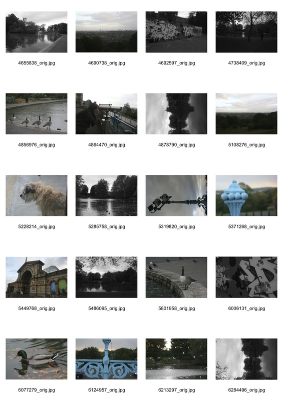
Preliminary shoot on the theme of 'Forces of Nature'
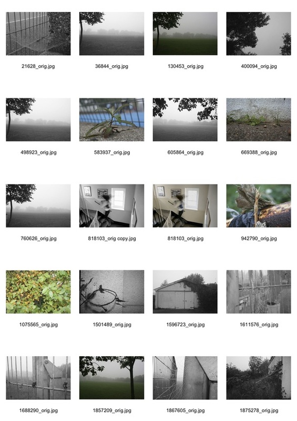
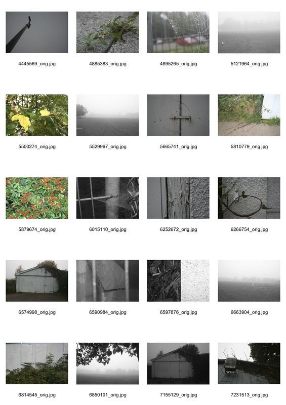
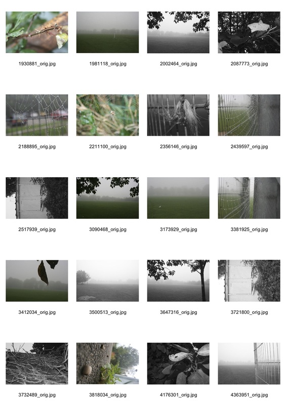
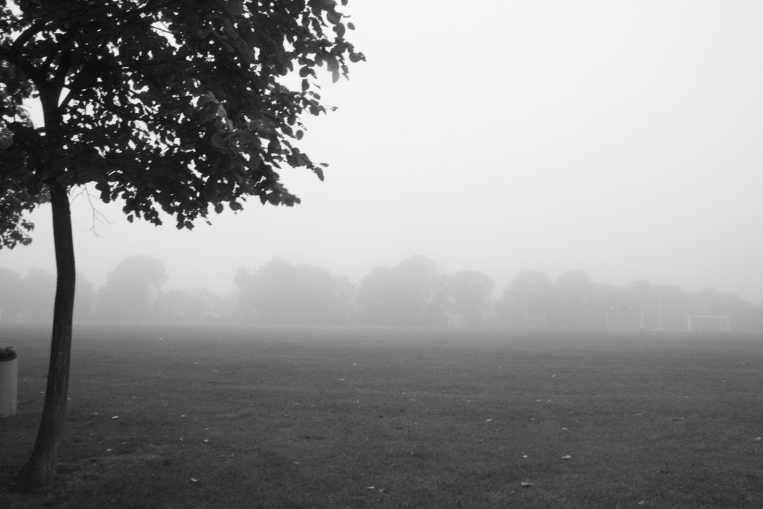
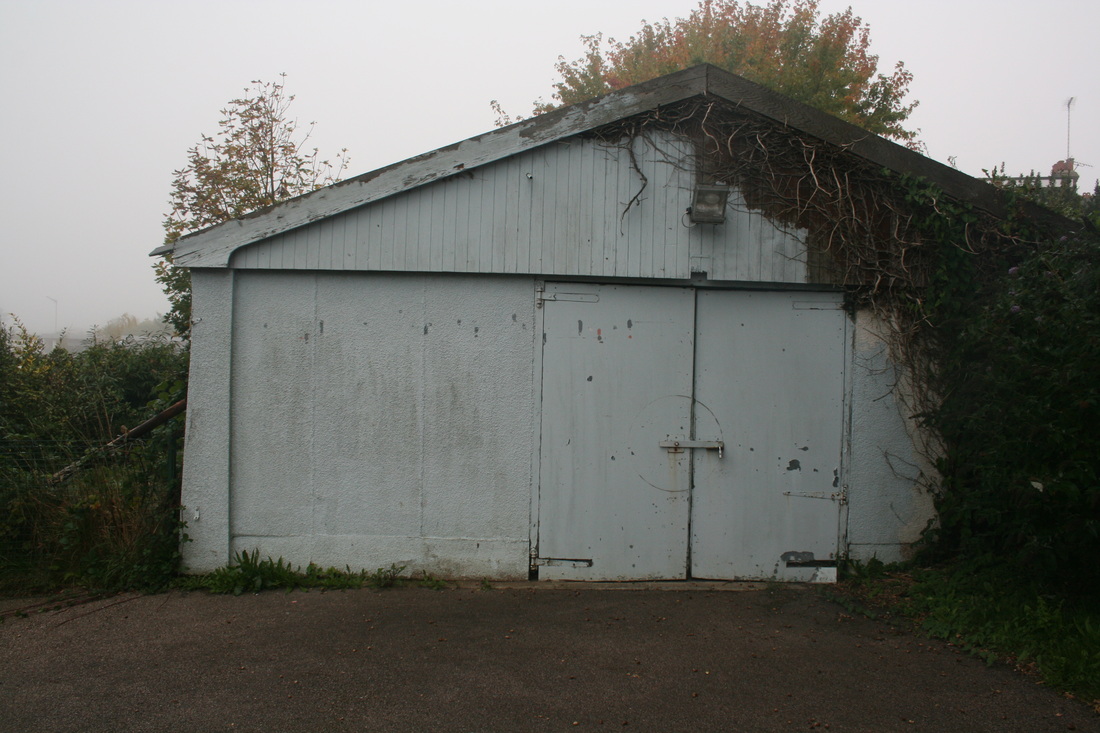
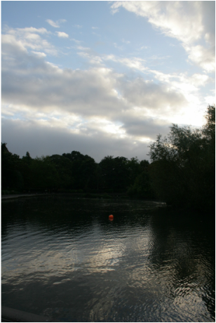
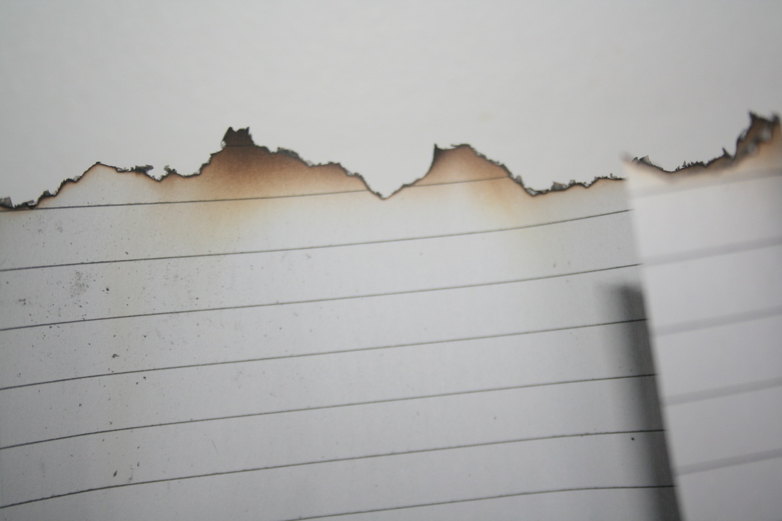
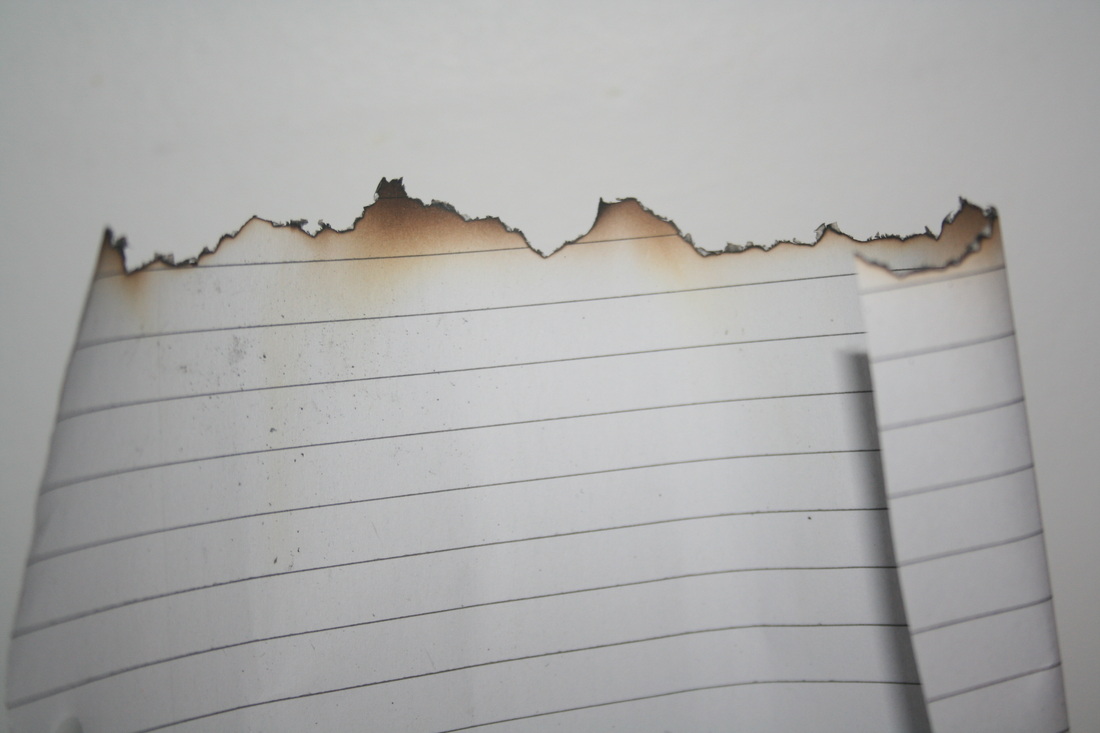
For this project I have done experimental shoot displaying the forces of nature against human built structures. As you can see below explored the use of black and white in the pictures with my camera on the monochrome setting.
|
|
Top four shots:
|
|
Favourite image
process
|
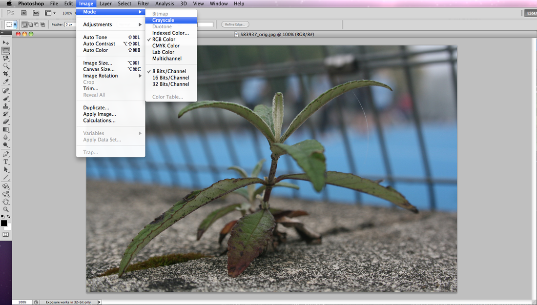
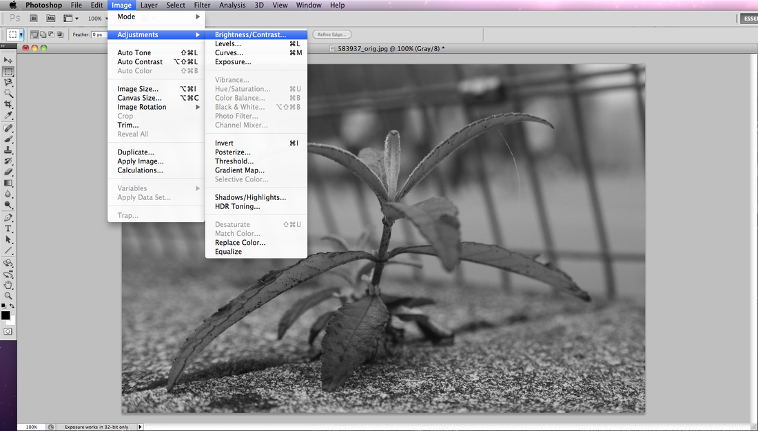
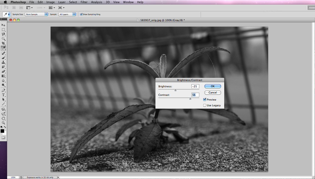
Open image in photoshop and go to image >
mode > grayscale after setting the image to grayscale, go to image > adjustments > brightness/contrast... Then select the brightness control and put it to -25, after that set the contrast level to 56. |
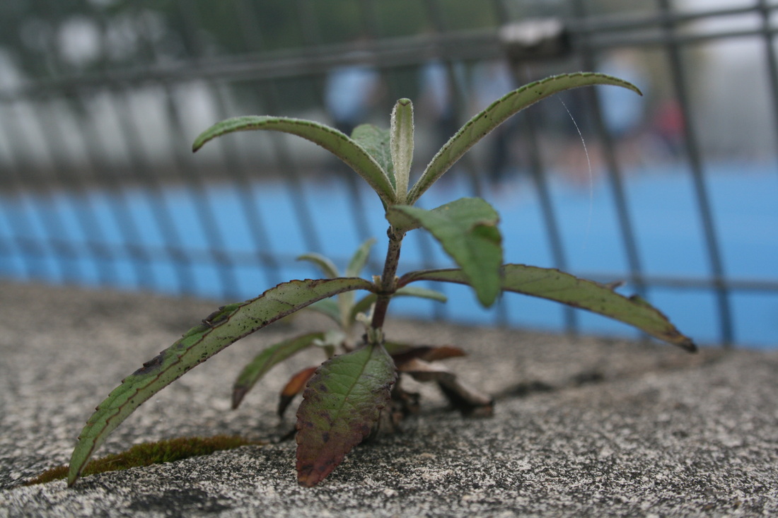
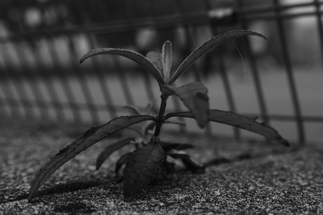
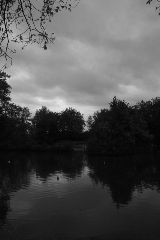
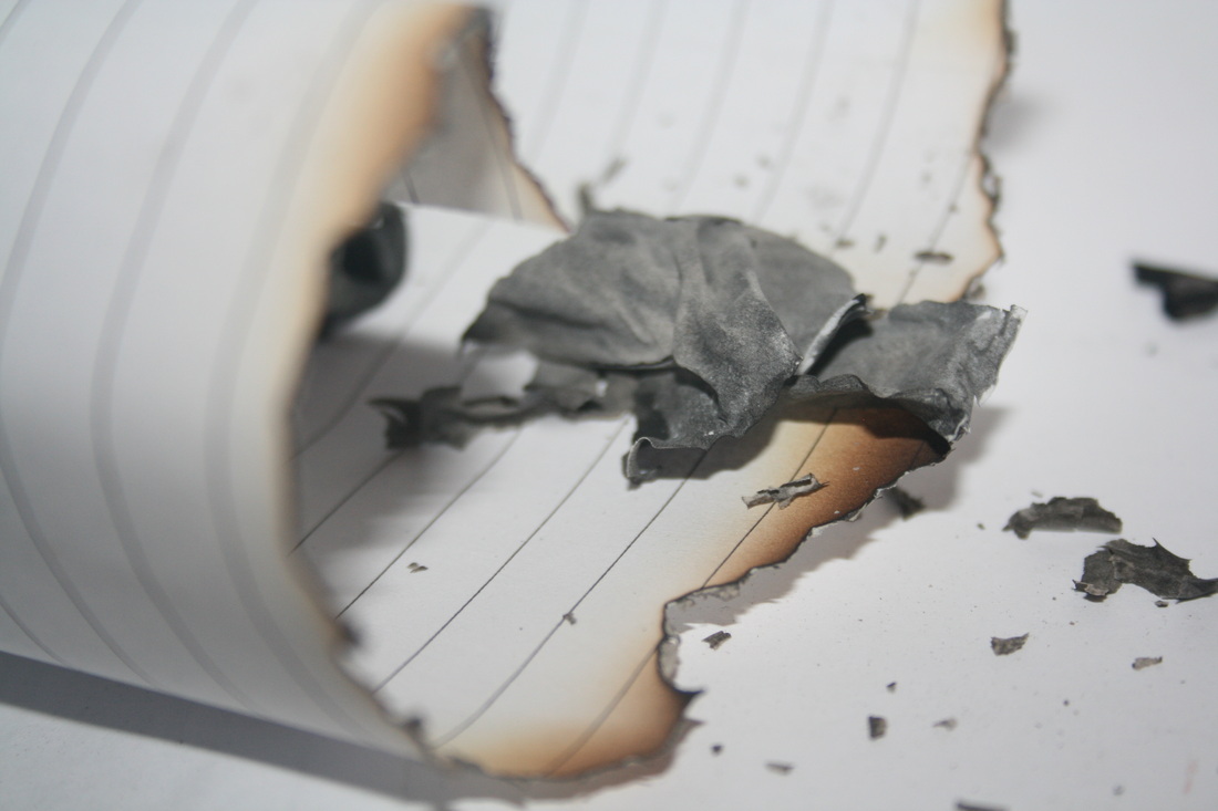
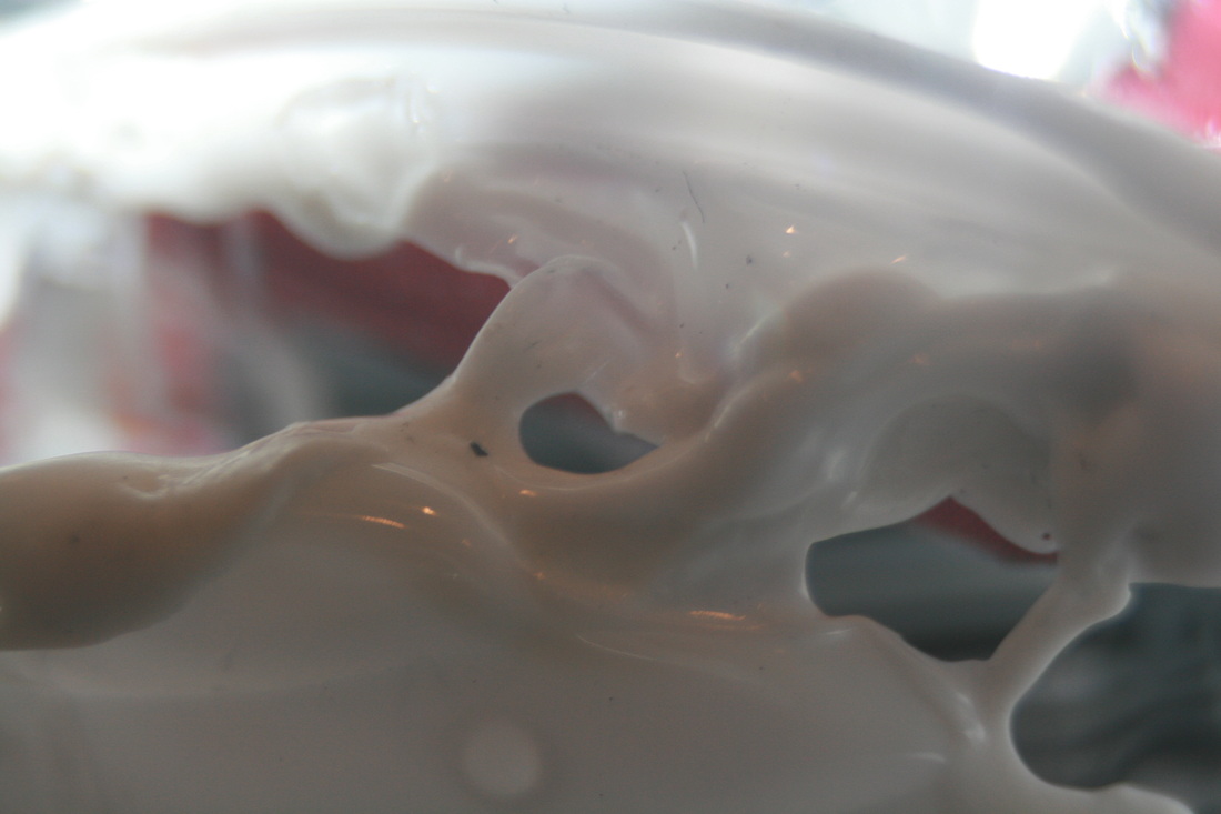
After my experimental shoot my favourite shot was the one shown above. I liked it because it really presents an obvious relationship between the force between nature and human activity. This is because the plant is shown growing out of the crack in the ground which displays how powerful nature is despite the tough concrete ground. I'm also very interested in working with the monochrome theme because it adds depth and a sense of clarity in the image. This image has lead to research into artists working more with forces of nature because i'm really interested in exploring more into this.
Artist's work i'm interested in
Fay Godwin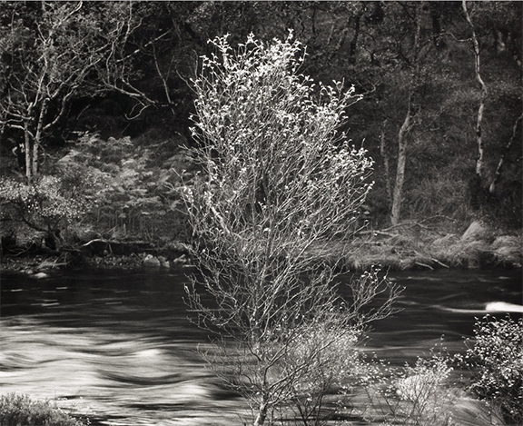
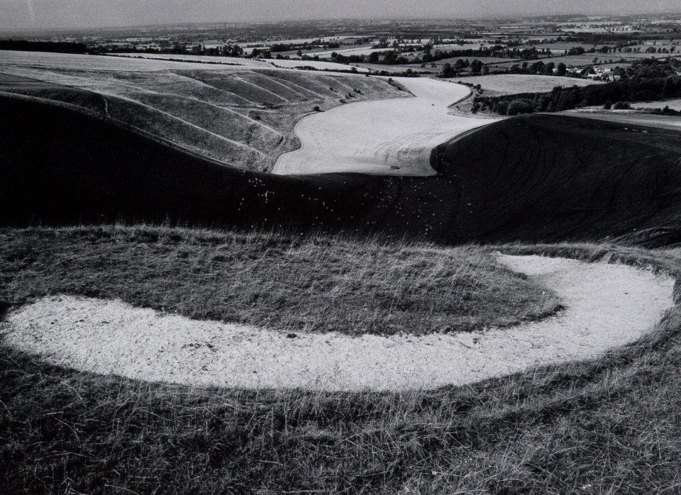
|
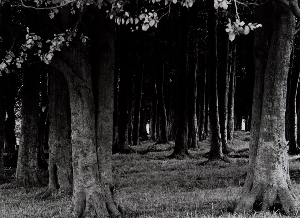
I'm really interested in some of Fay Godwin's work fromThe Ridgeway project. I especially liked these images because 'Force' works into them through nature. I also liked the monochrome theme that goes on throughout her project, i think it creates more depth in the pictures. I liked the first shot a lot because Godwin uses a high aperture to make the river look more 'flowy'. However, this contrasts with the crisp image of the tree right in the centre of the shot along with the other vegetation along the bank of the river. I also liked the second image because Godwin has a low exposure which creates a 'shadowy' look among the top of the trees. This contrasts with the bottom of the shot where it is much brighter and the light reaches this area as it is less dense. I also liked the small amount of light peeking from a few spots at the back of the woods where the trees haven't covered it. The last image is different from the other two because it shows a more panoramic view which has a lot more depth because of the many different 'layers' of land. I like the big change between styles each photo has been taken because it shows a variety and is more interesting to look at. However, all three images share the similarity of being in black and white which is simple but also creates interesting and in depth pictures. |
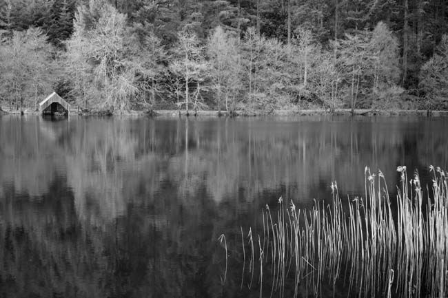
Deborah Herridge

|
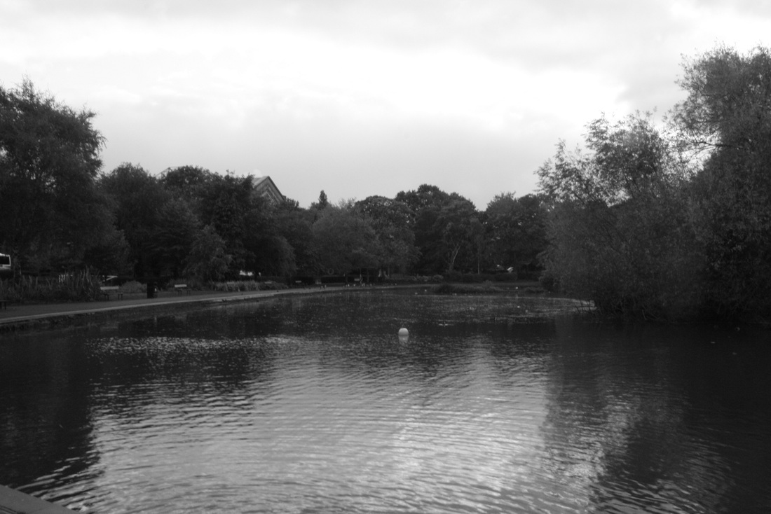
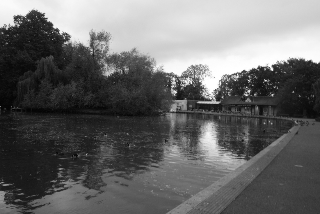
I like this image by Deborah Herridge because it shows a sense of 'forces' by the long line of trees along the river and one small shack on the left side. This reveals how overpowering nature is compared to the small hut and makes it look almost inferior to the rest of the environment. Similar to Fay Godwin's work, this shot is in monochrome. This, i think, highlights on the clarity of the reflection in the shot, i like the idea of the reflection because it adds to the effect of the power of nature as it almost 'doubles' the emphasis.
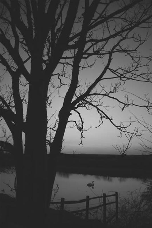
This shot is also similar to the previous one as it shows a black and white image with a reflective pond or river reflecting the surroundings bringing emphasis on the strength of nature. I really like the idea of reflections in images because it doubles the effect of whatever the shot is trying to convey. I feel that i want to experiment on this theme when i do another shoot. I also really liked this image because the Silhouettes add a sense of simpleness but also add a depth to the image as there are silhouettes created from different distances. My favourite part of this shot is the swan in the middle of the lake. The fact that it's isolated gives it a sense of purpose and importance. 'forces' is explored in this picture because the shadows of the trees give the image strength and power even though specific detailing of the trees aren't even shown. |
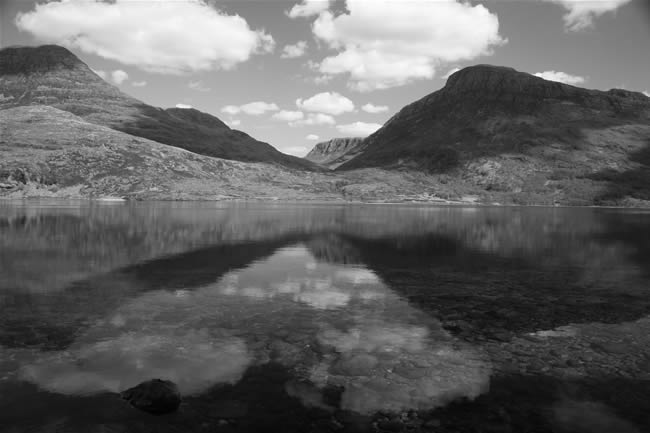
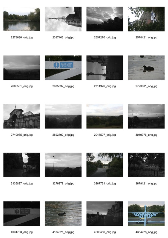
Response based on artist research
|
|
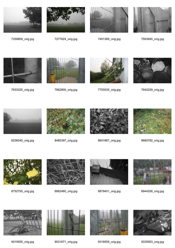
Top three shots:
|
|
Favourite image

|
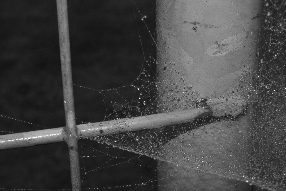
I edited this image using photoshop by just adjusting the contrast - no major changes as i took the initial image on the monochrome setting on my SLR. I like this shot because It displays a lot of characteristics of Fay Godwin's work i analysed. For example, there is an obvious aspect of reflection in this image of the tress onto the lake. This gives the shot a sense of 'forces' because the dark silhouetted trees and shrubs give a powerful look to the image as they are the most dominant figure in the picture. Another obvious feature is the black and white in the picture which gives the image more texture with the different shades and shadows.
|
Comparisons
|
Fay Godwin's
|
My response
|
Applied force
Preliminary shoot on the theme of 'Applied forces'
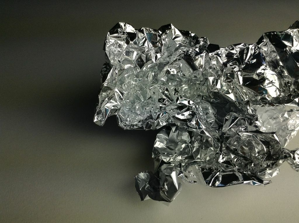
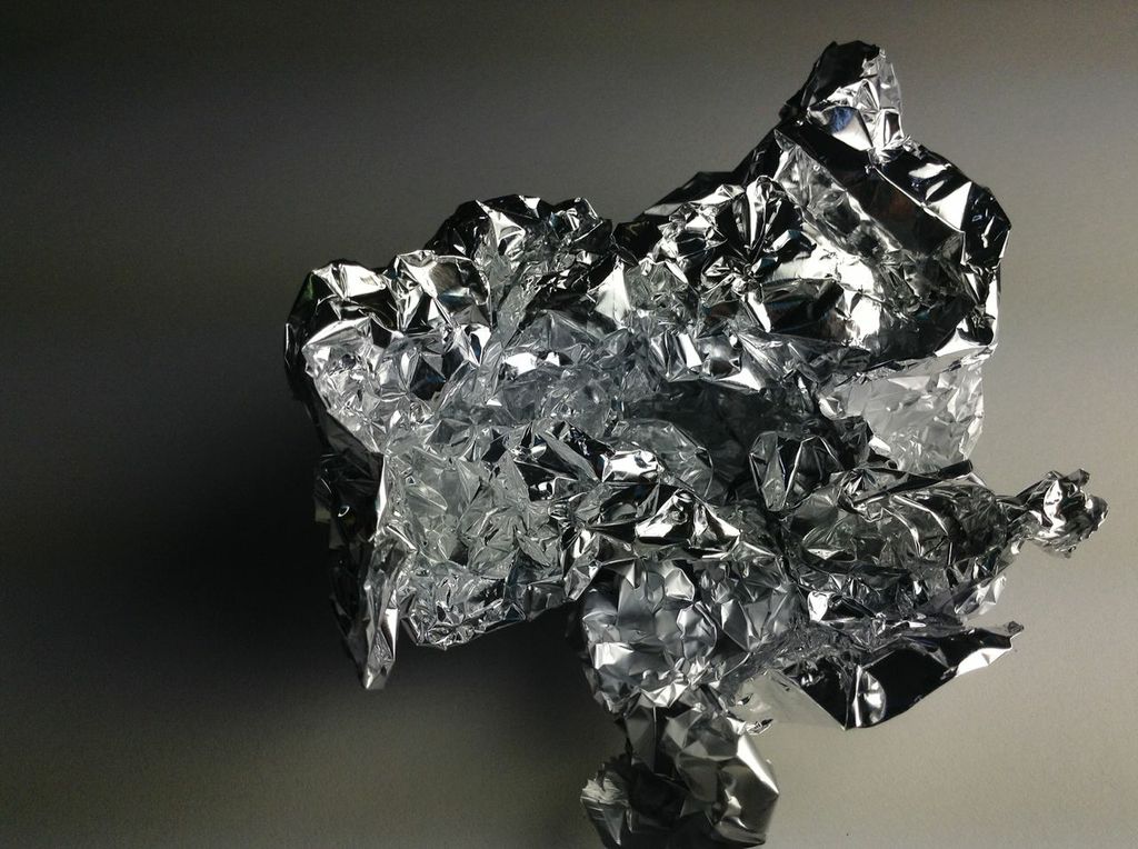
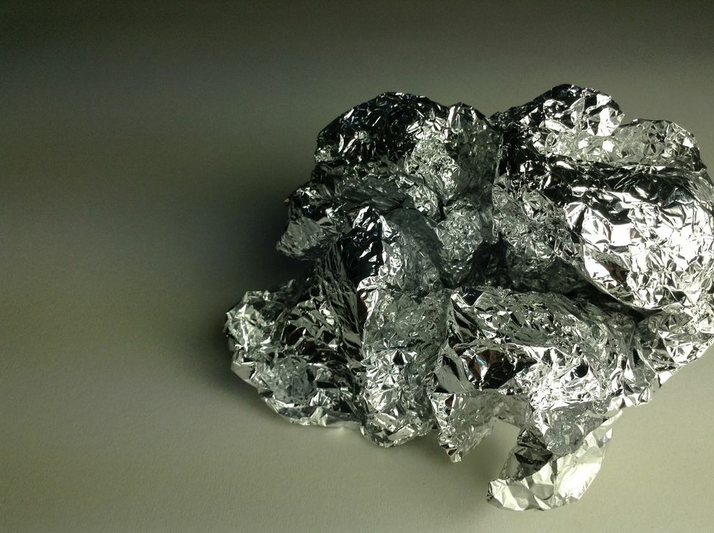
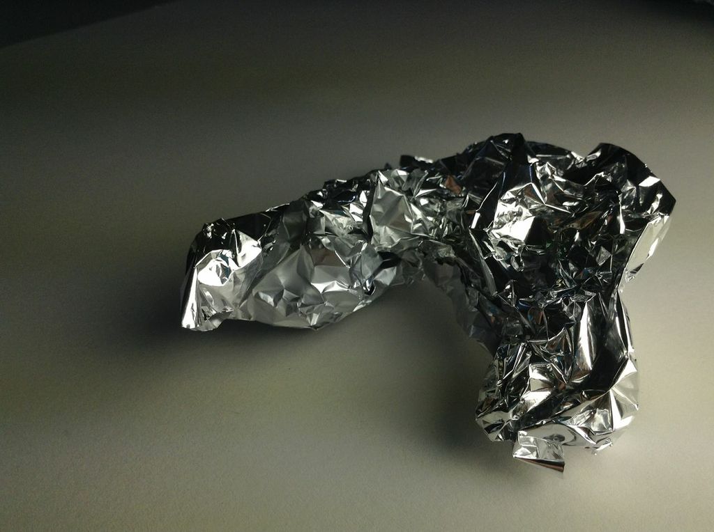
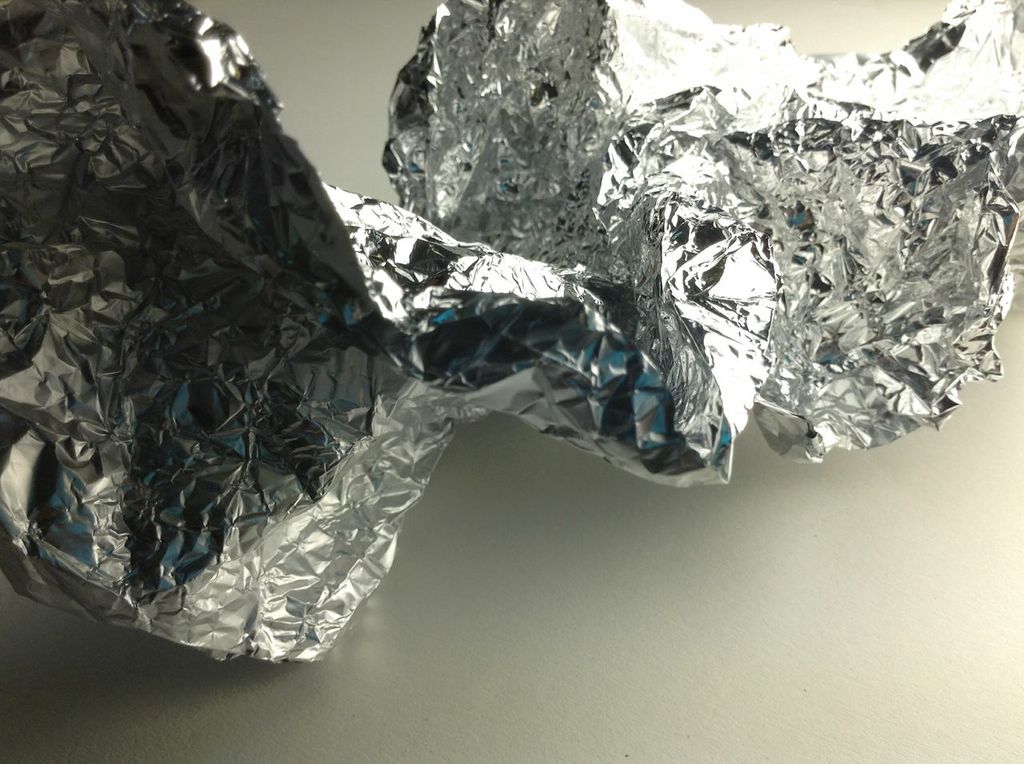
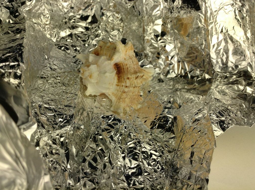
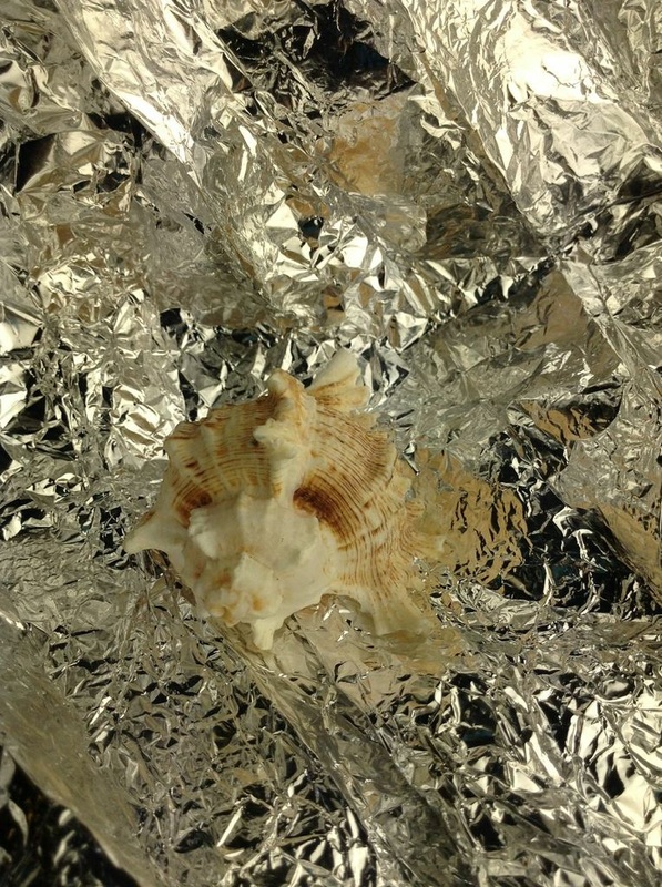
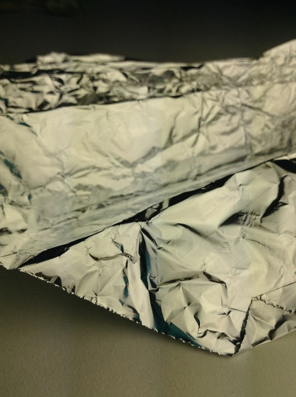
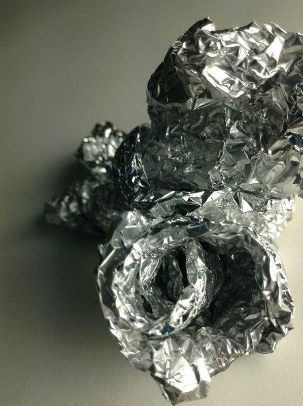
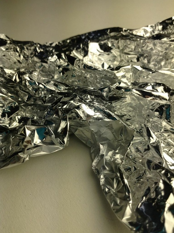
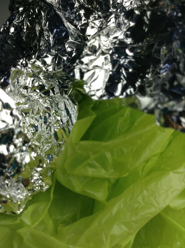
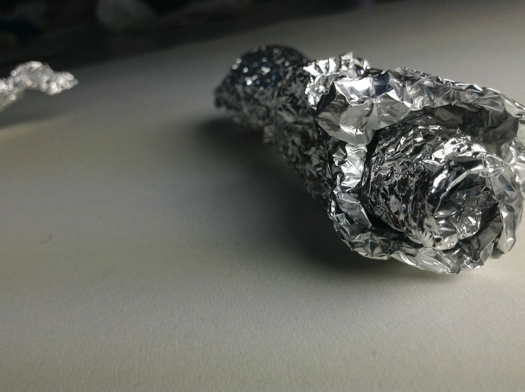
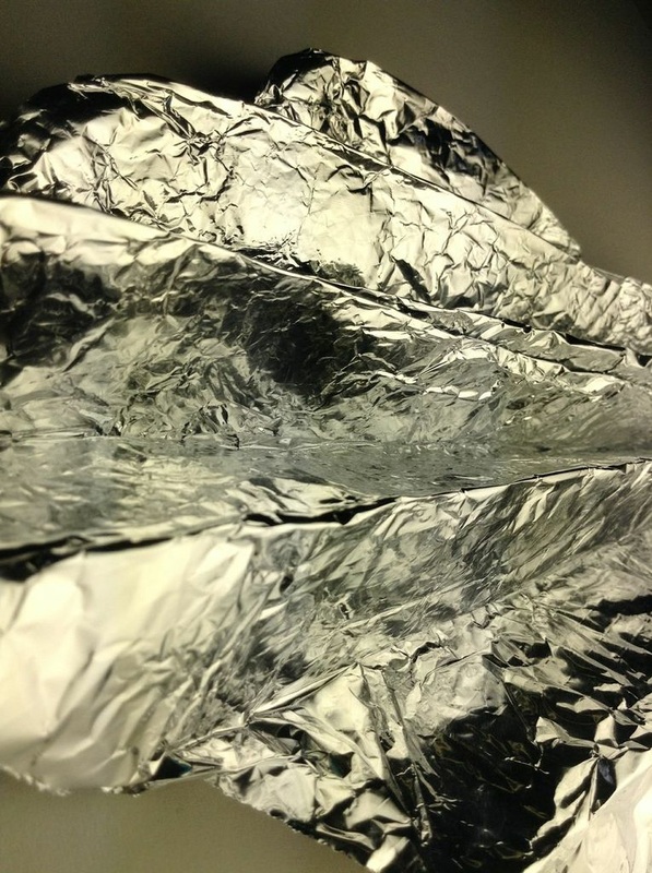
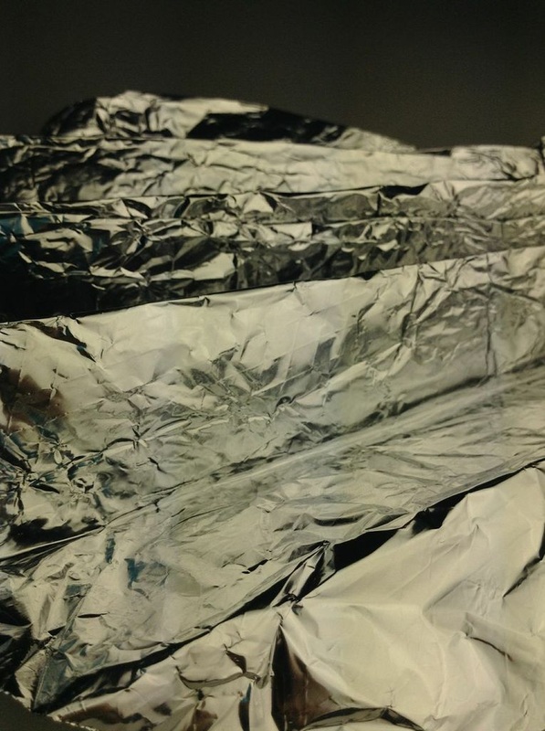
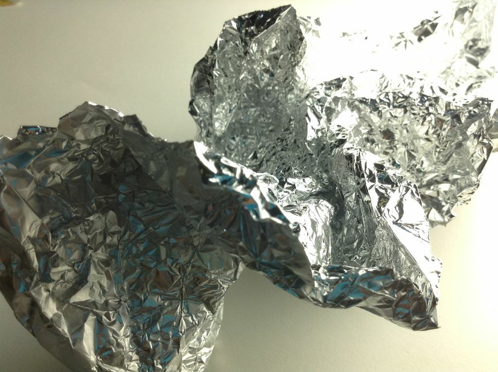
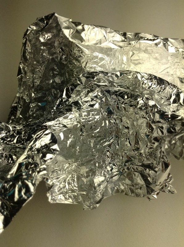
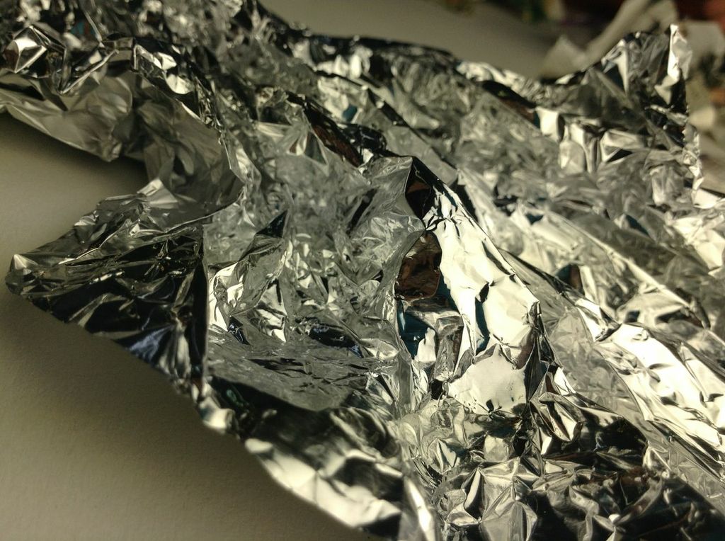
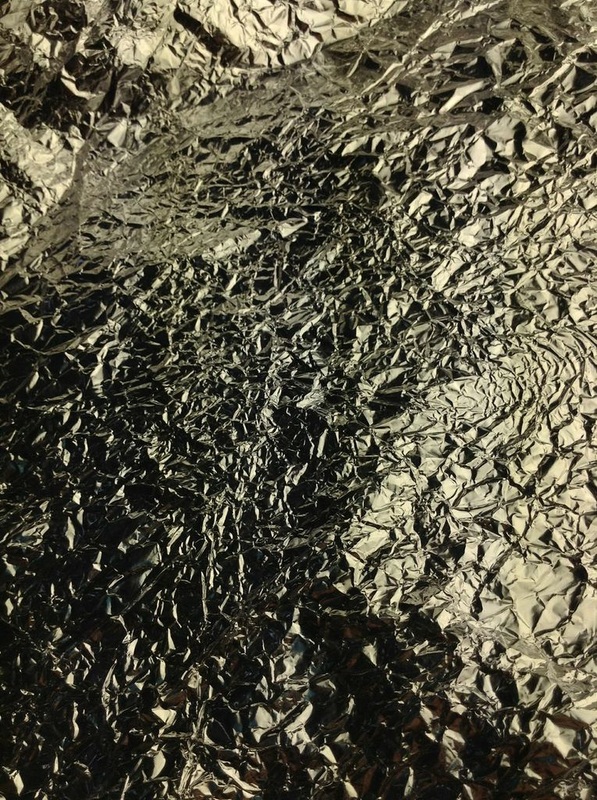
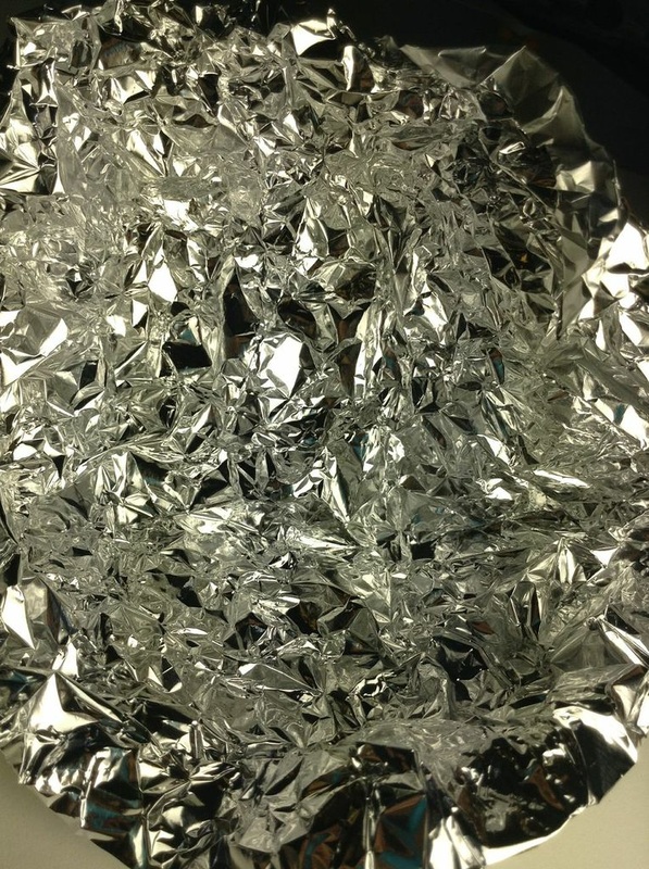
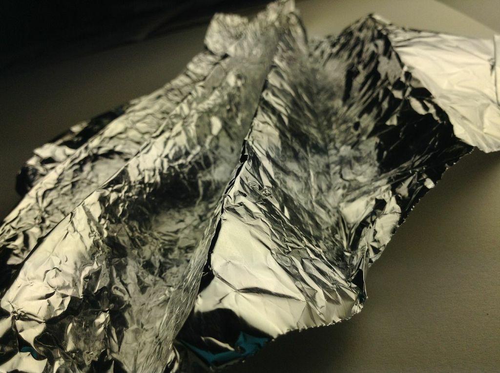
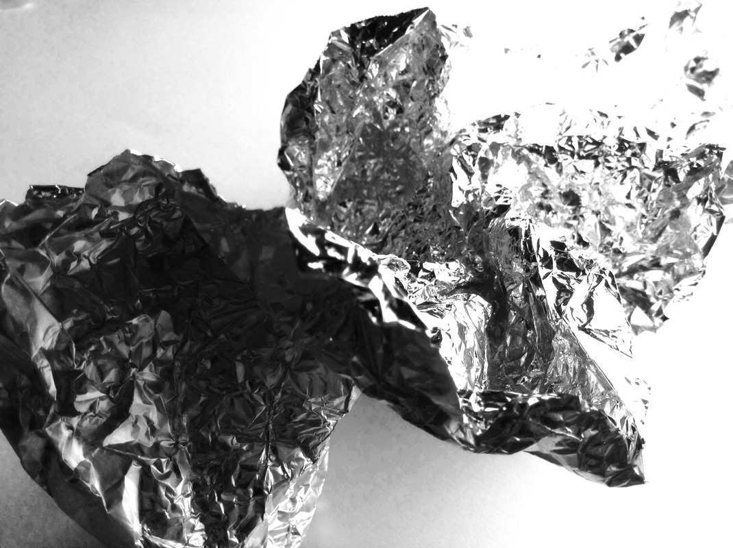
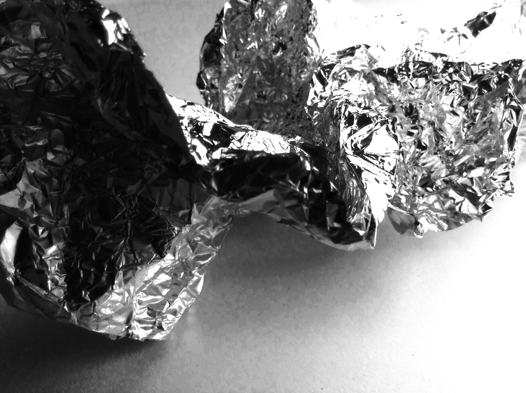
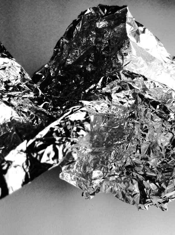
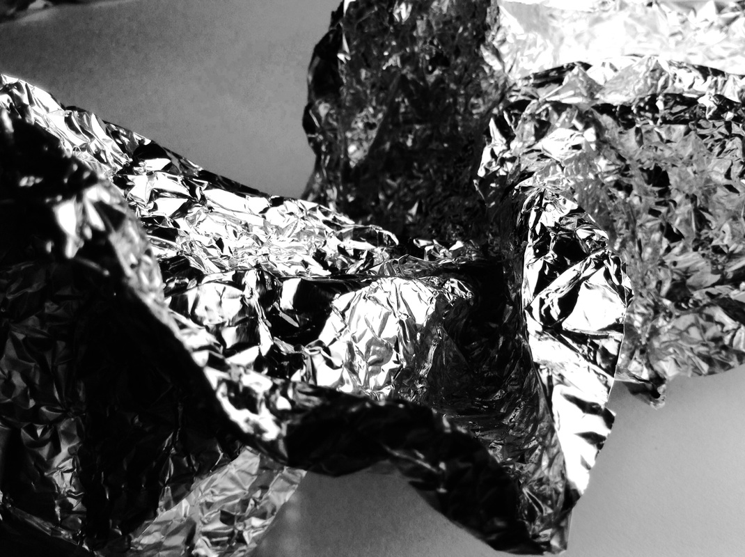
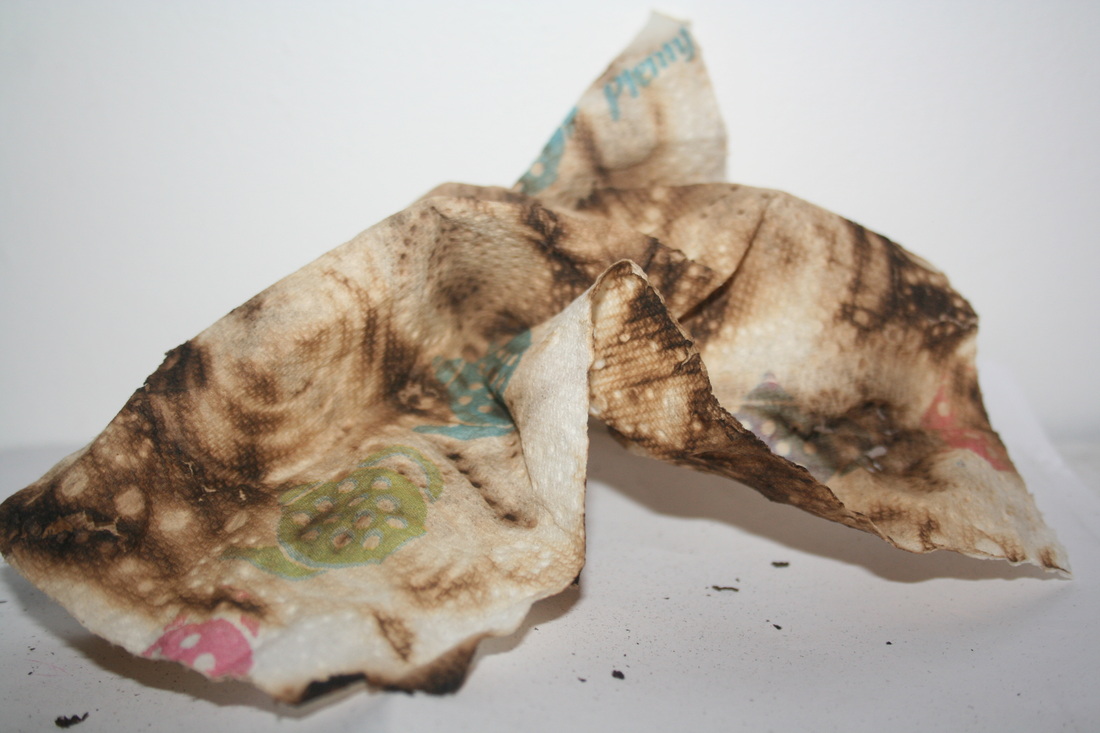
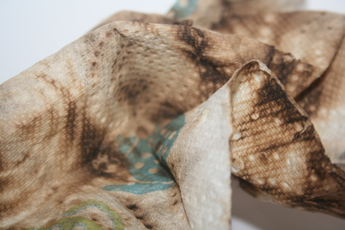
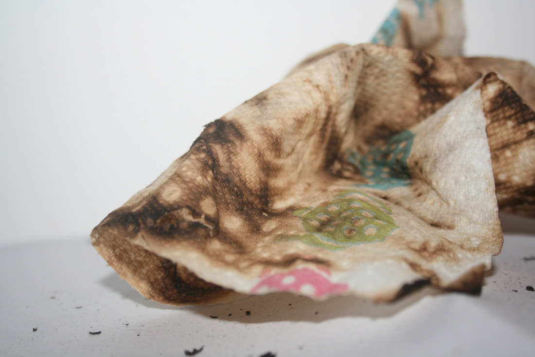
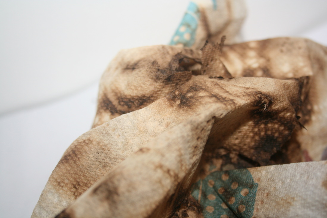
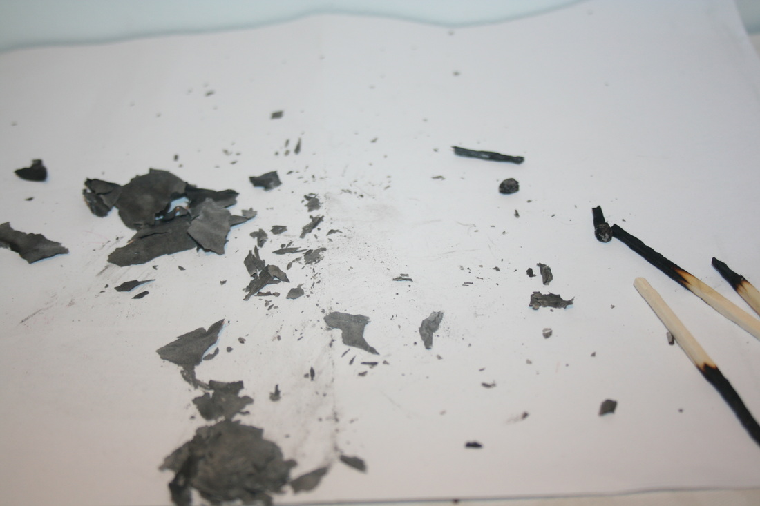
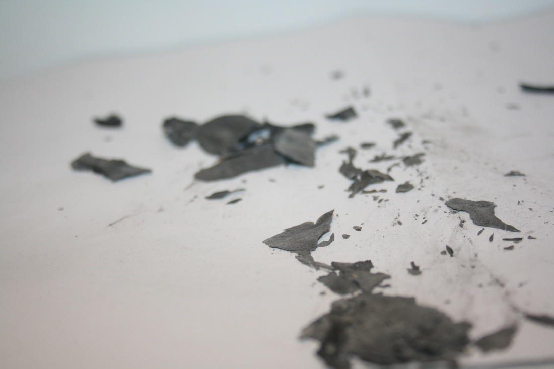
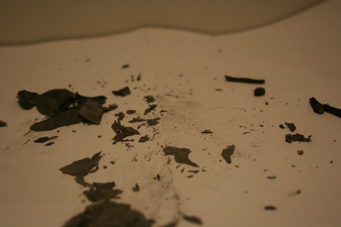
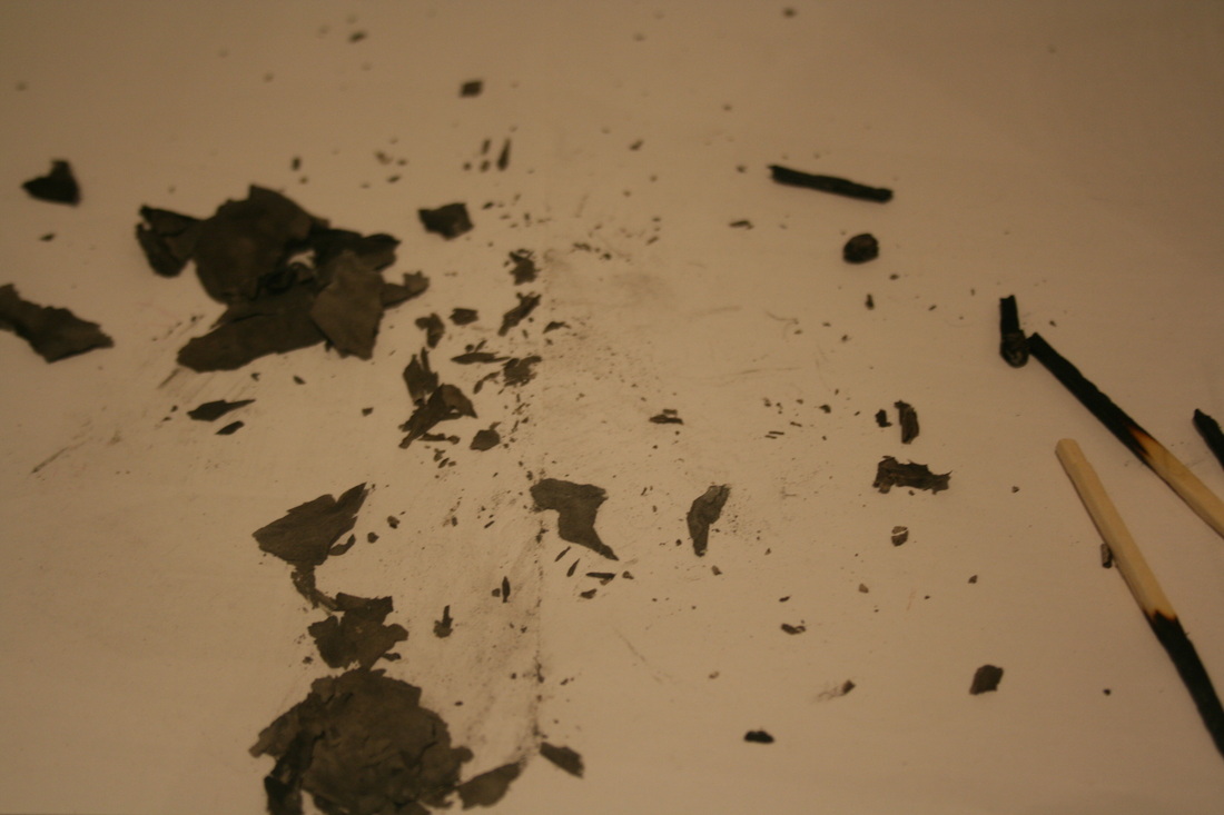
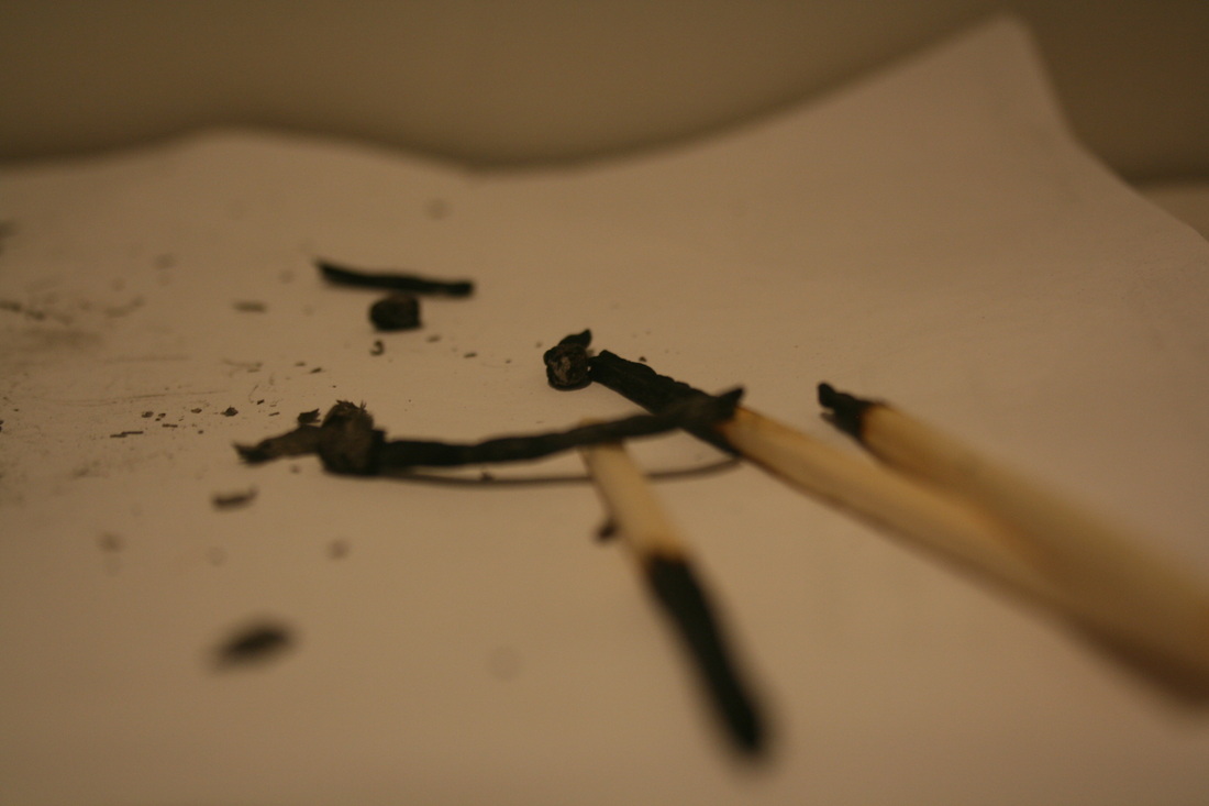
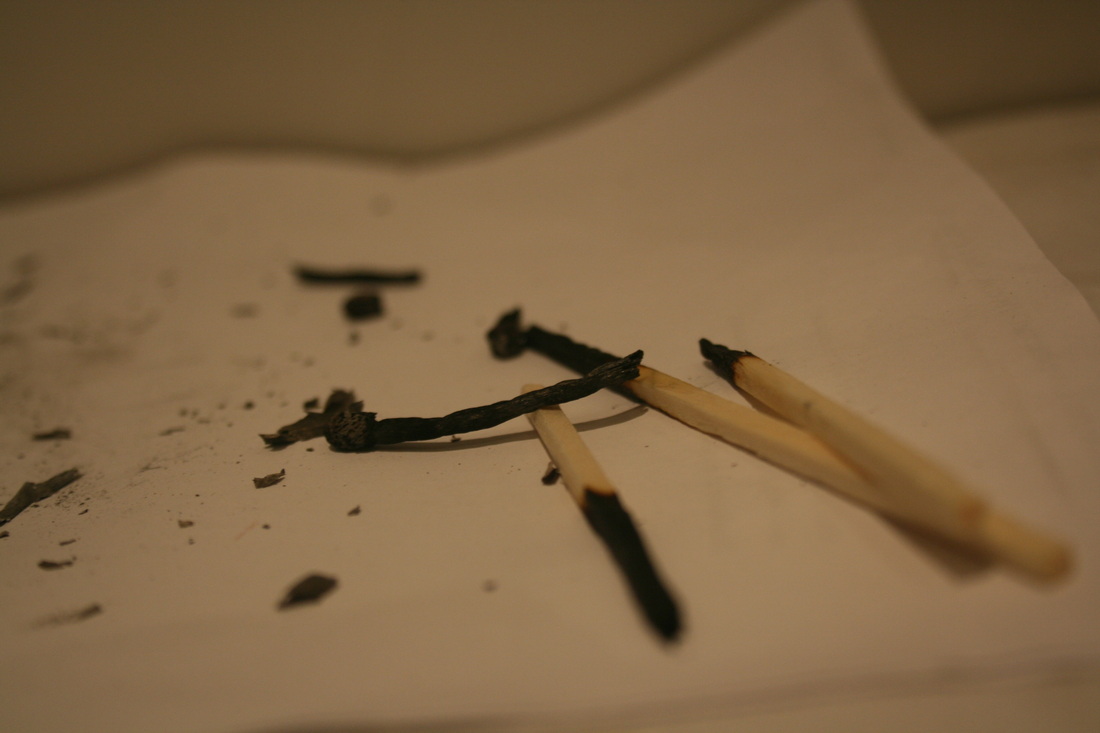
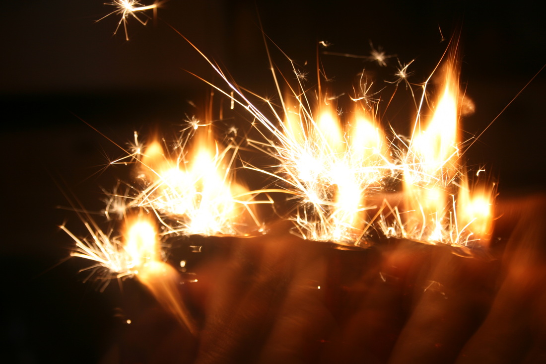
In this preliminary shoot of 'Applied Force' I used mostly foil for pressing,crushing,pushing,pulling, prising or stretching along with some various other materials. I preferred using the foil however because I found that creating abstract images with the moldeable shiny material was more interesting and had a better outcome. I especially liked the last three shots from this experimental work because i like the effect the monochrome had on it. It emphasized on the dark areas more and the same with the lighter areas creating a large contrast between the two factors.
Artist's work i'm interested in
Jon Shireman
|
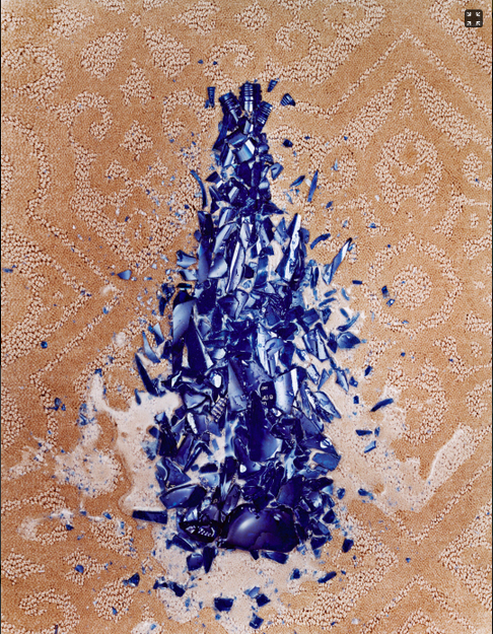
This picture demonstrates 'applied force' as it shows a glass bottle crushed into shards. However, you can still see the outline of the bottle showing that the glass pieces have been moved to create a more clear picture. The floor also looks as if it has been damaged or changed due to the crushing of the glass which also reveals 'applied force'. The only two main colours present are orange and blue. This creates a very simple effect but the dominating blue colour draws your eye onto the centre first.
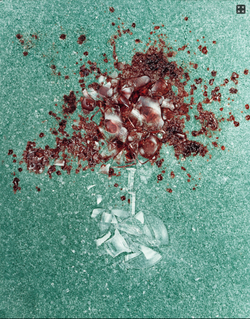
This image is similar to the previous one as it has the same idea of crushed glass and two key colours. However, this shot has obvious differences too such as the the back ground is coloured styrofoam rather than a hard, patterned floor. The styrofoam has a different effect to if it was a hard floor because it soaks up the wine rather than letting it spill and spread it out. The red is a very strong and eye catching colour in this shot which makes it effective. |
Rob Prideaux
|
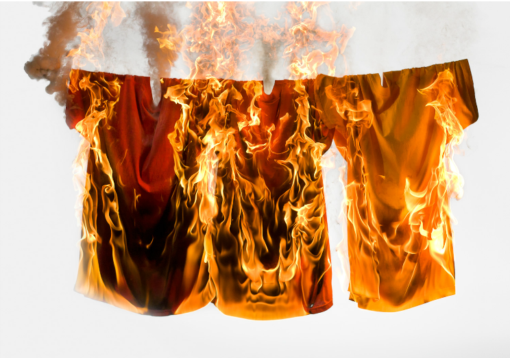
I like this shot by Prideux because it explores the topic of applied force through a more controversial way. The significance of using fire as a force is that it will always be changing until the flame goes out. This can therefore give you a variety of different shots and stages which can show your progression. I liked the destruction the fire causes on the shirts on this picture because it reveals how strong this force is and how it's almost 'unstoppable'. I would like to try and work with technique as it's very intriguing.
|
second shoot on 'Applied force'
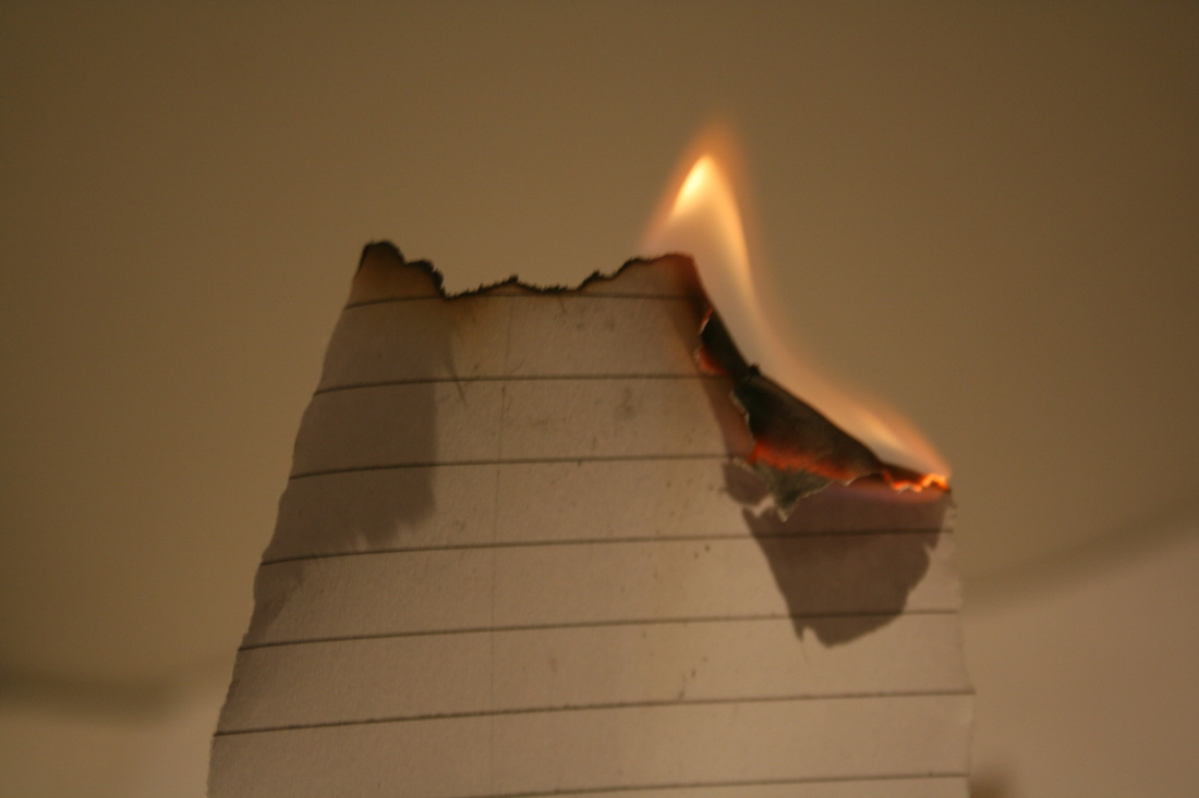
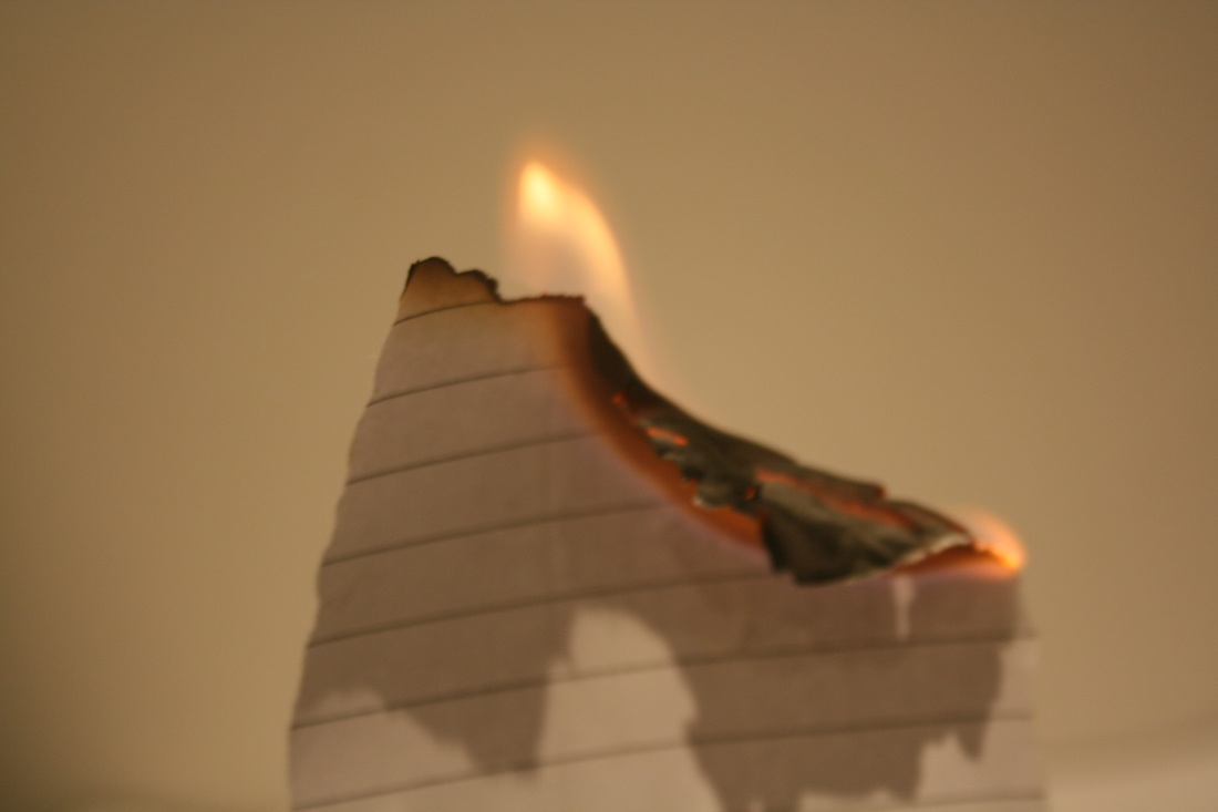
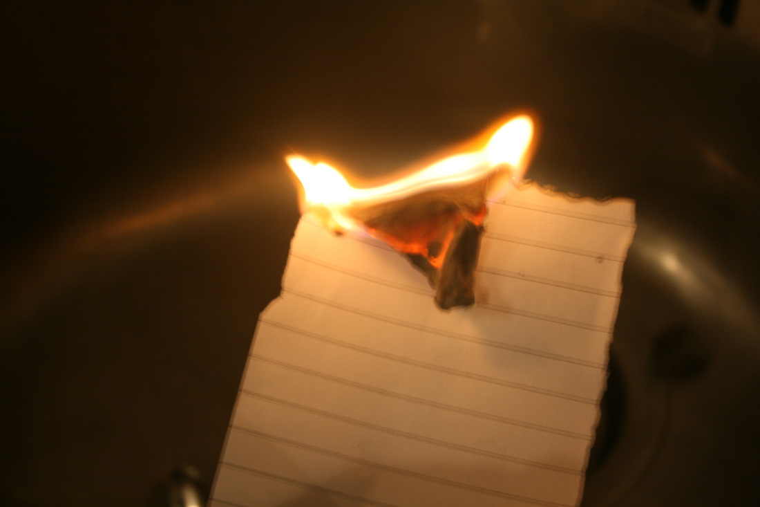
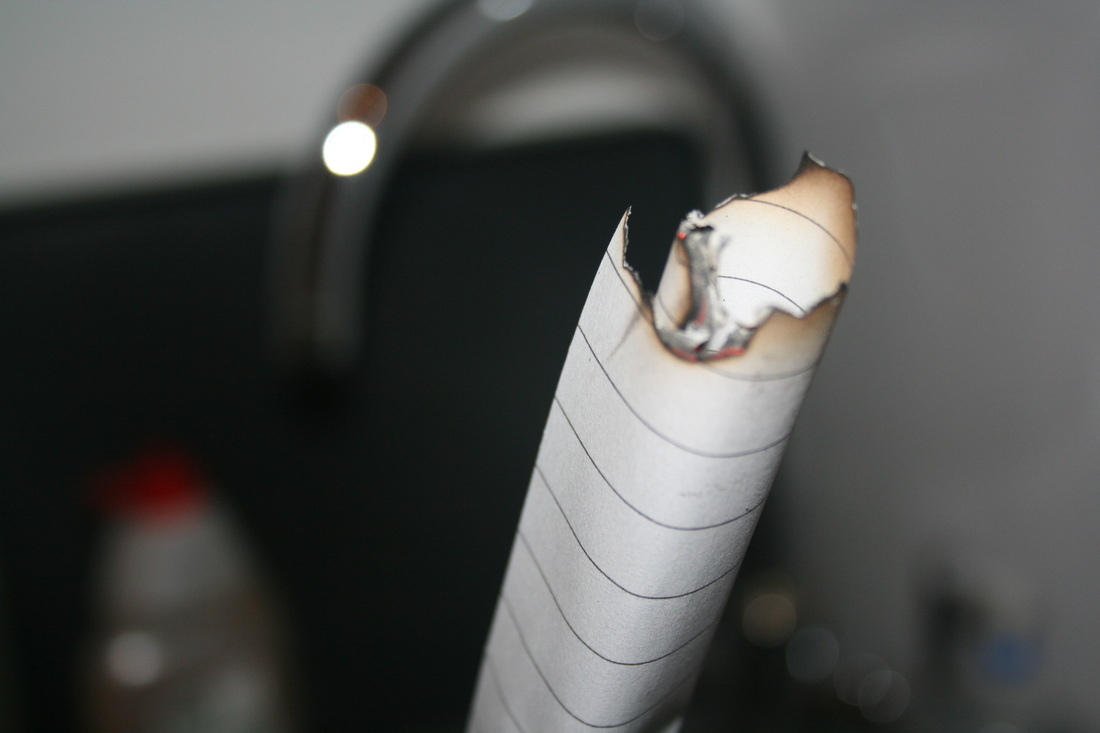
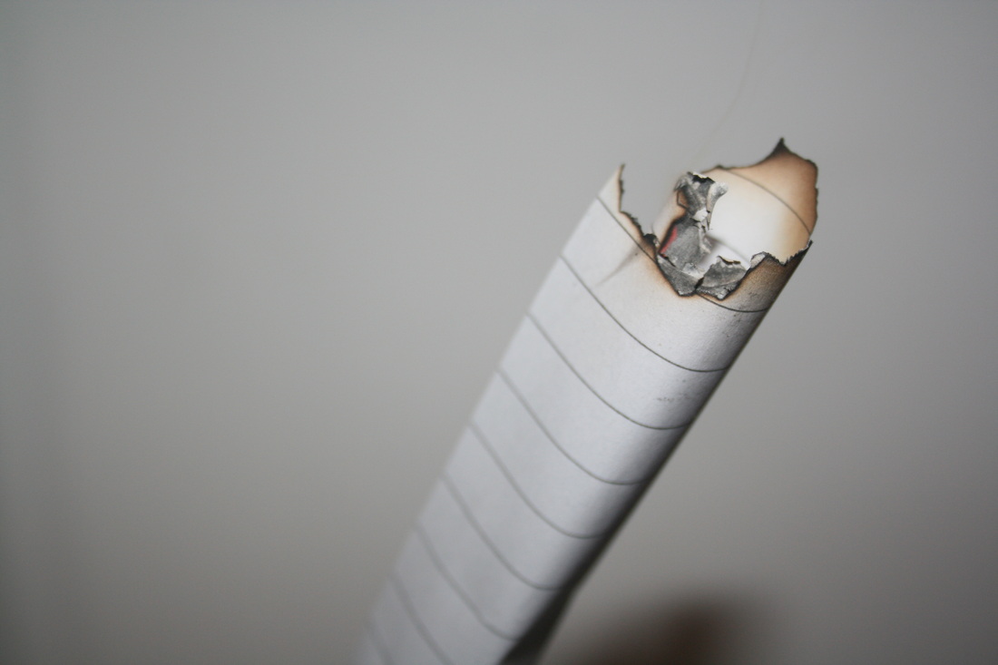
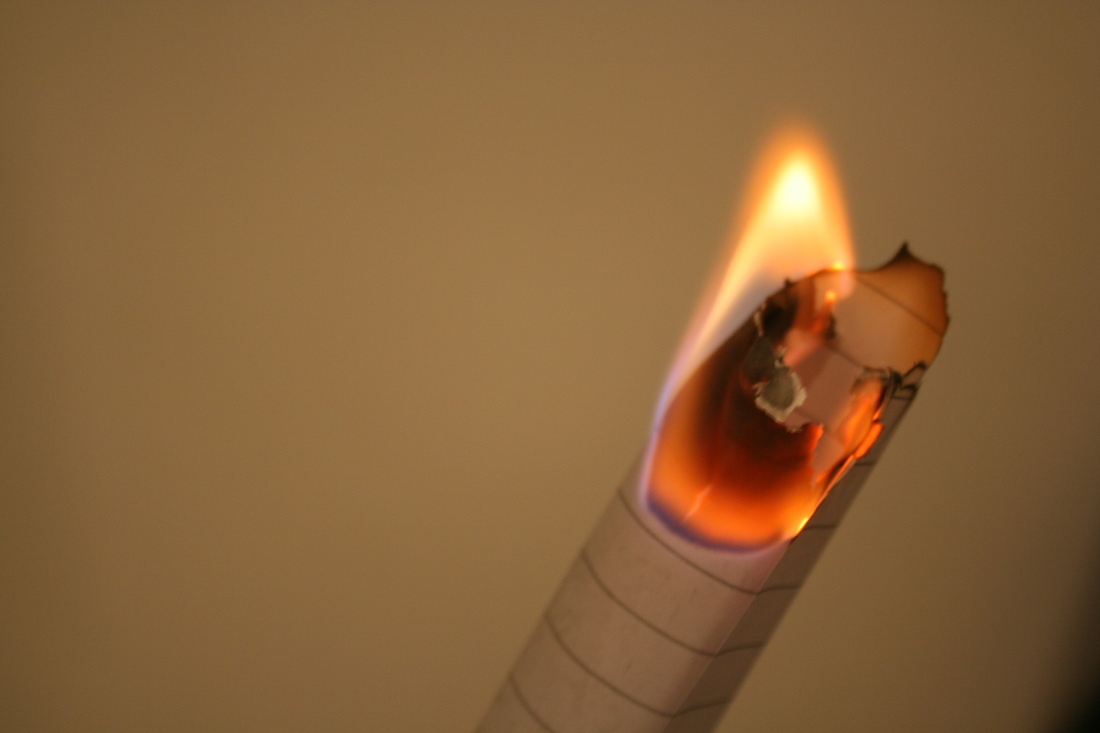
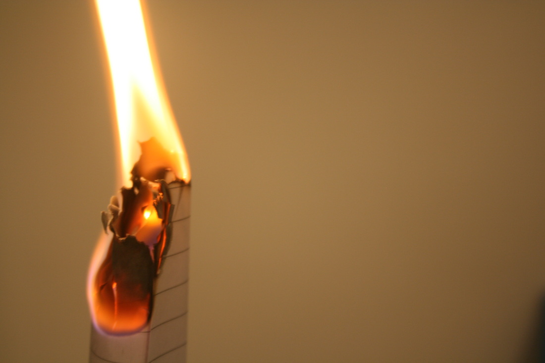
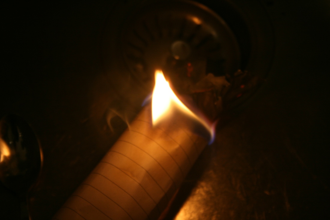
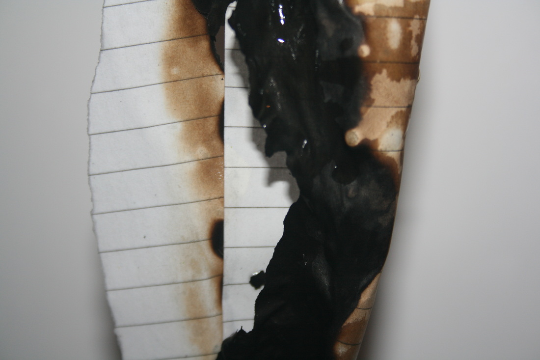
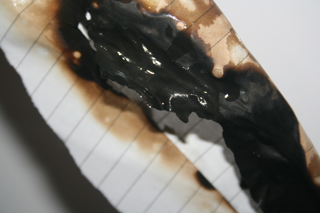
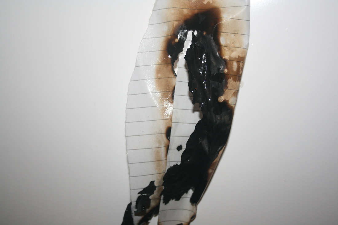
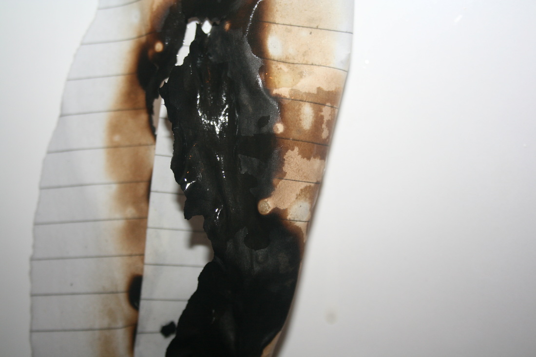
I edited this picture using photoshop by changing the contrast to high and he brightness to low. I find that this emphasizes on the main colours such as red and orange more. This shot demonstrates 'applied force' because the fire is changing and altering the piece of paper with the force of a flame. I liked using fire because you could keep it burning until the paper came to a stage I liked the look of it at.
Obscured force
|
|
Maurizio Anzeri
Here, Anzeri shows the process of the obscured force as well as the outcome. This creates a view of the transformation and all the stages the sewing went through. The women is also moving in the video which creates an effect of surrealism and entices the viewer. |
|
Physical obscured force response
This sewn on image was a response to Maurizio Anzeri where he sewed onto a picture to alter its appearance and to 'obscure' a force. For mine, i only used three simple colours. I wanted to go for a more minimalistic approach. I also liked the effect of the light blue string where it left a shadow when i took a picture. I preferred using the twists in sewing rather than the straight line because i thought it created a more interesting pattern.
|
|
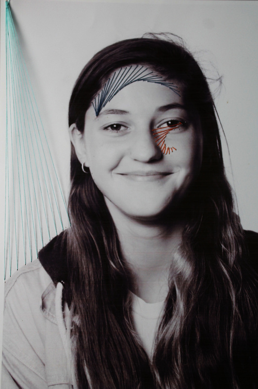
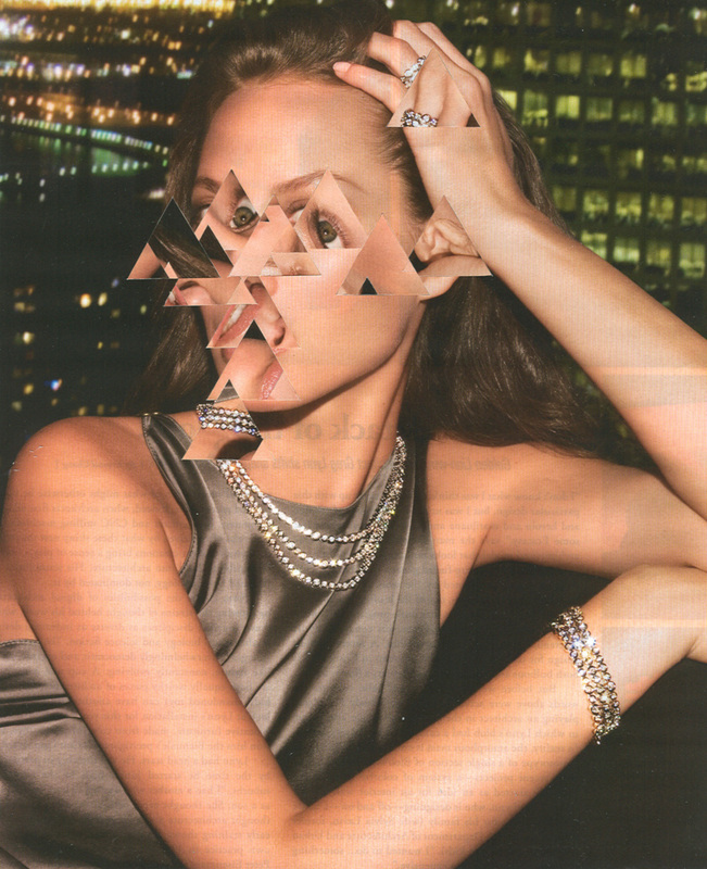
Gordin Magnin
Here Gordin Magnin uses photoshop to digitally obscure the image. He uses triangles of different parts of the image and places them in different areas of the models face. This creates a 'defacing' effect and you can't see a clear view of her face. This could reveal Magnins' criticism on media extortion of beauty so he decides to cover it up and alter the image to create a point. You can see dimly underneath this image that there is text on the other side of the image. This shows that this picture was just simply torn out of a magazine and this shows the simplicity of his work. |
Response to digital obscured force
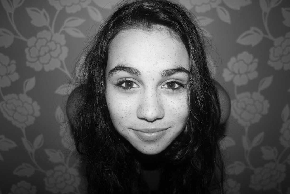
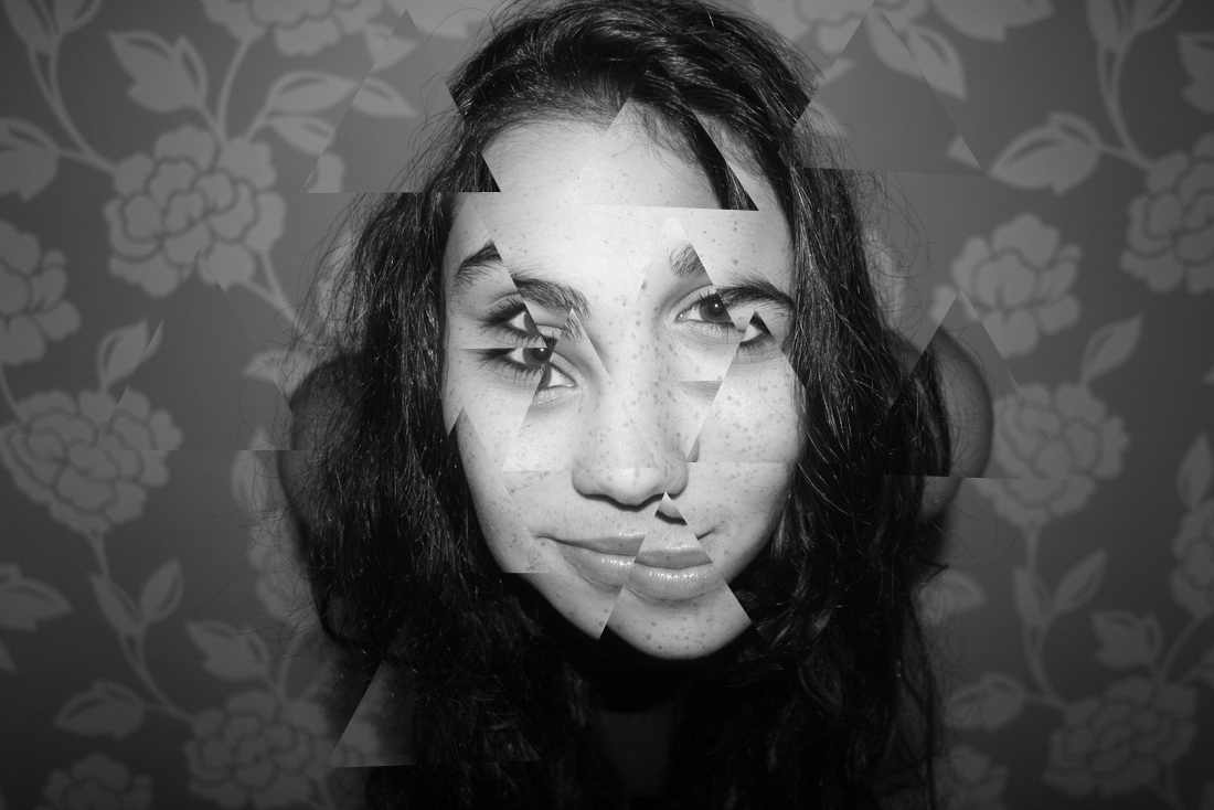
This image was a response to Gordin Magnin where he digitally extorted an image to deface someone. I used photoshop to copy this effect. I feel that this attempt was successful as I was able to mimic the whole idea of using a certain shape to copy around the picture. I liked using this because I liked the subtle changes to the image. Unlike Magnin, I only moved each cutting a little bit from its origin, I did this because i preferred the slight shift it had.
|
Process:
After opening my image in photoshop, I selected the Polygonal Lasso tool.
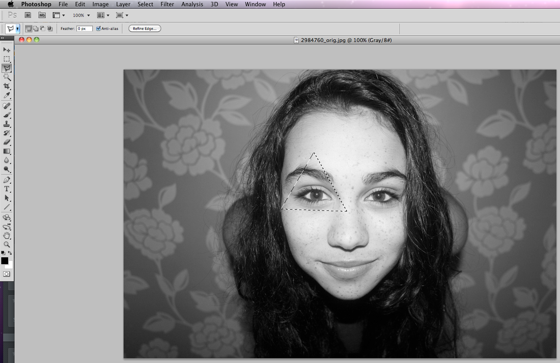
I then drew out a triangle shape in the area I wanted to copy from.
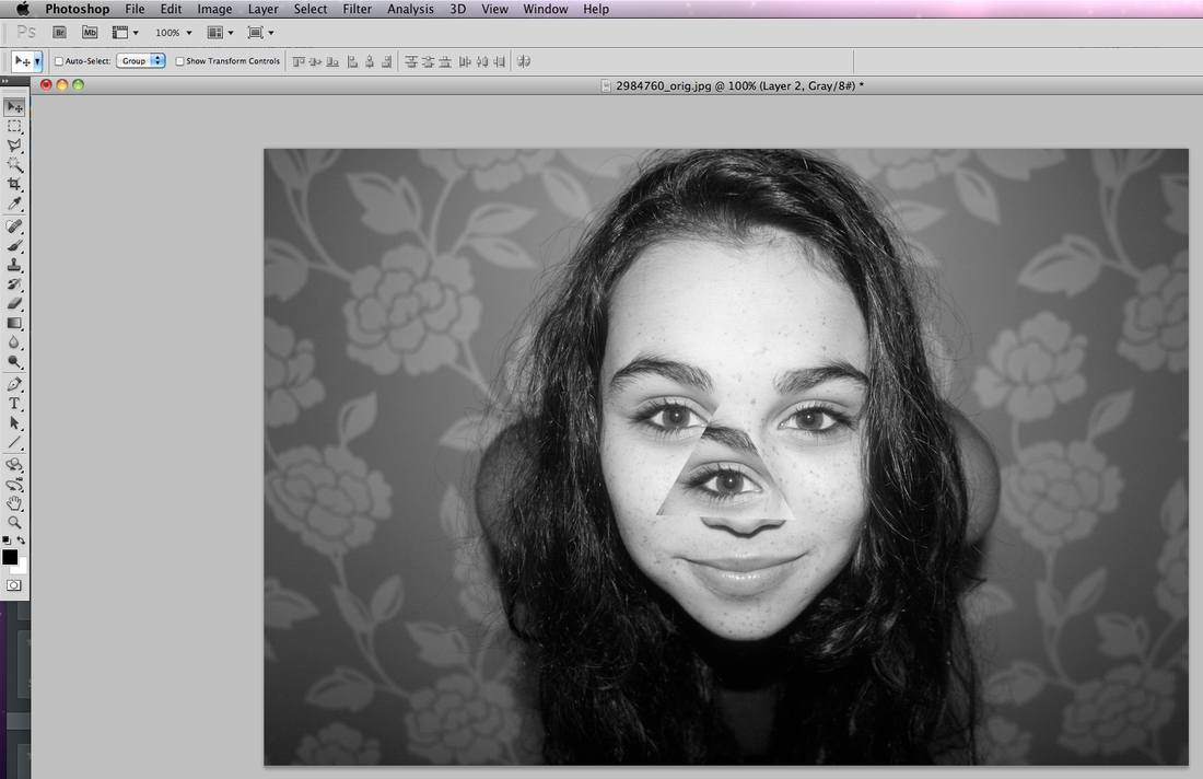
I copied it to a new layer and moved it around until `I liked where it was.
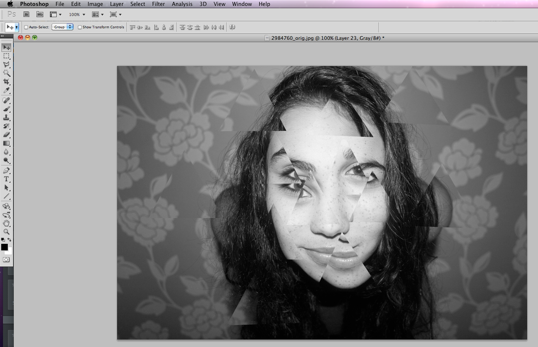
I repeated this and moved them around until I liked the final outcome.
|
Expanding my project
I would like to expand my project on the subject of 'applied force'. This is because i really enjoyed using the element of fire in my shots. I would like to explore by meting, burning and scorching several different items and objects, I would also like to explore by using different photographic techniques. The artist I will be basing my work on is Davy Kelly and Catherine Yass. My first shot will be based on work to do with burning and melting objects in household.
http://www.davykelly.co.uk/category/fire-photography/
http://www.culture24.org.uk/asset_arena/3/75/66/166573/v0_master.jpg
http://www.davykelly.co.uk/category/fire-photography/
http://www.culture24.org.uk/asset_arena/3/75/66/166573/v0_master.jpg
Davy Kelly
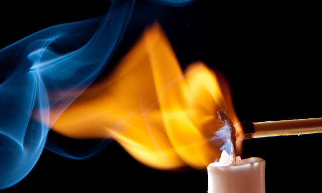
|
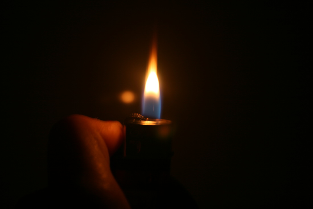
Here, Davy Kelly uses a very fast shutter speed to capture the image of the flame lighting the candle. He also must have used a high exposure to be able to catch all the colours and light in a fast shot. I really like the two separated colours of blue and yellow, they both flow really well and fill the shot well. The black back ground highlights the fire by making it more visible and brighter creating a stronger image.
|
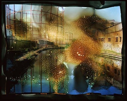
|
In this photo, Kelly uses fire to alter and transform a photo to create sense of 'applied force'. The relevance of a some sort of power station in the back is that it causes damage, so by burning and scolding the picture it reflects onto this issue. The burns create colours such as green, yellow, black and orange. These colours show characteristics of a fire which links into the burning of the picture.
|
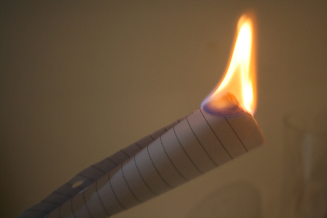
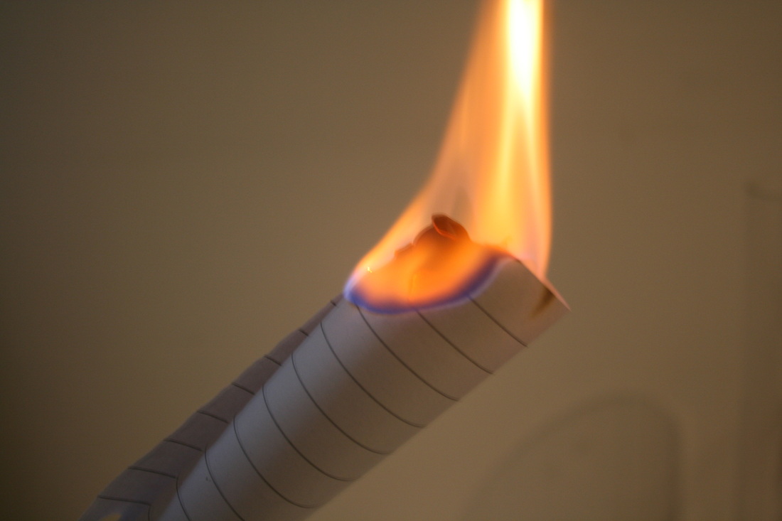
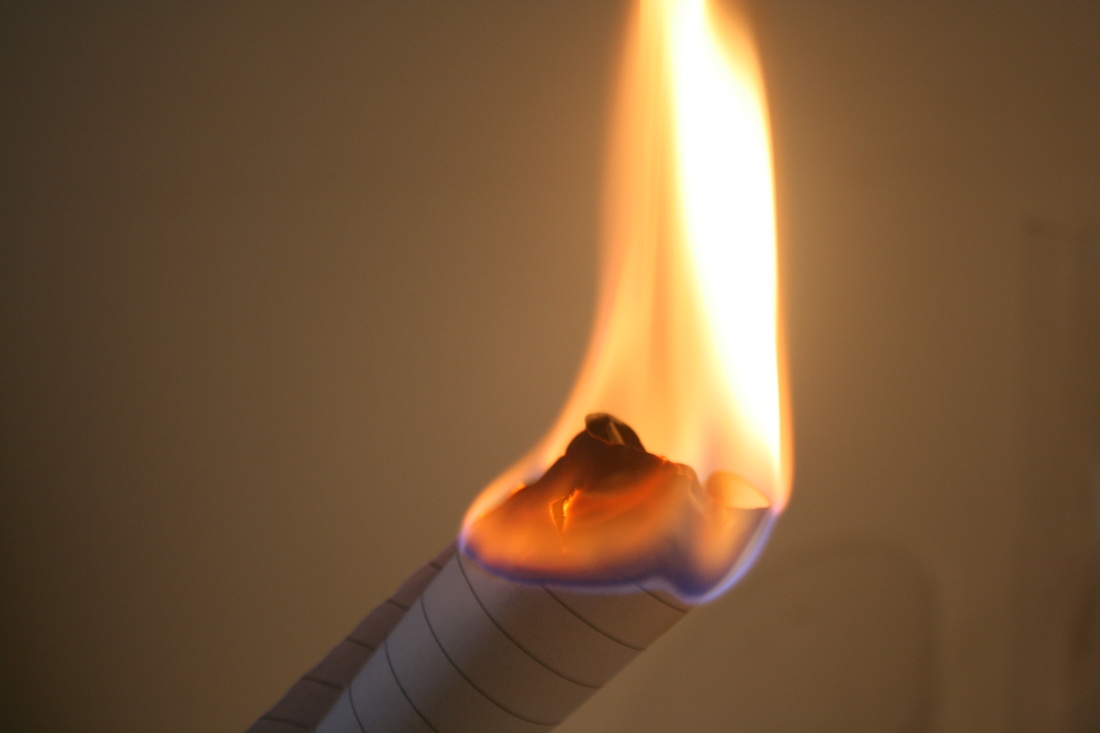
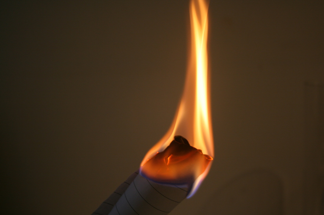
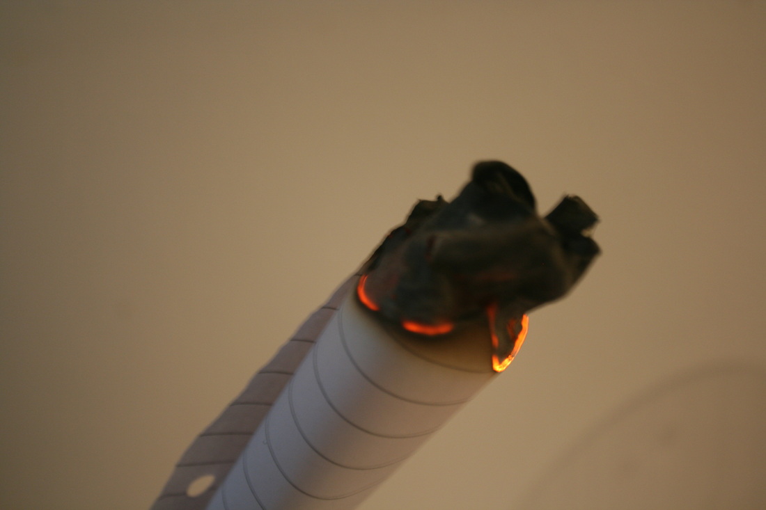
First response to Applied Force using fire
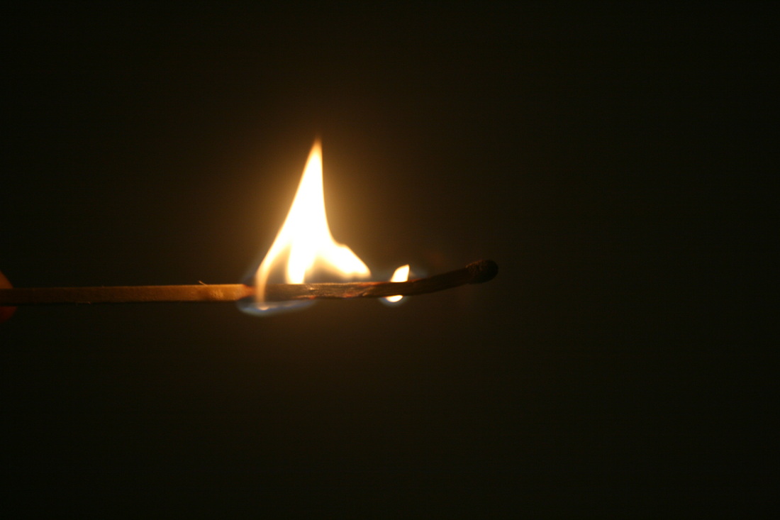
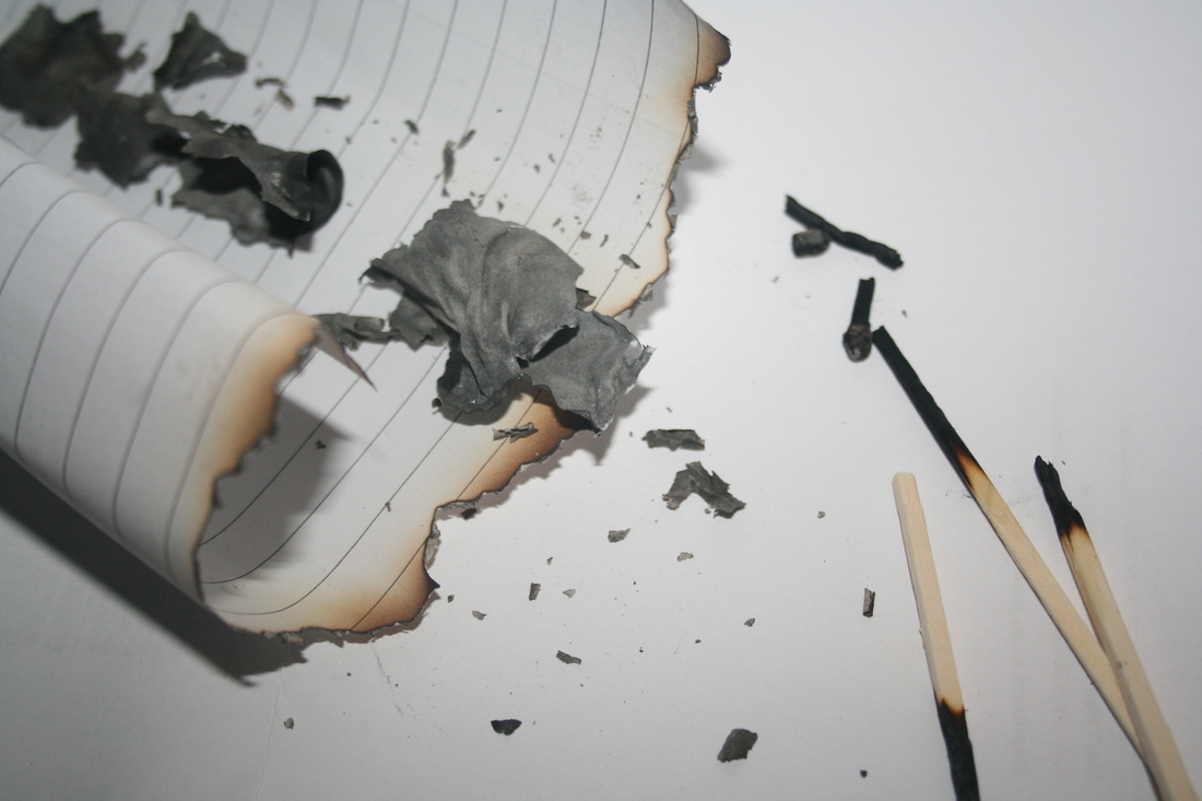
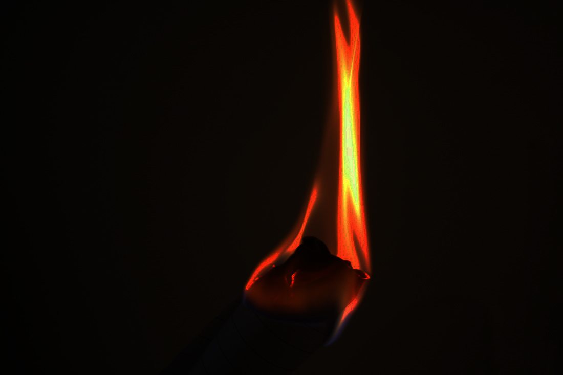
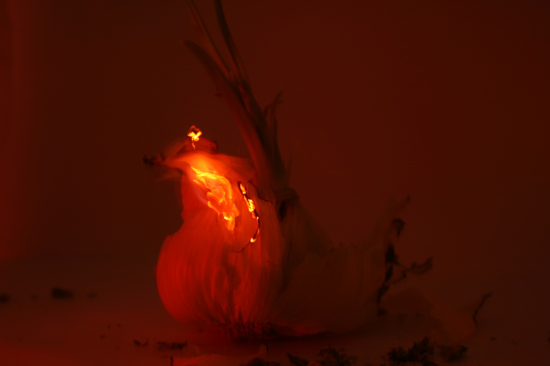
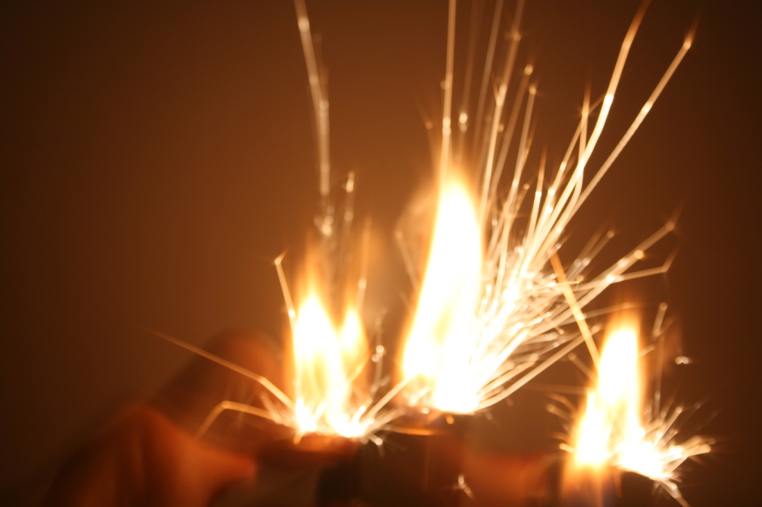
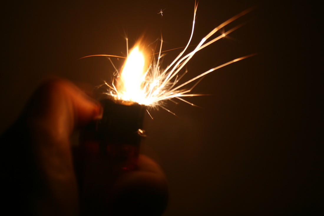
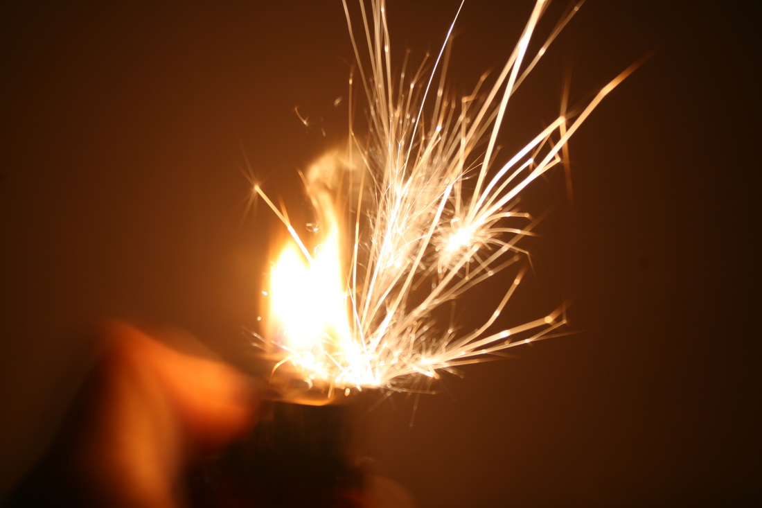
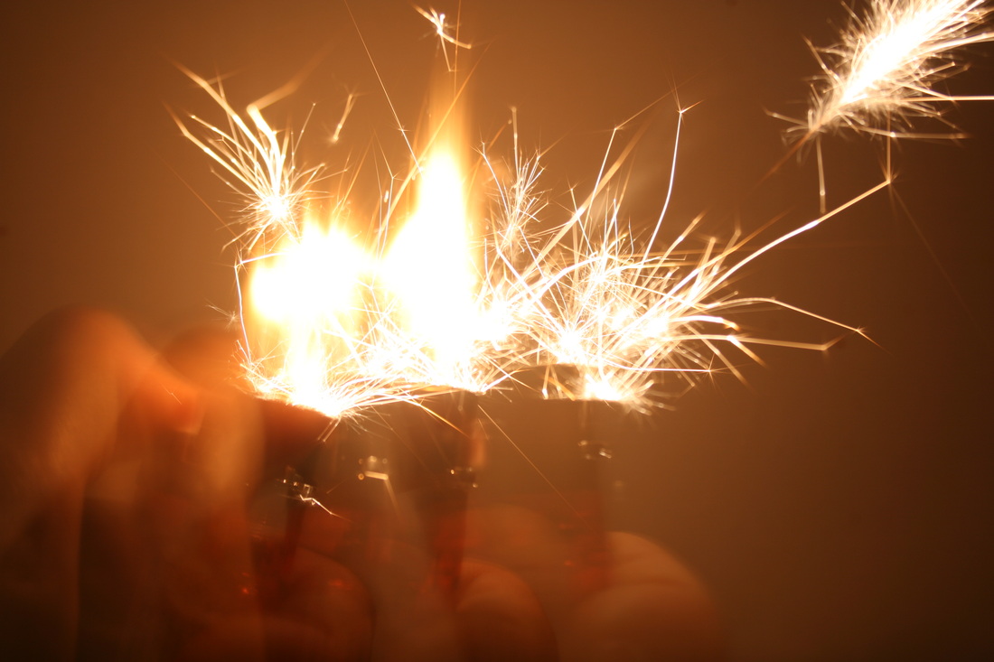
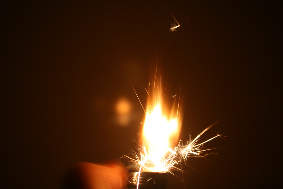
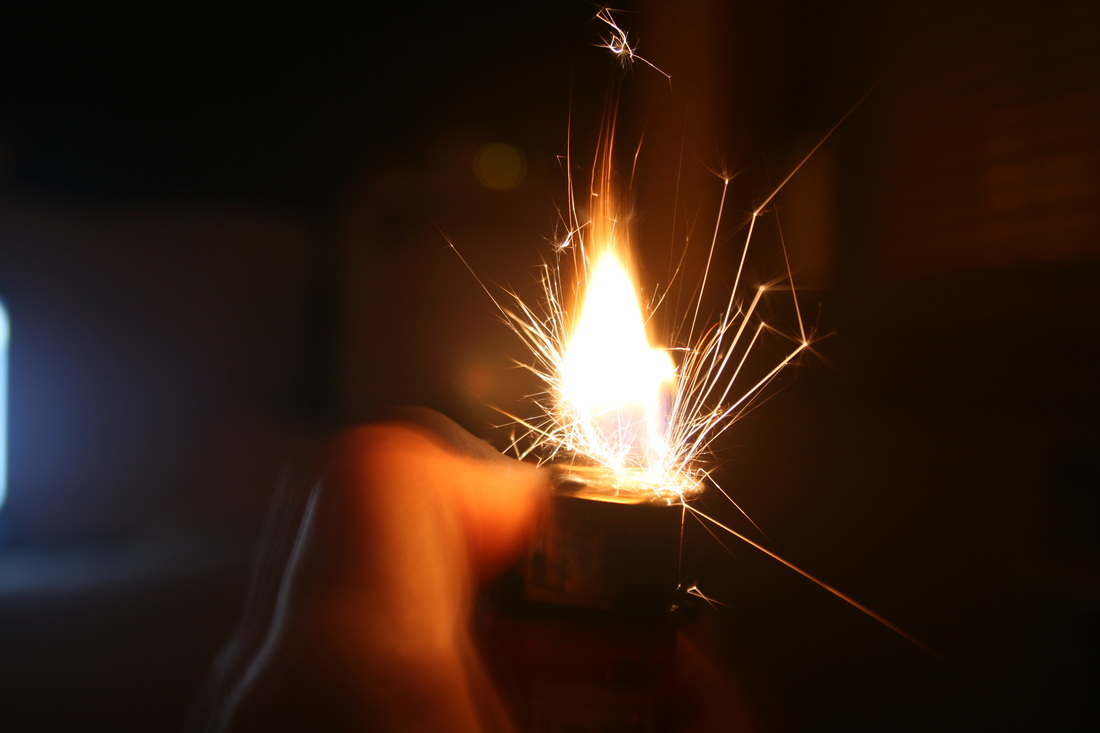
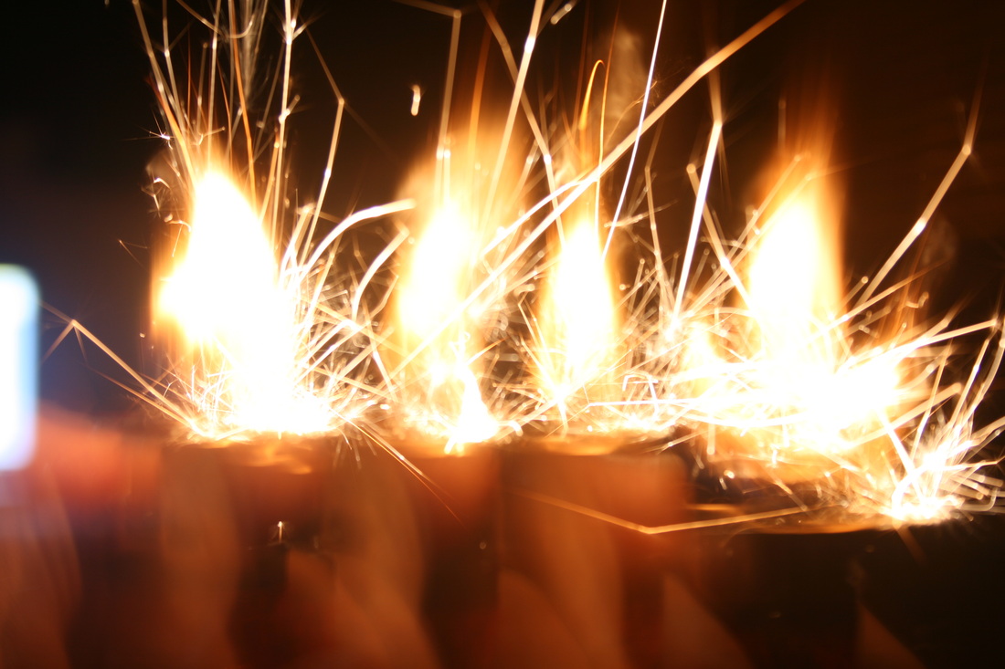
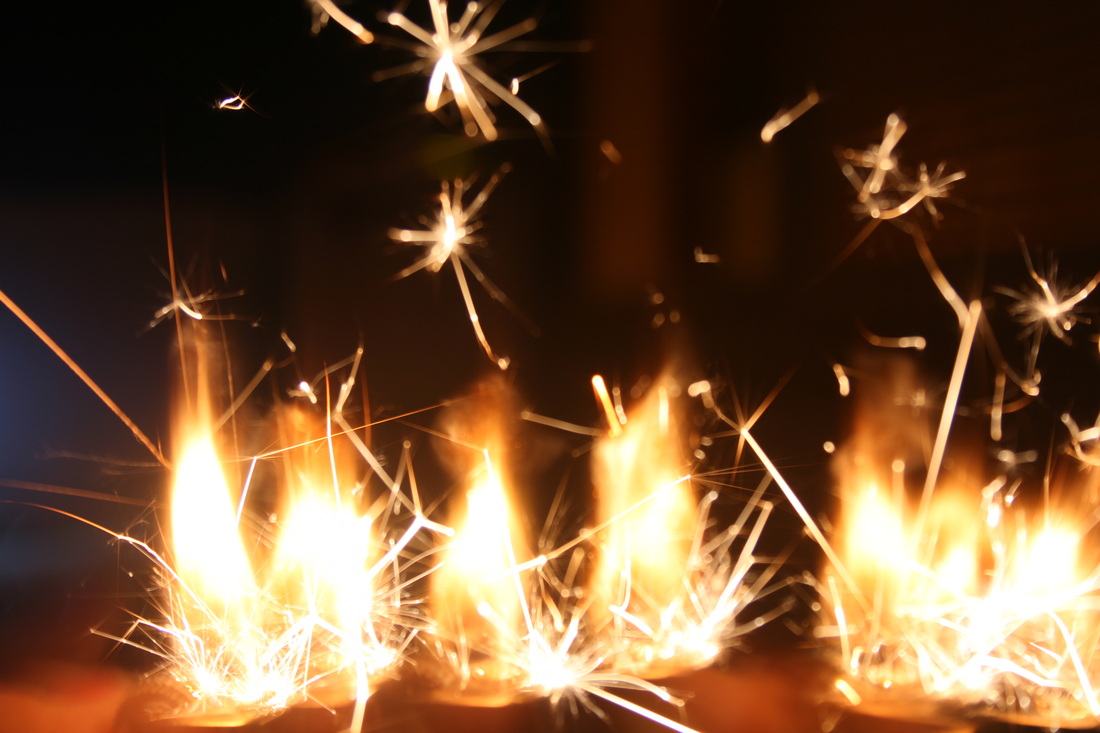
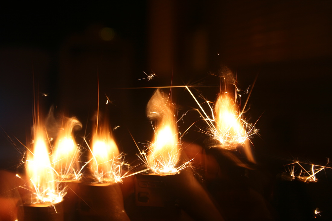
Before i actually began setting objects on fire, i used a 'light painting' technique to experiment with and giving an illusion of objects being on fire. I used this by setting the shutter speed to about 5 seconds and quickly moving a match around the object in the motion of how a flame might flow. Then after i used a garlic to experiment with to actually use fire with. This was a slight challenge as the garlic would only set alight for a few seconds so i had to get the timing perfect.
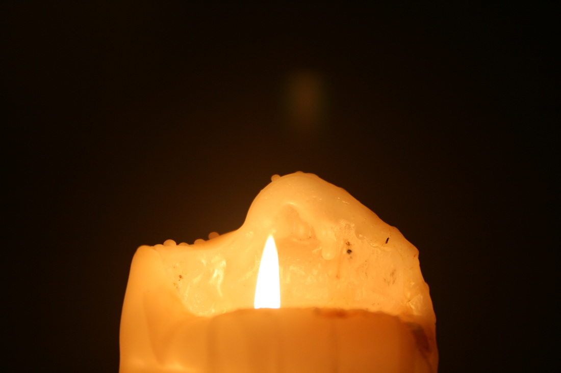
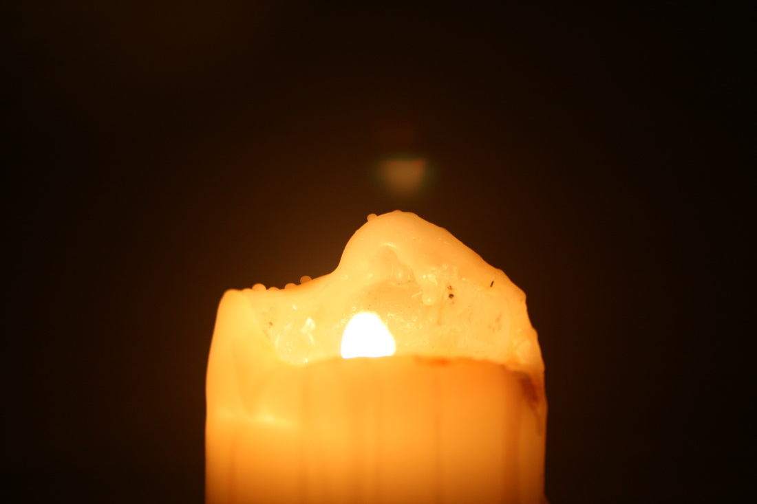
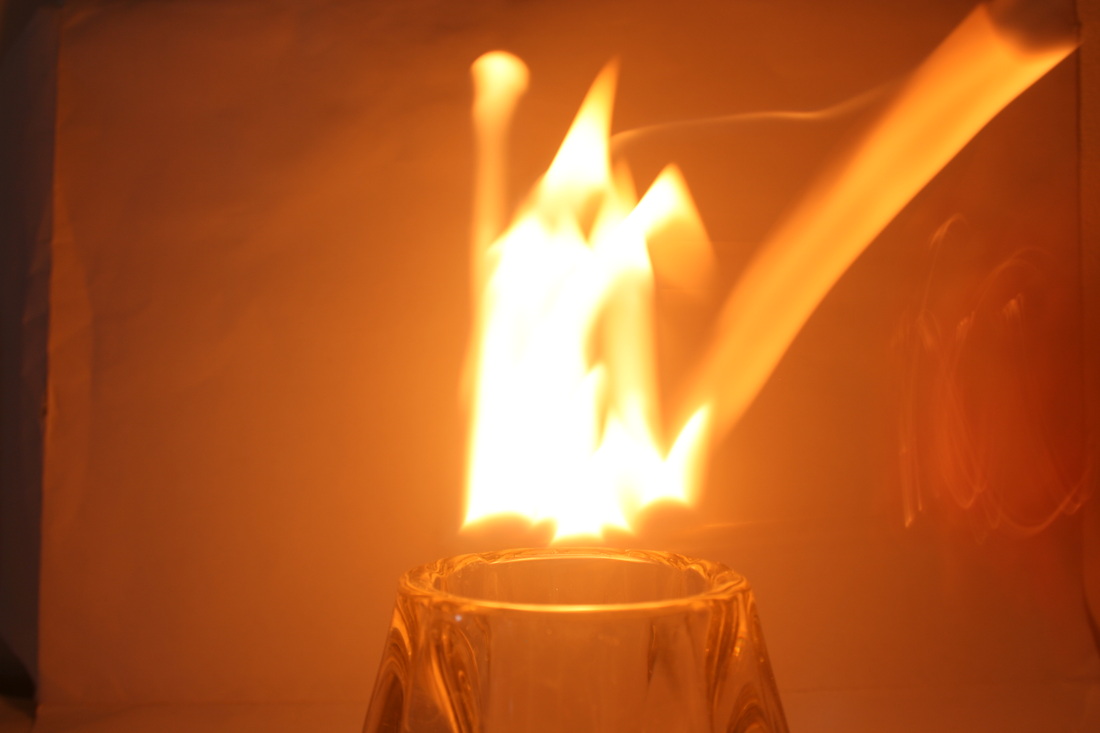

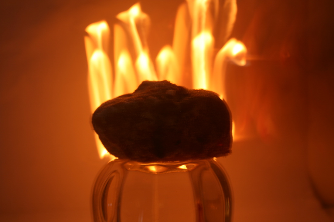
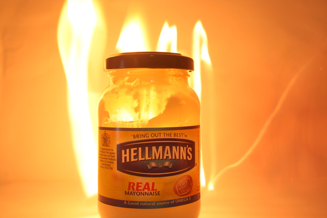
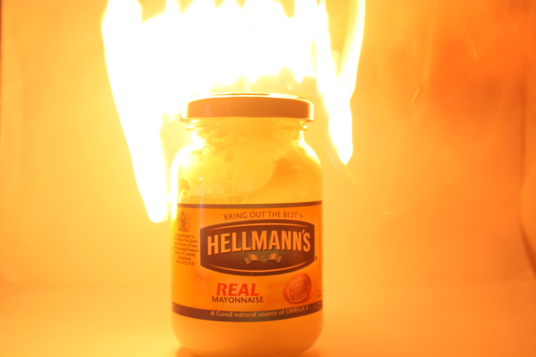
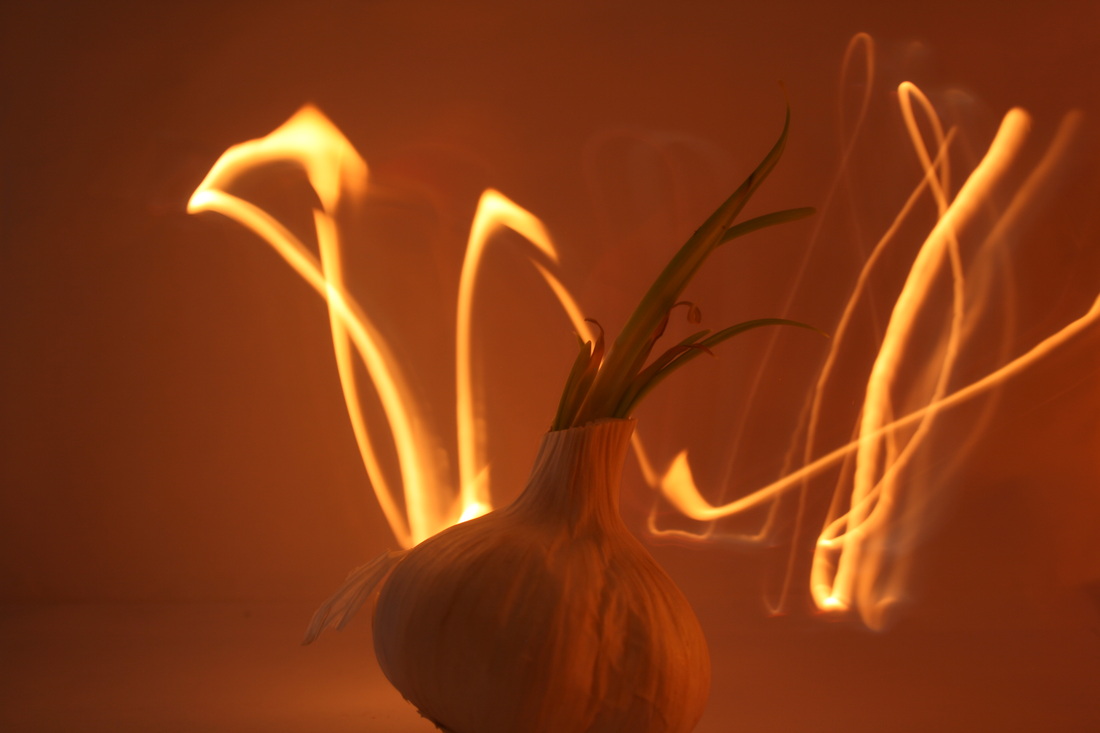
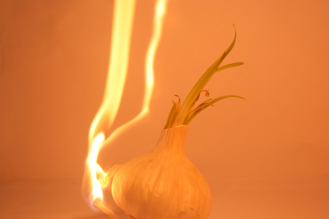
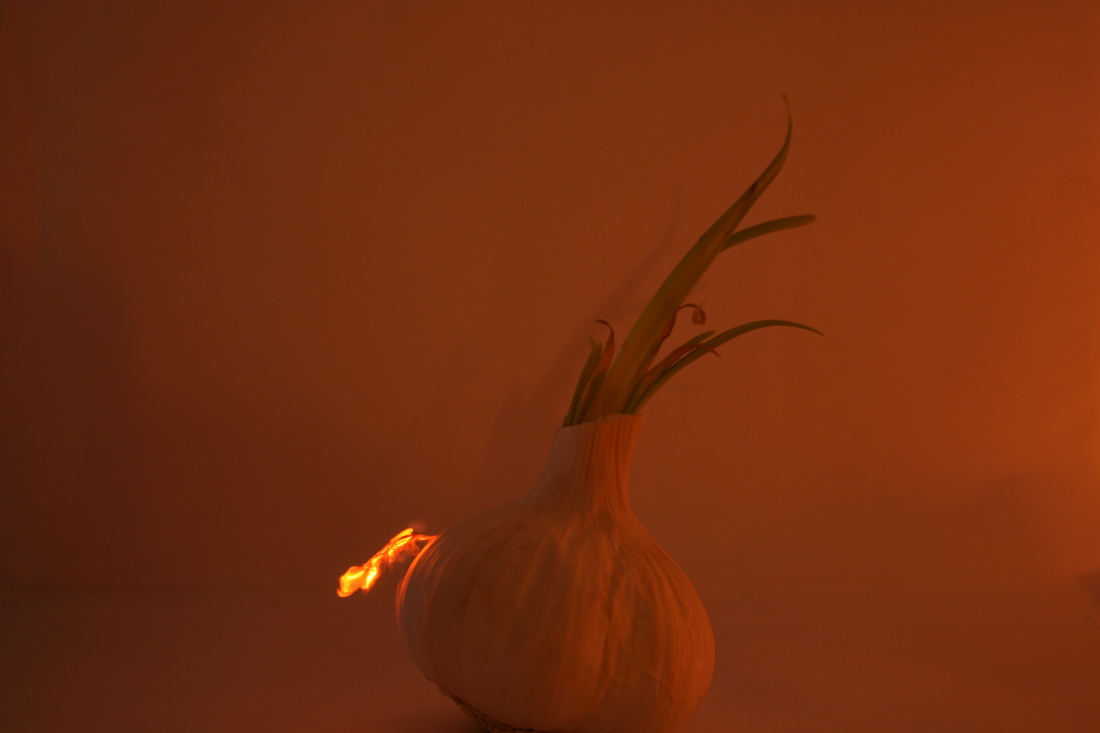
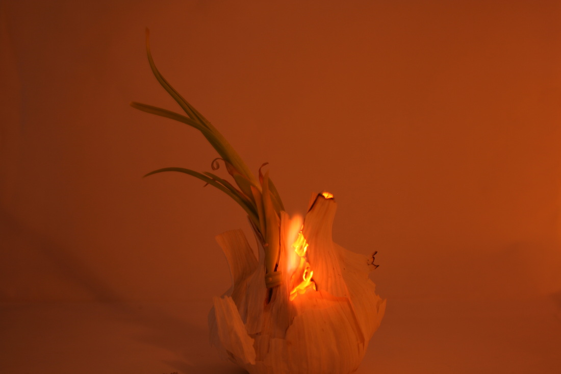
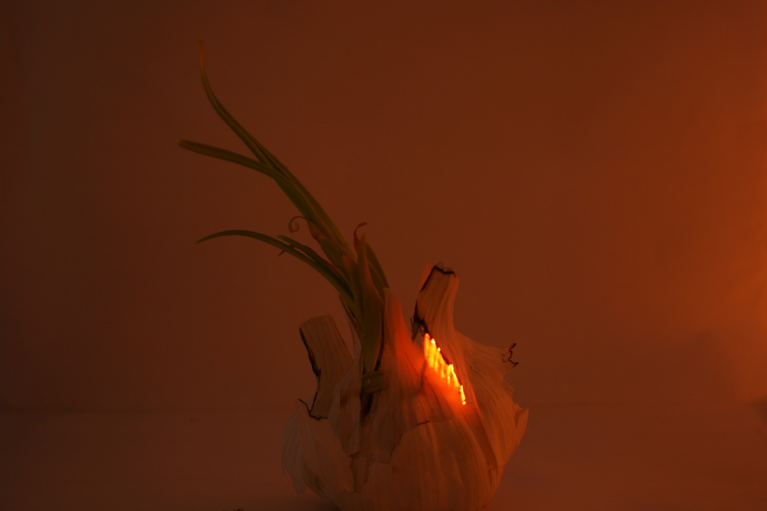
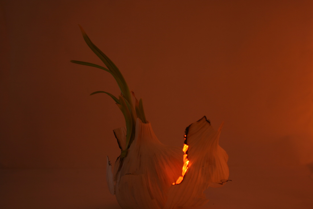
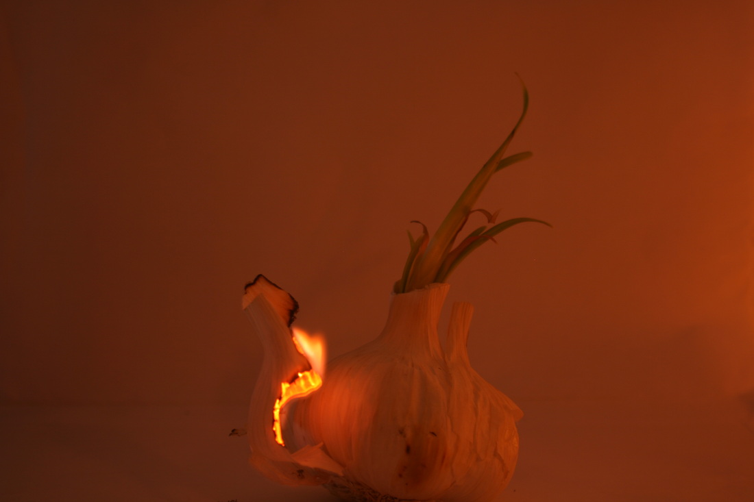
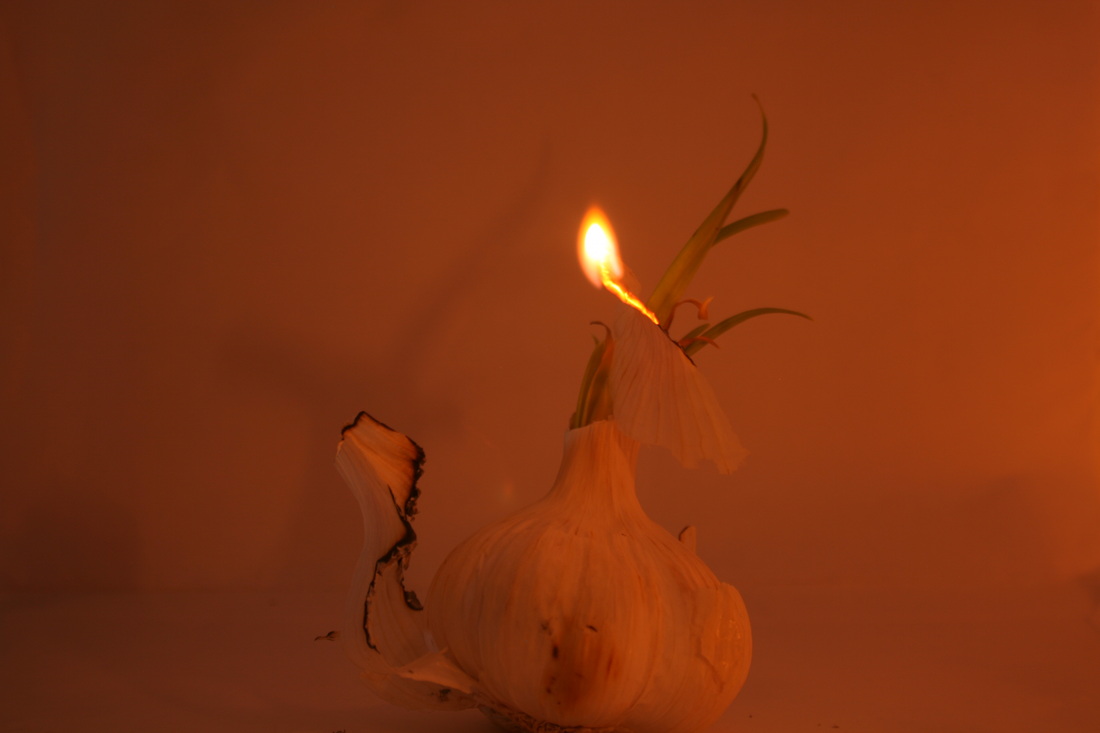
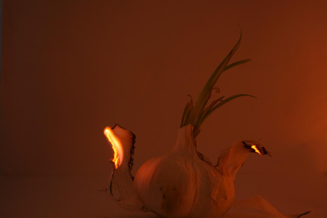
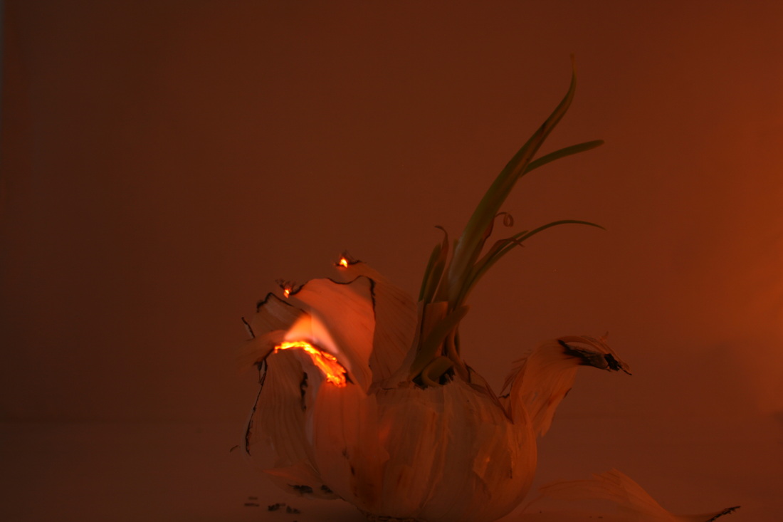
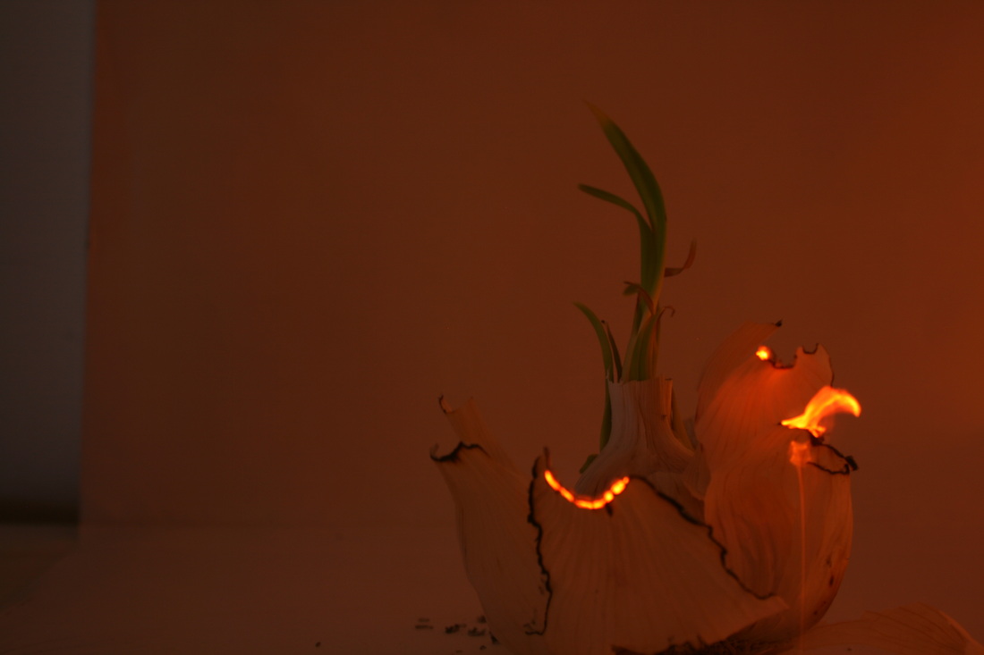
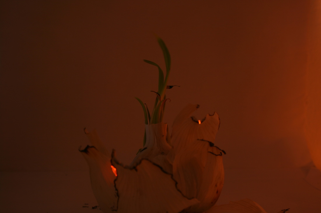
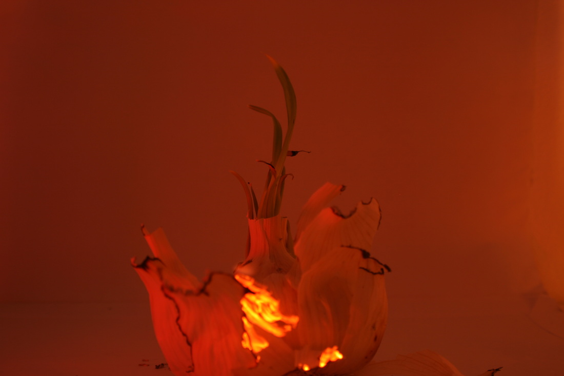
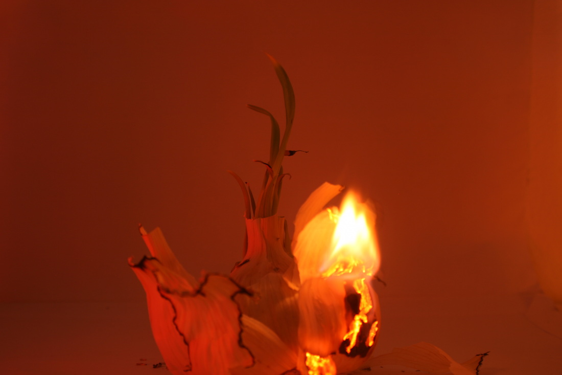
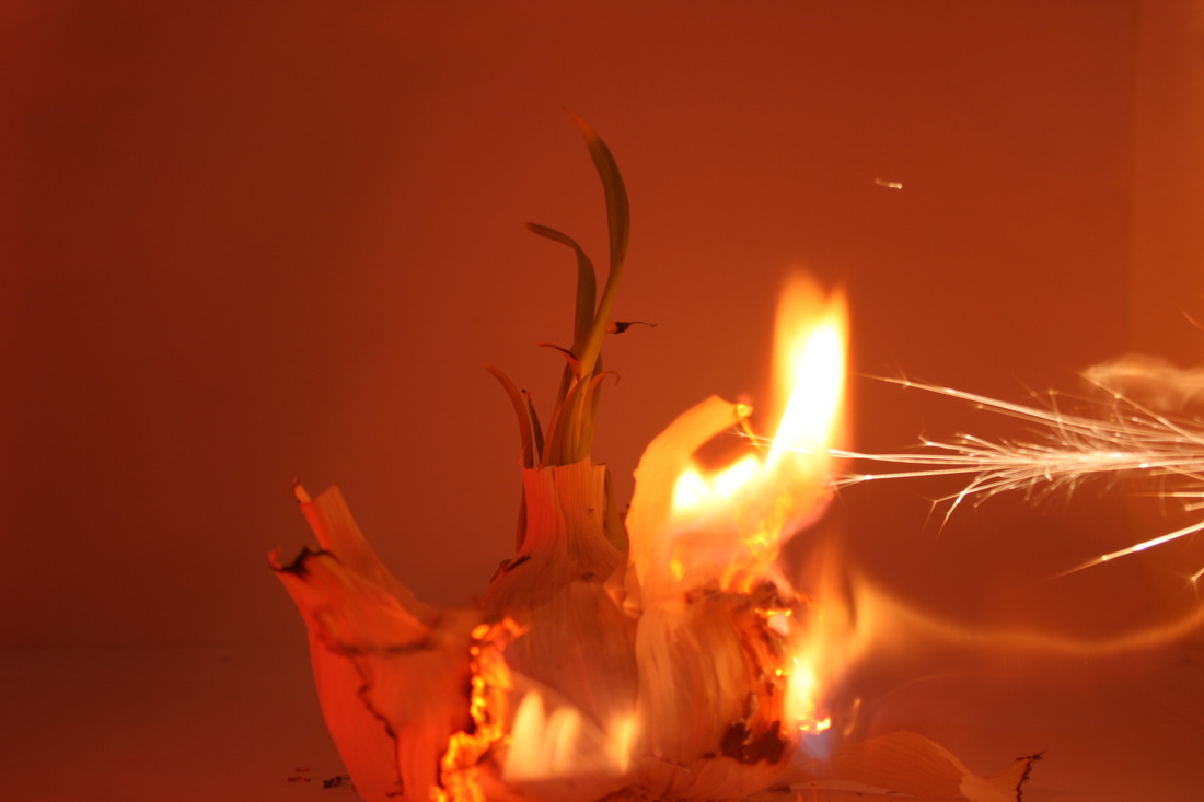
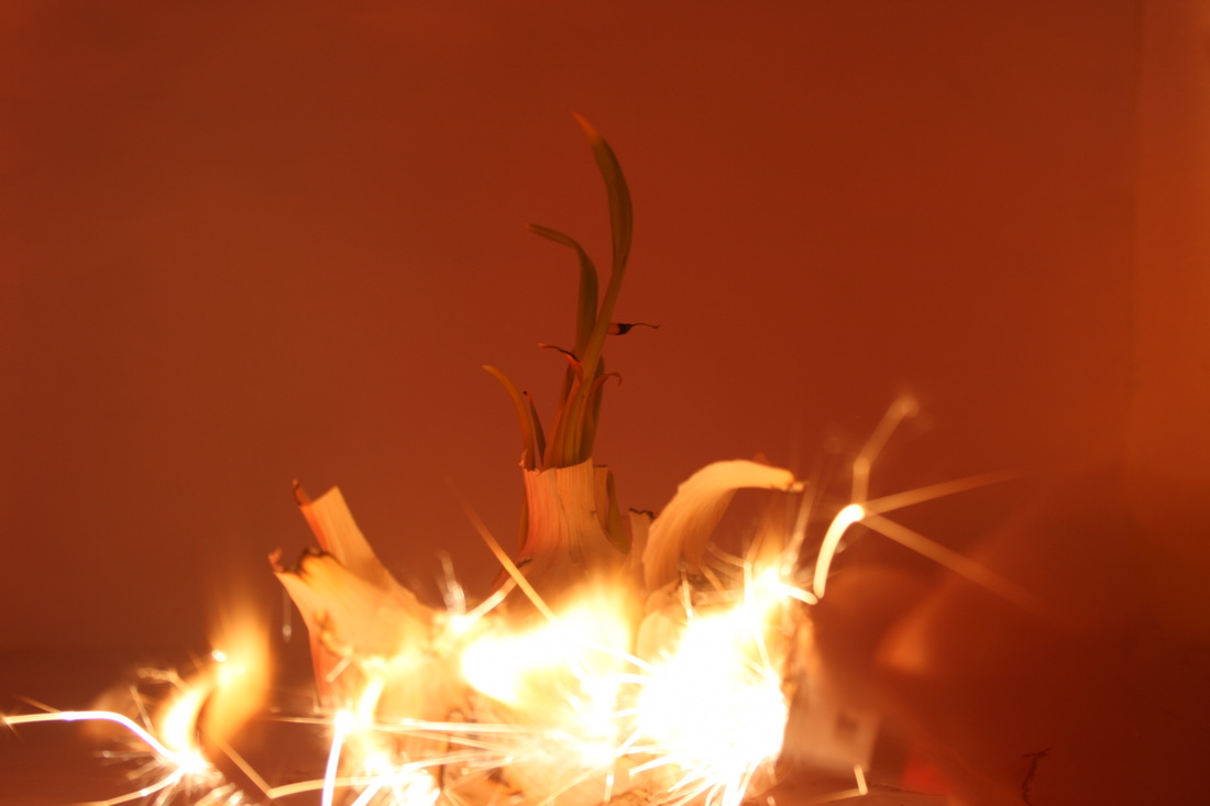
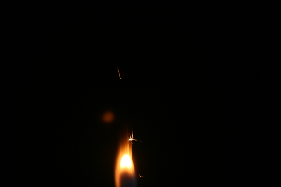

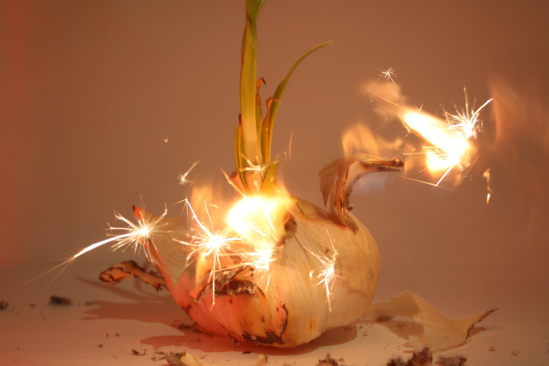
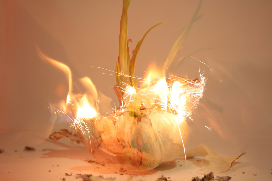
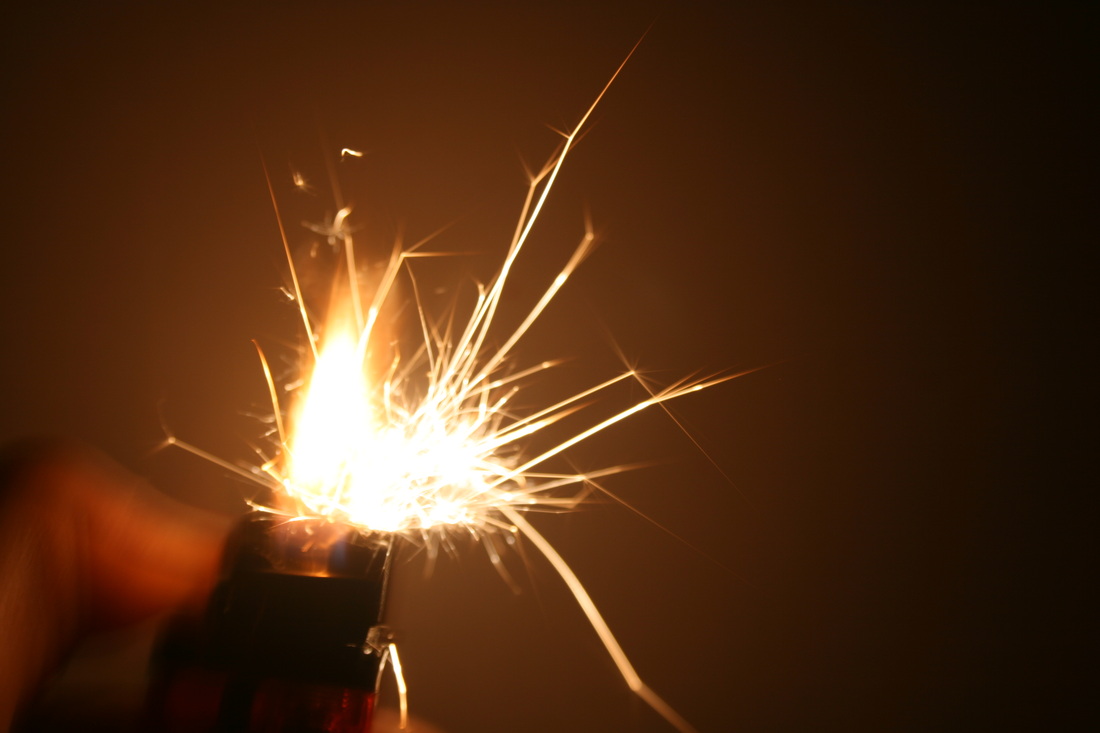
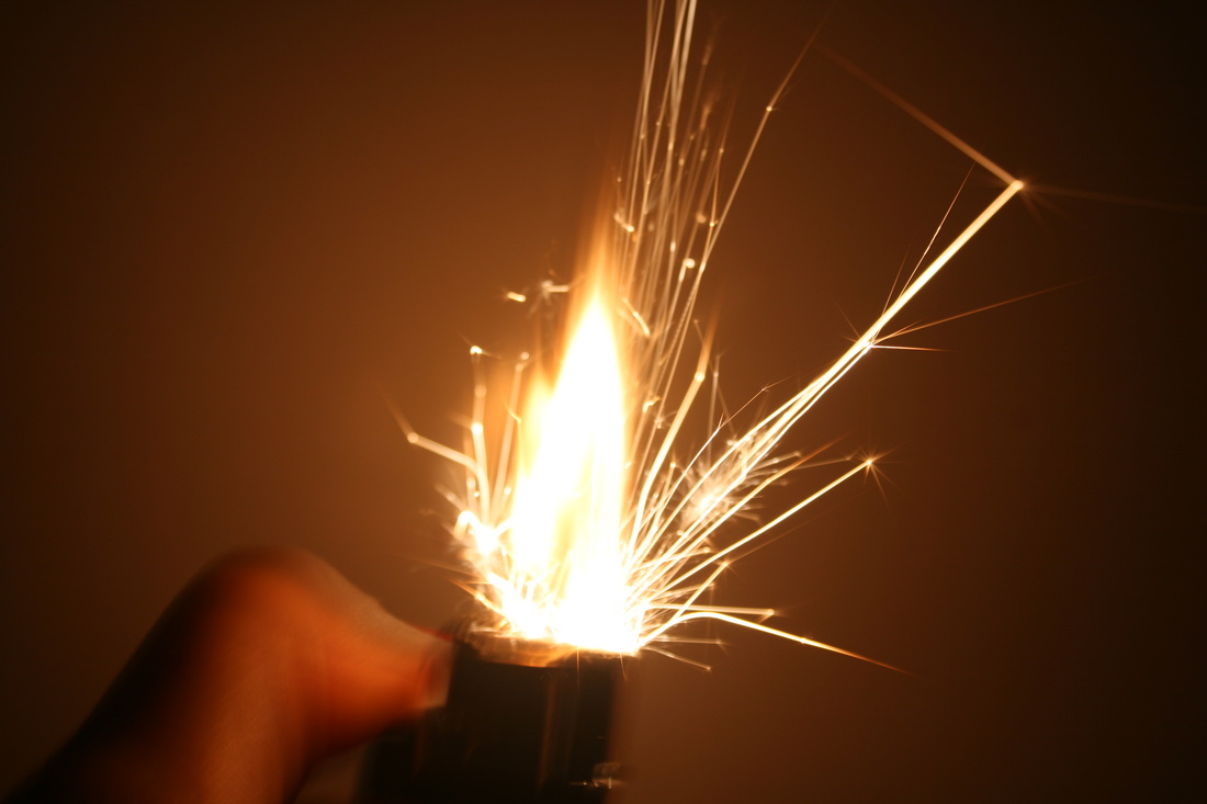
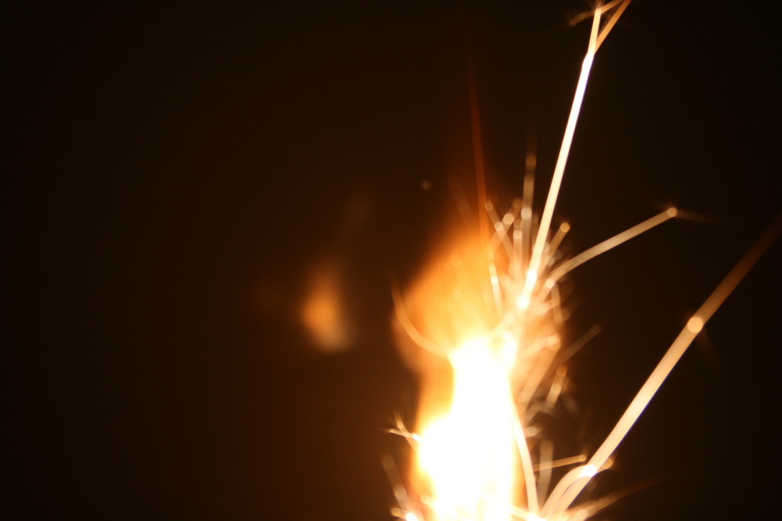
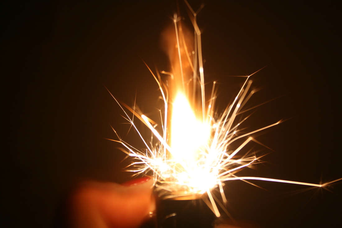
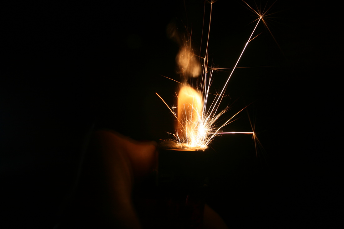
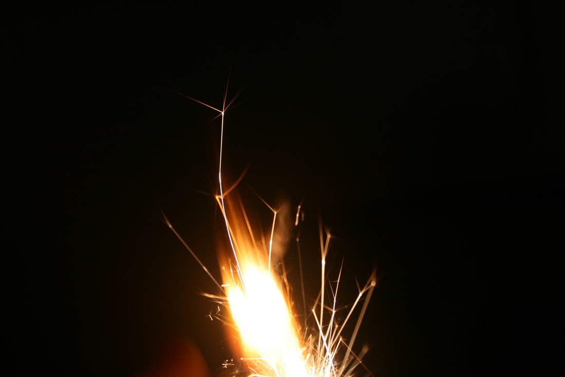
After setting the garlic on fire i came across a new technique and look i really liked. I started using a lighter instead of a match and when i sparked the lighter it created a 'sparkler' kind of effect as you can see in the last two pictures above. Again, i left the shutter speed on a for a long time which enabled me to get an opportunity to get several layers of the spark making a fuller picture.


Photoshop editing
To enhance this picture and make it more to my liking, I used photoshop :
|
First, I opened my chosen picture in photoshop.
|
|
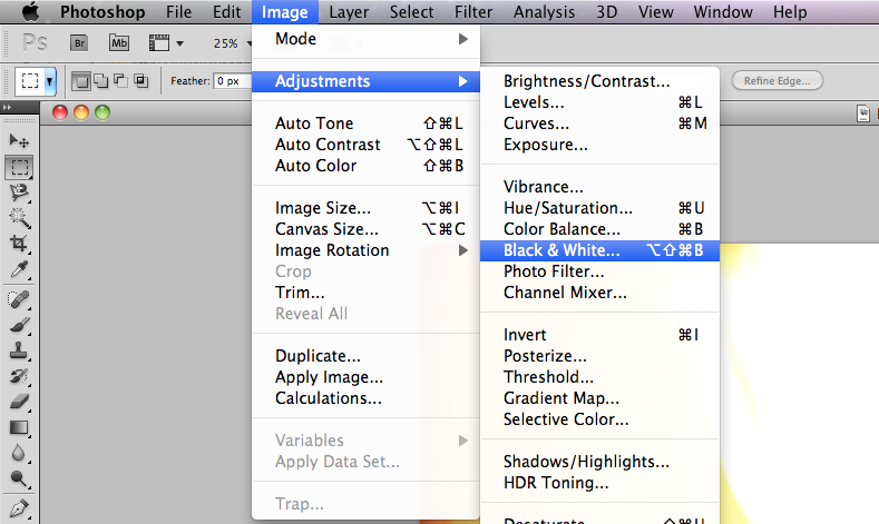
Then to create a monochrome look, i went to:
Image> Adjustments> Black & White... |
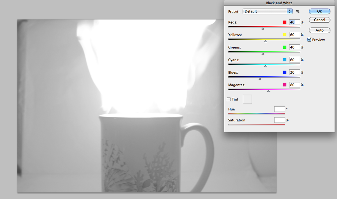
|
This then turns the image into grayscale and a small custom box pops up so you can adjust each colour specifically.
|
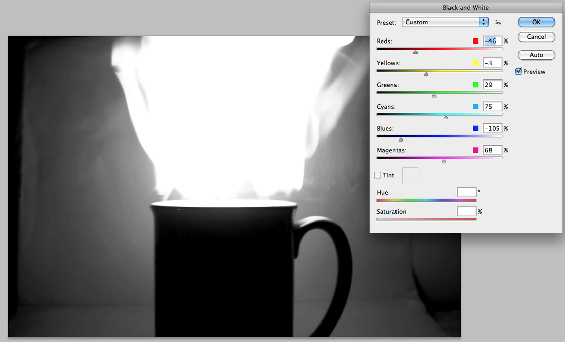
|
I then adjusted each specific colour until i reached the colouring of the picture I liked.
|
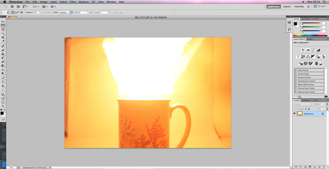
Before
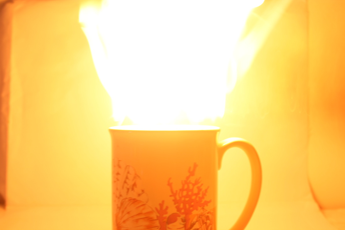
After
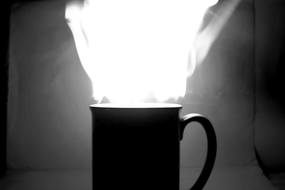
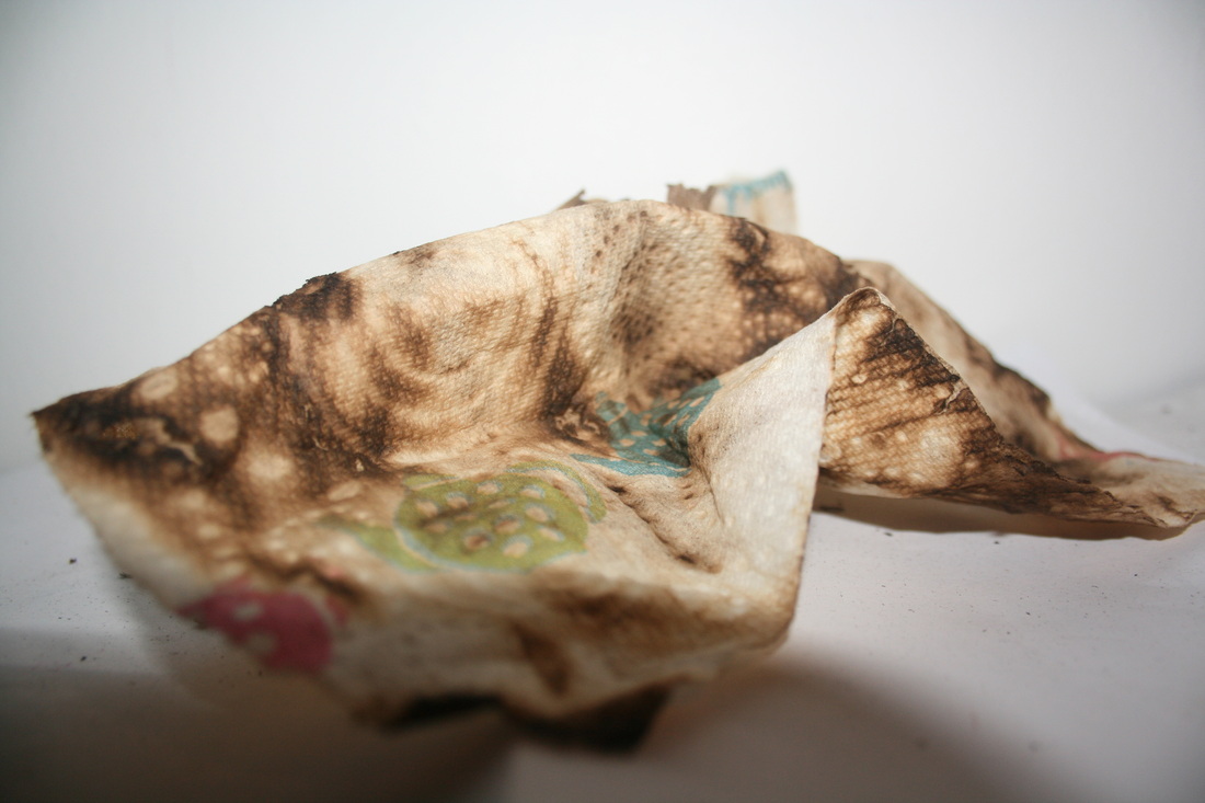
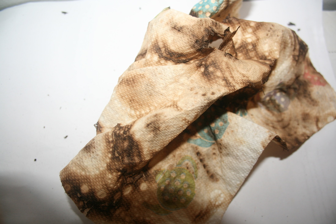
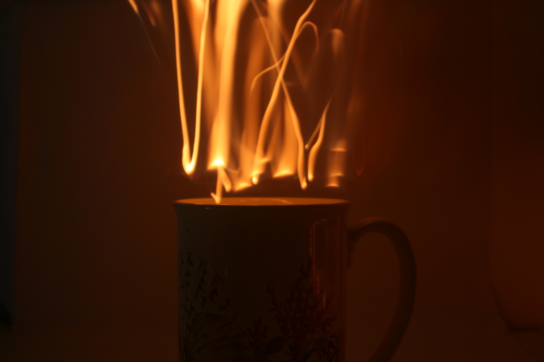
I used this image to edit because i like the effect it had from the illusion of fire coming out of the mug, however, i didn't like the colouring and the pattern on the mug. So then I edited it so the image was in greyscale and also the mug was also silhouetted, I think that this change adds depth to the image as you can see a clear layering between the mug, the fire and the back ground.
Interim Piece:
For my final piece I would like to present it as a video rather than in picture form. I feel that this would give the viewer more of an understanding and a better experience of the force of fire altering the appearance of the object that is being effected.
I first experimented with different objects to see which would have the best effect of burning and which would be the most prone to physical change from the force of fire.
|
|
For the first trial I set a kiwi on fire. I thought, because it had many fibres on the outside of the kiwi, it would set alight quite easily. However, although it did set on fire, it didn't create a very powerful impact and the fruit remained pretty much unchanged apart from the top being scolded a bit. The flame also stays very minute in the video which also reveals that this wasn't very successful and won't be useful for my final piece.
|
|
|
For my second experiment I decided to use nail polish remover when setting the lemons on fire in order to help induce the effect of the fire. The outcome was much better when using the flammable liquid to help with the burning. However, the actual effect on the lemon was minimal so for my next experiment I want to use something more prone to change.
|
|
|
For my last experiment I decided to use a plastic cup because I realised that the plastic would have have a melting effect when added to heat. I was very pleased with this outcome because as you can see the effect is destruction and change. The fire creates a sense of force and power as it causes the cup to fold in on itself. I would like to further develop using the idea of melting plastic.
|
|
|
Development from previous video:
I decided to edit the previous video to make it go in reverse. I liked the effect it had and how the cup looked like it was reforming after being destroyed. I feel like this will strengthen my final piece if I also use different forms of editing rather than just using physical ways of altering the object. |
For my inter rim piece I have decided to use different plastic objects so they can give off a strong sense of the strong force of fire. To make sure the plastic sets alight successfully I have also decided to use a small amount of nail polish remover to cover the objects with so they become flammable. Additionally, these will have to be filmed in a fume box so they don't let off harmful fumes which may be harmful. For the editing process, i want to use different techniques to make the piece more powerful and interesting. For this process I used iMovie.
For my inter rim piece was overall pleased. I used iMovie to edit and reverse the video's which gave a 'rebuilding' effect. The force of the fire was strong in each clip as they mostly destructed and melted the objects. I feel that the theme of 'force' was well represented in this piece as it exposes the force of the fire having the strength to disintegrate and alter the appearance of the plastic containers.
To develop my work further I want to continue using fire as a force but, i want to try and get closer to the objects being effected. I think the best way to do this is by taking stills rather than pictures. Using stills then allow me to get closer and get more detailed and minimalistic photographs. I want to experiment with lots of different materials such as natural ones and more artificial ones rather than just working with plastic.
Artists
|
Rachel O'Sullivan
This is an abstract image created by taking an extreme close up of melted plastic. O'Sullivan uses colours such as red, green, grey and. These colours are complementing and the red really stands out and makes the shot very powerful. The process the artist went through was firstly to melt the plastic and then use a close up lense or extreme zoom. This image was also edited in photoshop to add emphasis on the red. |
|
Shaqayeq Arabi
In this first image Is many different plastic objects melted together to form one large melted mass. This shot consists of a variety of different colours such as green, yellow, red orange and black. This forms an interesting contrast with the white background. This, however, is different from O'Sullivan's work because it has a completely different perspective. Unlike, a minimalistic close up, this has a wider view of the object and this creates a different effect. This image also shows a large wider image rather than a close up. It shows the effect of melting on the same object three times, this shows the different possibilites there could be when melting occurs on certain objects. It appears that the milk cartons had been melted in those spots and therefore took the shape of what they were on. This also reminds me of Salvador Dali's painting featuring a melted clock: 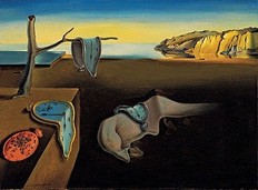
|
Response
|

|
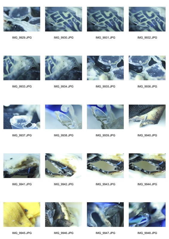
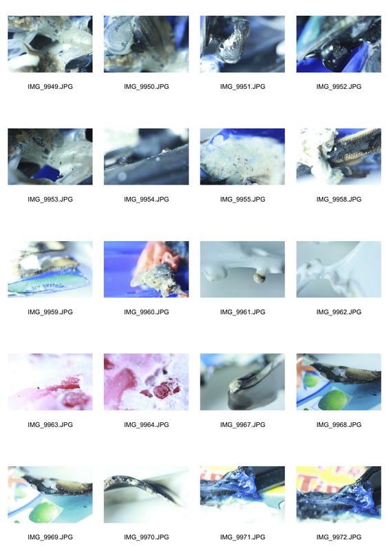
top 4 pictures
The following pictures are more similar to Rachel O'Sullivan's work rather than Shaqayeq Arabi's. This is mostly because my pictures were taken at an extreme close up creating a minimalistic effect.
However, They are still fairly relatable to Arabi's work because I melted plastic to achieve the subject of force but just took a minimalistic approach.

|
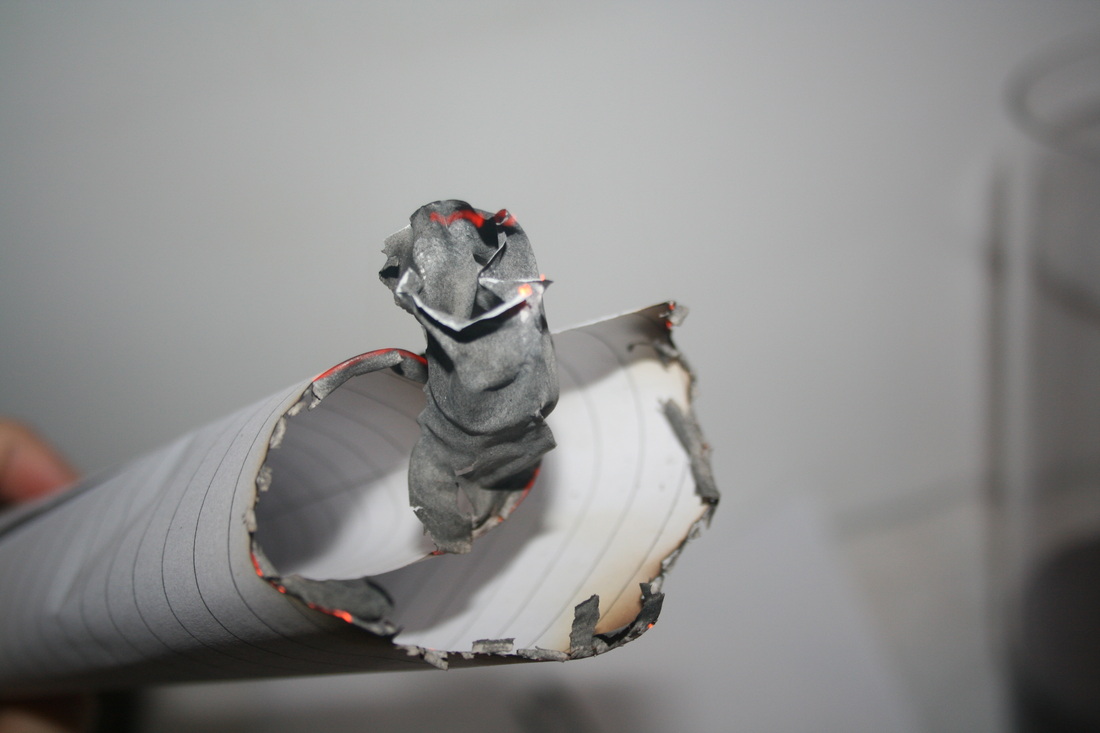
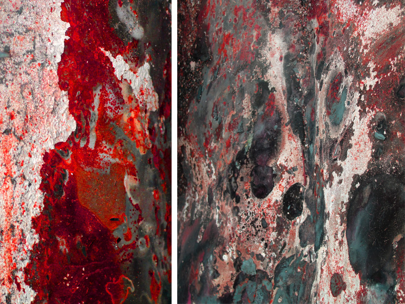
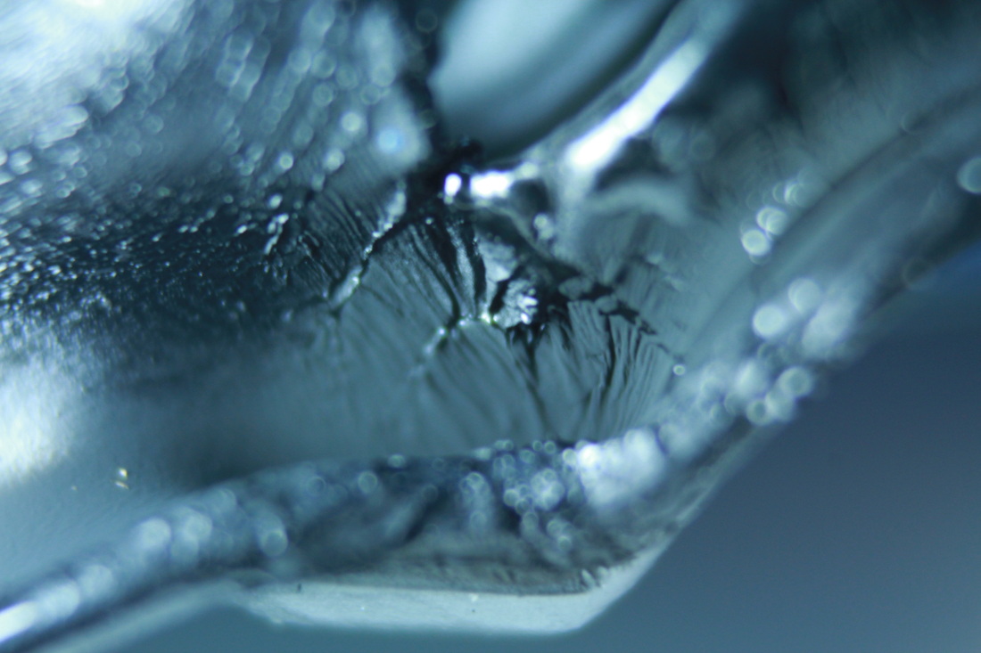
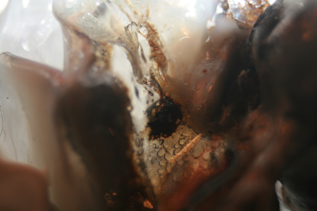
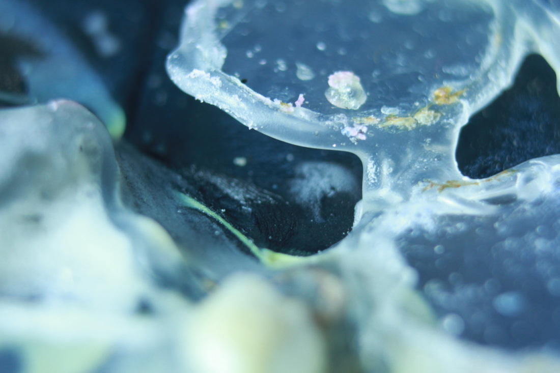
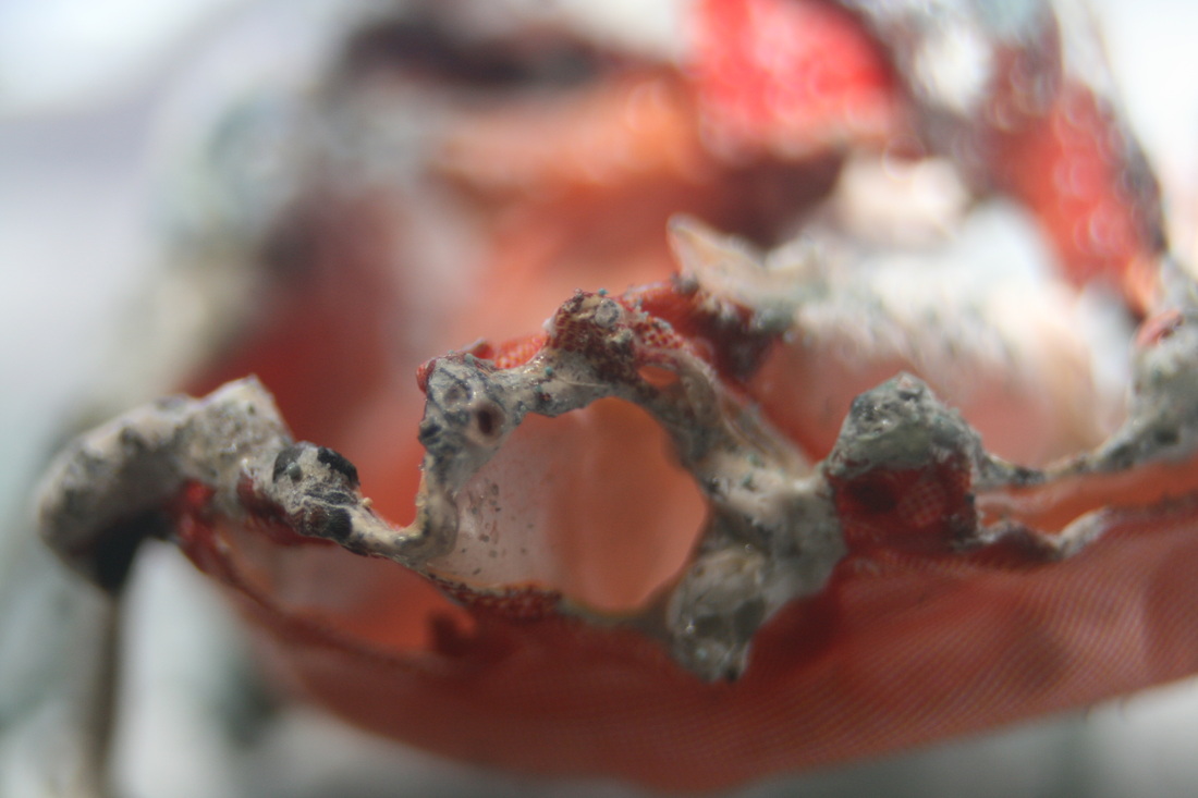
This shot resembles a microscopic image which can have the effect of largeness on an individual. I liked this shot especially because it has the force of altering ones perspective on the awareness of their size and power. The power of fire is reflected in this image because it reveals how fire and heat can so easily destroy and mould plastic. This again relates to the power of an individual and how easy it is to obtain such a strong force like fire to destroy or change.
|
|
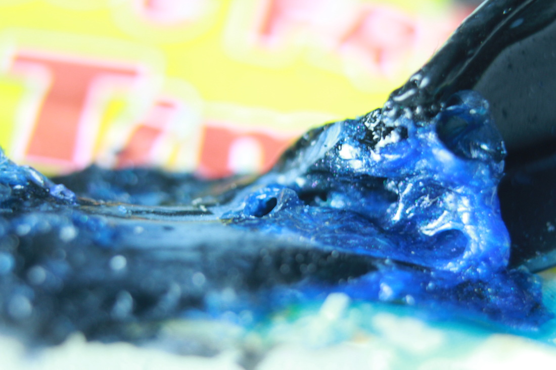
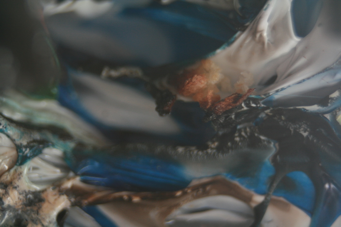
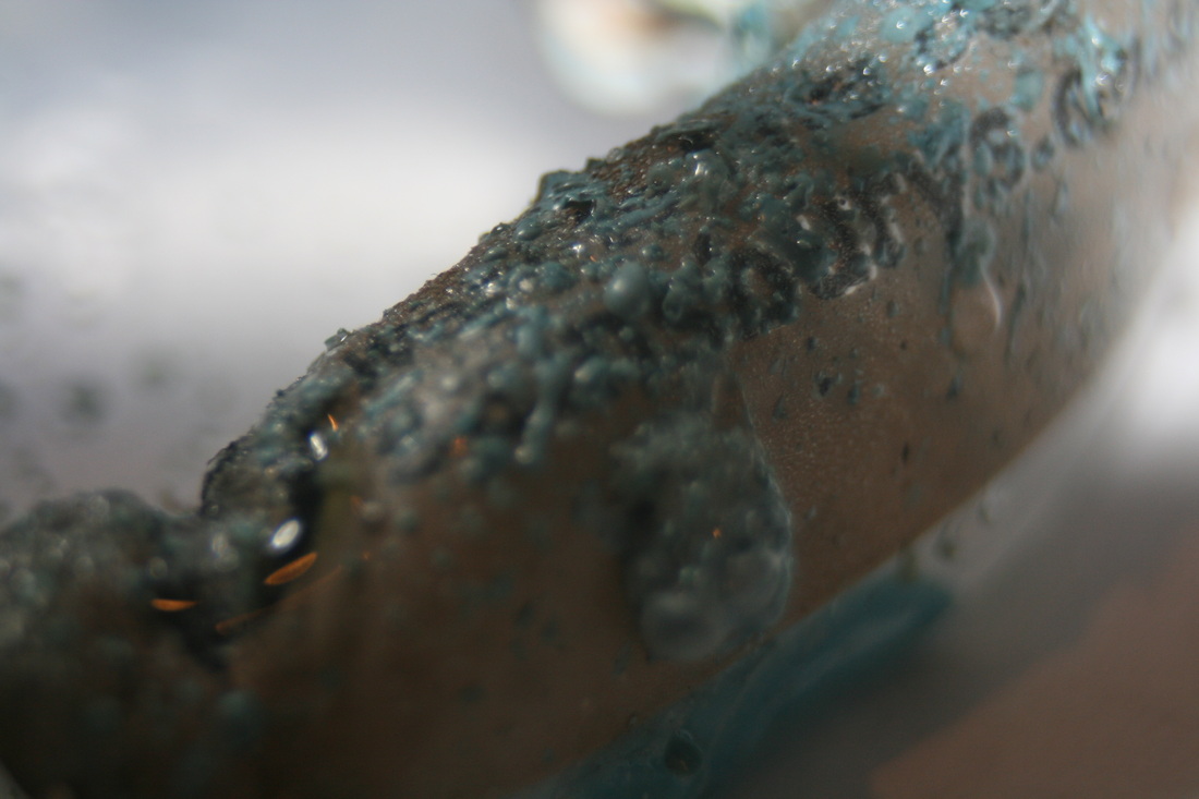
I like this image because it ties in depth of field along with colour and luminescence. Only the black and blue colours are in focus , however, the strength of the yellow made it present in the shot. I feel that this makes the image more powerful as it has many aspects of tone and colour. This image reveals a sense of force as the colours are over powering each other. The melting proposes a sense of power also because it shows the force of fire along with all the other shots.
|

|
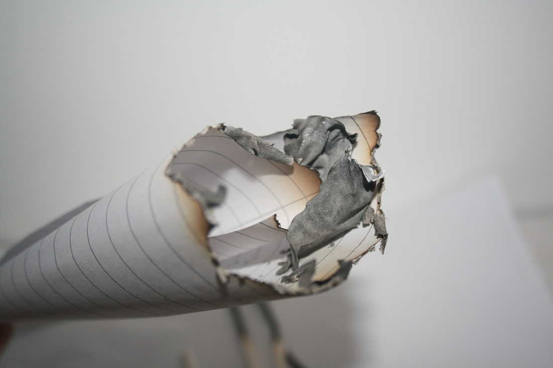
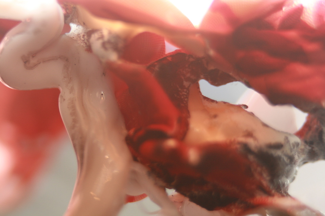
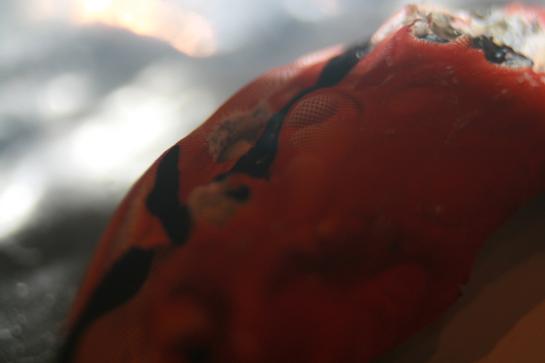
This shot gives a theme of strength and power, but, also a sense of extreme change. The fire affected this shot in a slightly different way than the others as it became reflective and shiny rather than gritty and rough. The shape of the plastic resembles a sort of hand shape which adds to the power as hands or fists are usually associated with strength.
|
|
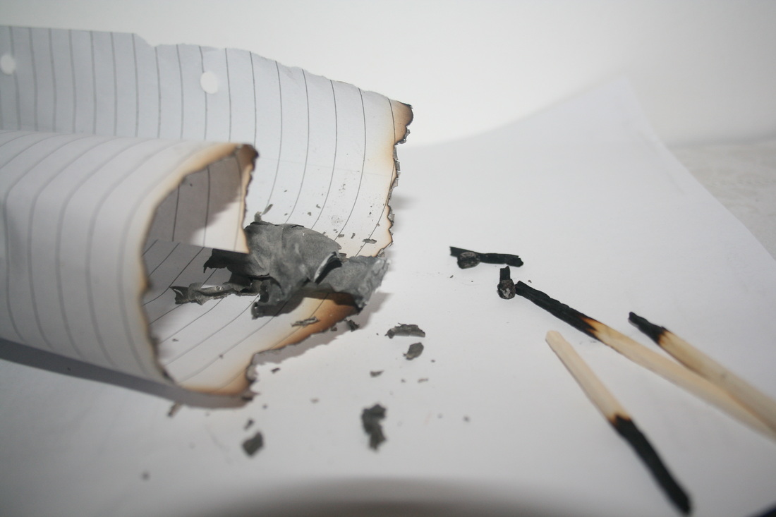
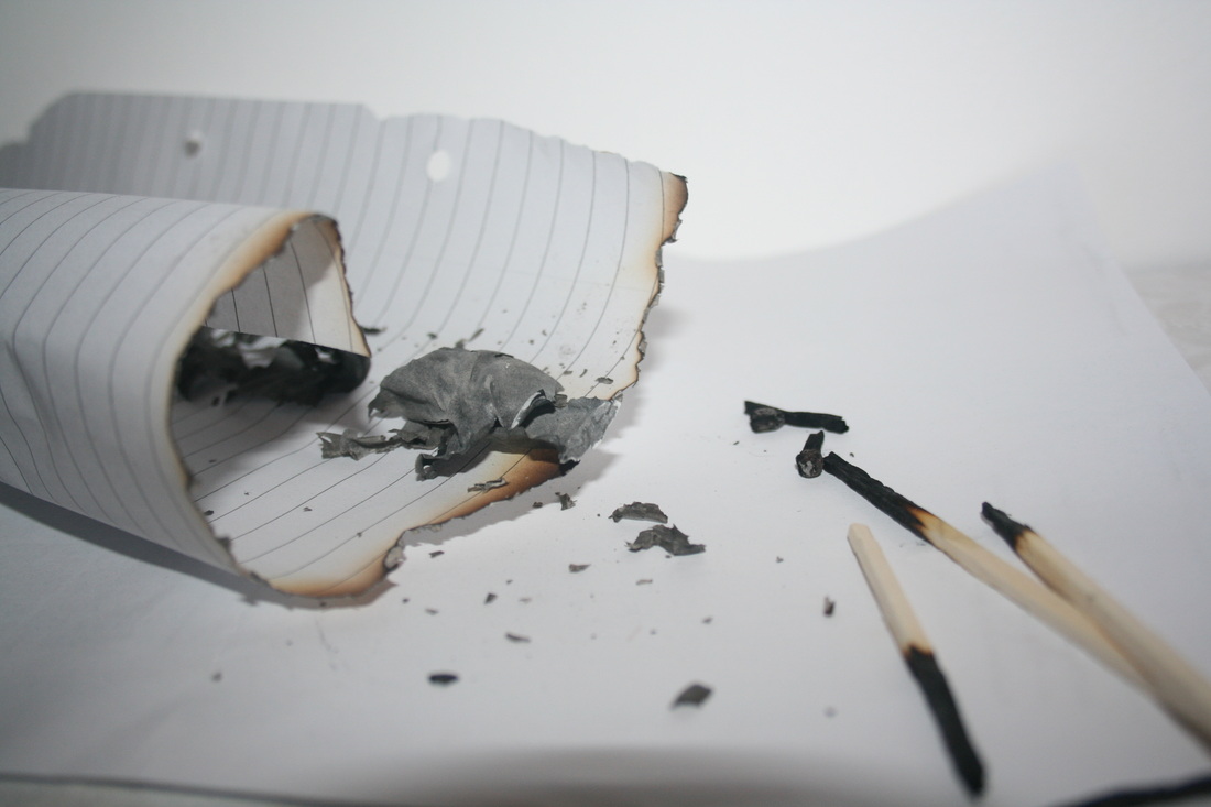
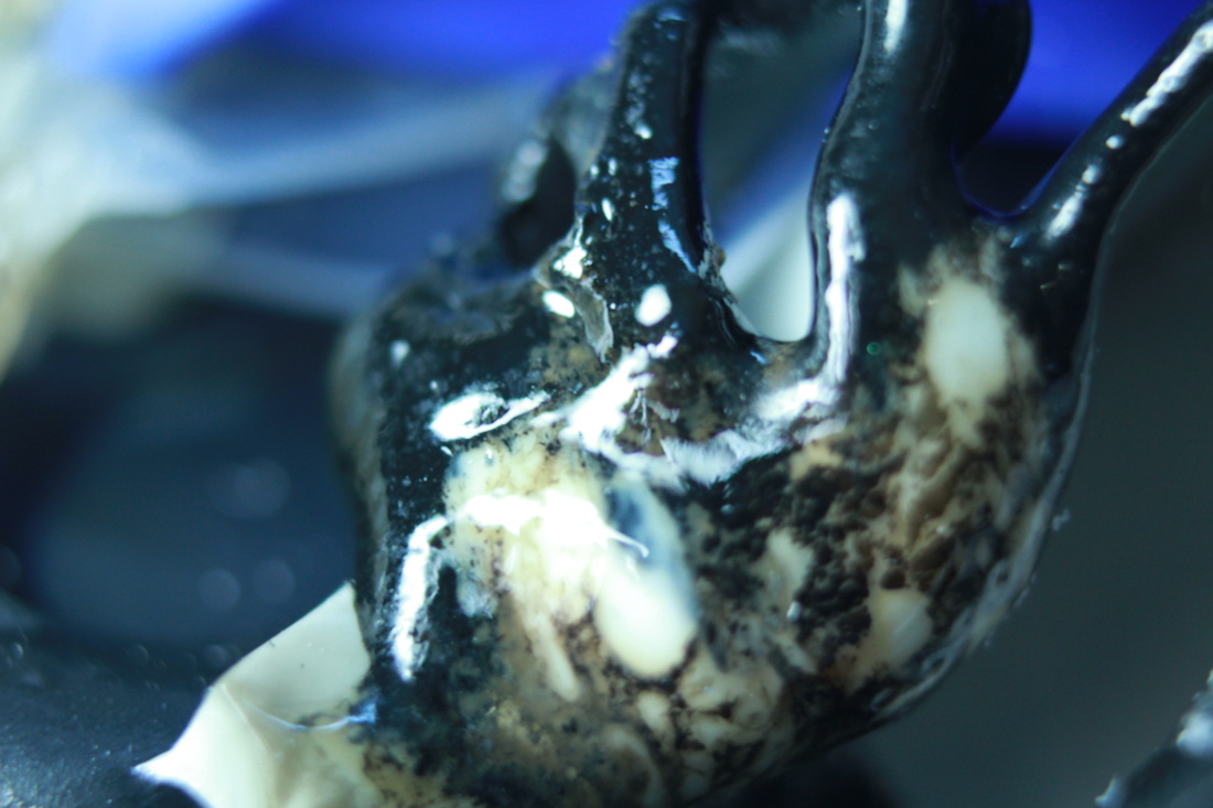
This shot is my favourite mainly because it is dominated by one colour - black. Some parts are in focus and some aren't and like the other photos, this effect adds depth. The melted black plastic resembles a leathery texture, this then signifies strength and force as leather is commonly known for being strong and durable. However, the opposite has happened to the plastic as it was so easily distorted and changed which creates an interesting controversy within the image.
|
Teppei Kaneuji
Ted freeman
Ted freeman
|
|

|


|
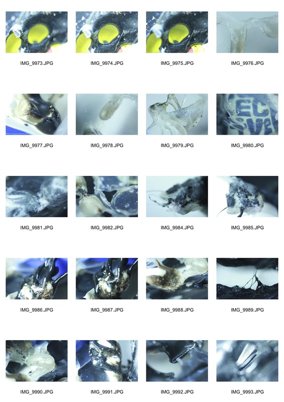
This shoot gave me a good contrast with the last one. The red tones are almost opposite to the more blue colours in the previous shoot creating a good variation between them, representing hot and cold. For my final piece I want to take the best shots from each shoot and combine them to make a gallery of different close ups to present forces.
Final Piece:


For my final piece I thought the theme of opposites came into the subject of forces. Along with the force of burning and melting, fire also relates to the bottom images where red is present in most of them. This contrasts with the top images where blue is present in all the pictures and these could both represent a battle between the opposite elements of fire and water.
