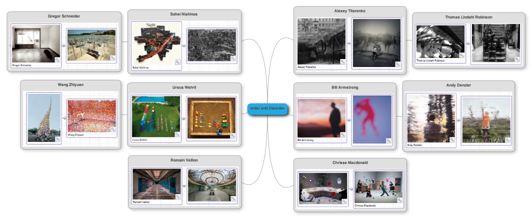
Order and Disorder
Project Brief:
For this project I want to explore many different artists and forms of order and disorder. For this I will first experiment with four different strands; typology, symmetric order, portraiture and city disorder. The one that sounds the most interesting to me is city disorder and I feel that I may want to develop that one into my final piece.
For this project I want to explore many different artists and forms of order and disorder. For this I will first experiment with four different strands; typology, symmetric order, portraiture and city disorder. The one that sounds the most interesting to me is city disorder and I feel that I may want to develop that one into my final piece.
brainstorm
Typology
Ursus Wehrli - The art of cleanup
|
|
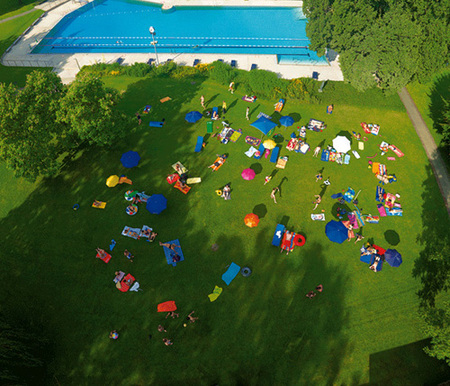
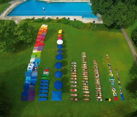
Ursus Wehrli's The art of cleanup project previews Order and Disorder by taking disorganised situations and putting them in an order. Here, Ursus uses a green space next to a pool where people are sunbathing and have various objects scattered around. He then rearranged the people and objects to neatly line up next to each other, even people. He placed everything in colour order which stands out well next to the bright green back ground of grass. These before an after images portray a sense of both order and disorder. This is because the previous shot shows no clear pattern or organisation and resembles a chaotic atmosphere - representing disorder. The after shot then presents order because it shows a clear lay out and line up of objects and people in the order of size and colour.
My response
|
|
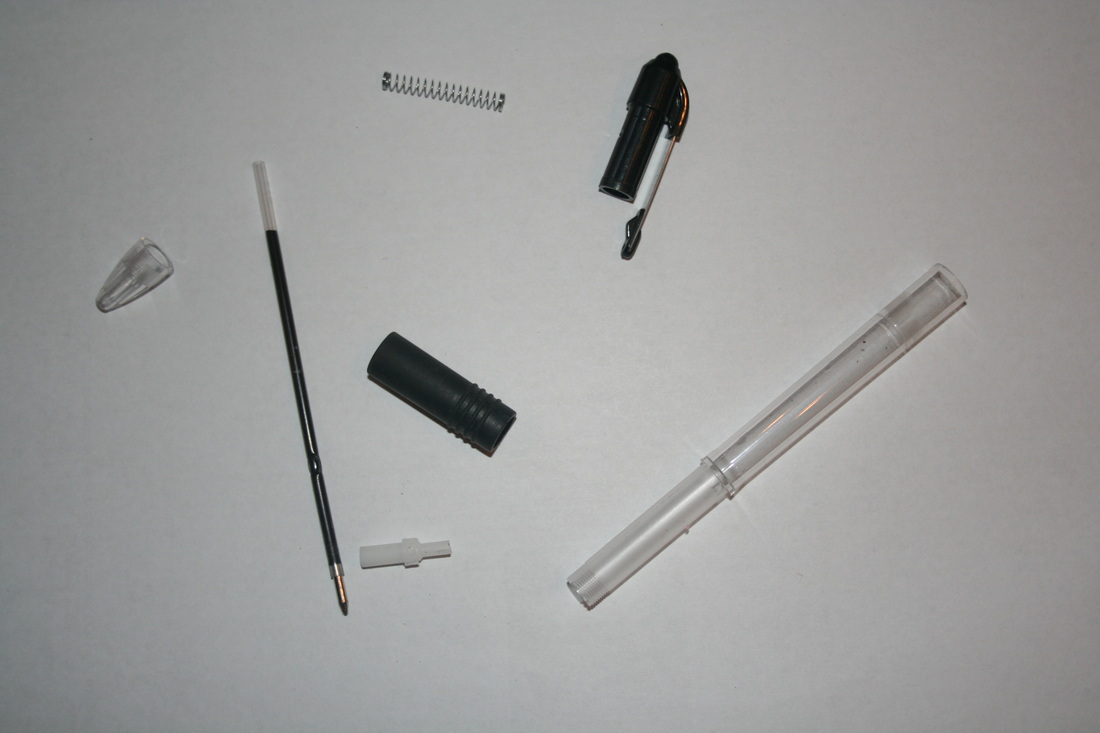
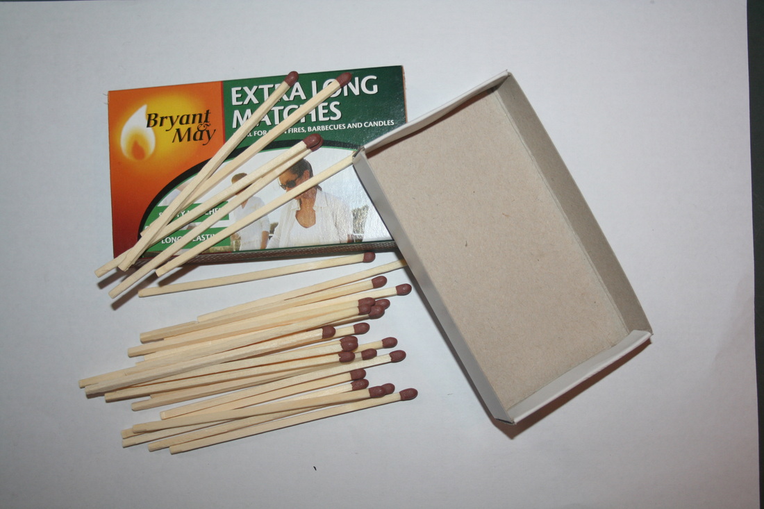
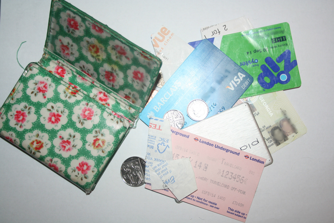
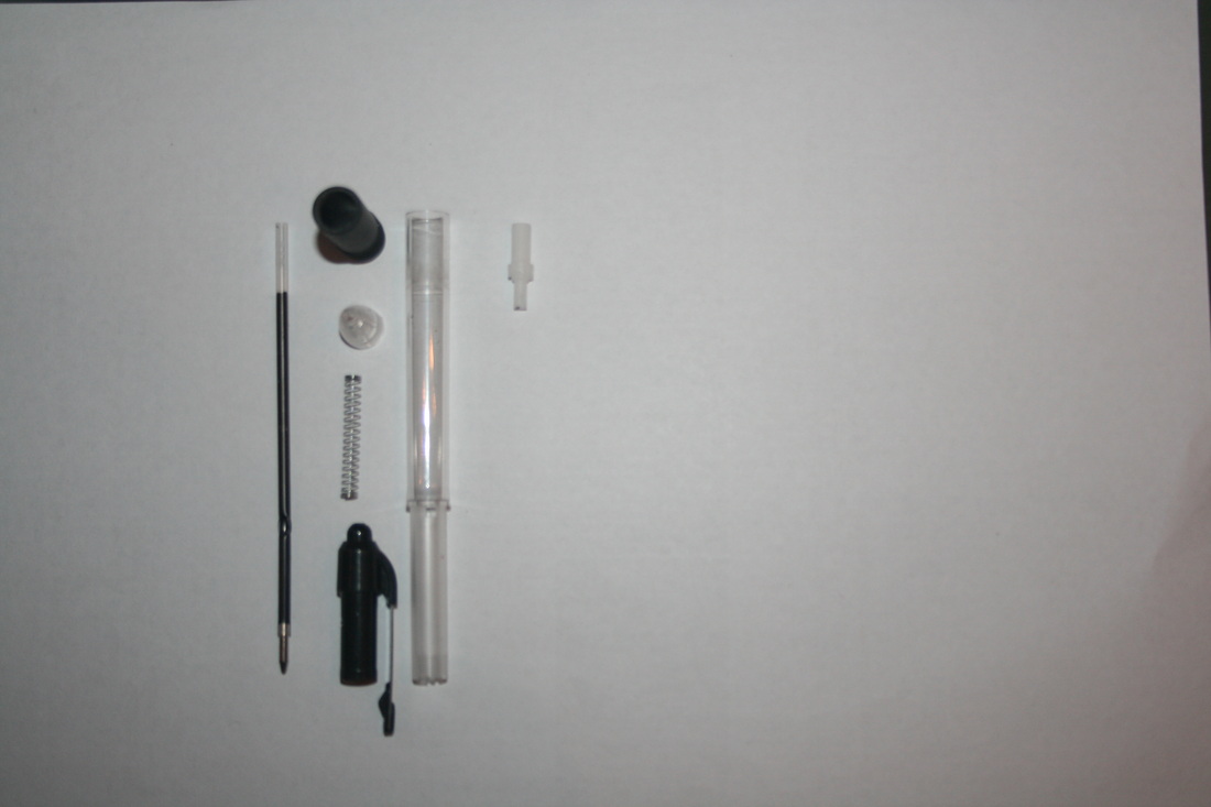
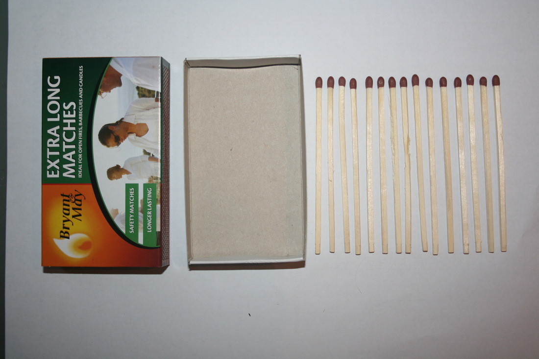
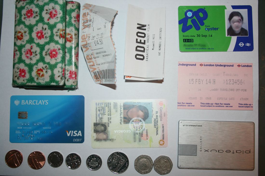
For my Response I decided to scale it down to smaller household objects rather than large landscapes to present order and disorder. For the first image, I used a pen and took apart all the possible pieces and arranged them to fit into a small rectangular space. I liked the organisation of the pieces because it took up much less surface area and looks neater. For the second set of images, I used a match box. Although it only consisted of three key objects, it still had a great impact due to the large amount of matches being lined up next to each other. For the last response, I used my purse because it went from being so compact to spread out, highlighting the drastic increase in surface area:
This creates a big impact and sort of goes from order to disorder to order again. This is because everything packed away in the purse creates organisation, then when taken out in no specific fashion it produces disorder. When the objects are lined up again, it creates order.
|
Development
To develop the idea of comparison of before and after organisaion
To develop the idea of comparison of before and after organisaion
Todd Mcellan
|
|
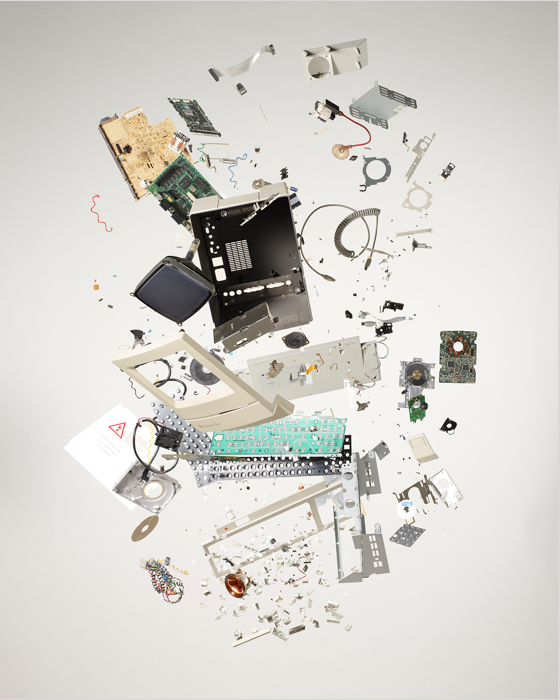
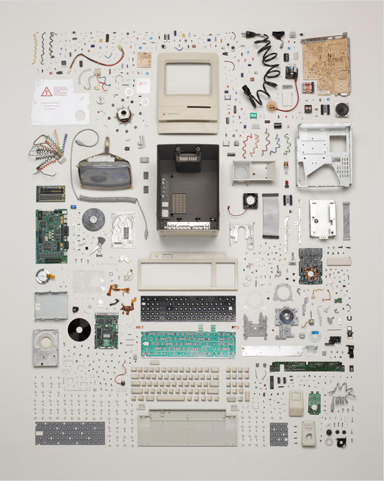
Todd Mcellan's work is similar to Ursus Wehrli's 'Art Of cleanup', however, it has slightly different process to it. Mcellan, rather than finding a disordered situation and organising it, he takes apart an object to create the disorganisation. He then after lines up all the pieces from the object, in which this case is a computer. The first shot gives us a perspective of where all the objects seen to be falling which previews the theme of disorder. This is because all the parts have no order and are just placed aimlessly. The second shot represents order because each and every piece is placed next to each other to form a perfect rectangular shape. It also has a sense of simplicity from the regular geometric shape, but this is juxtaposed by the fact that there are so many intricate pieces.
|
My response
|
|
|
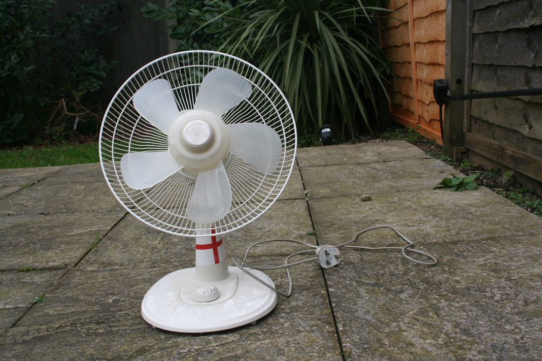
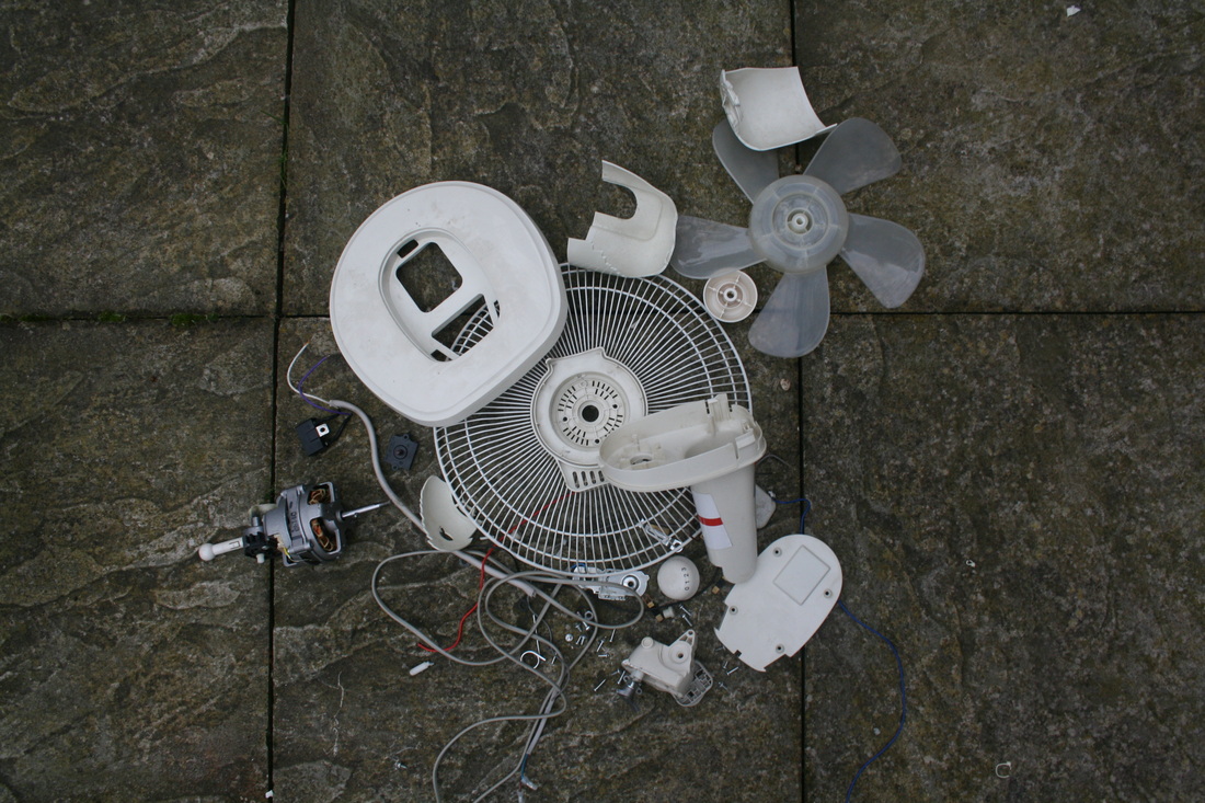
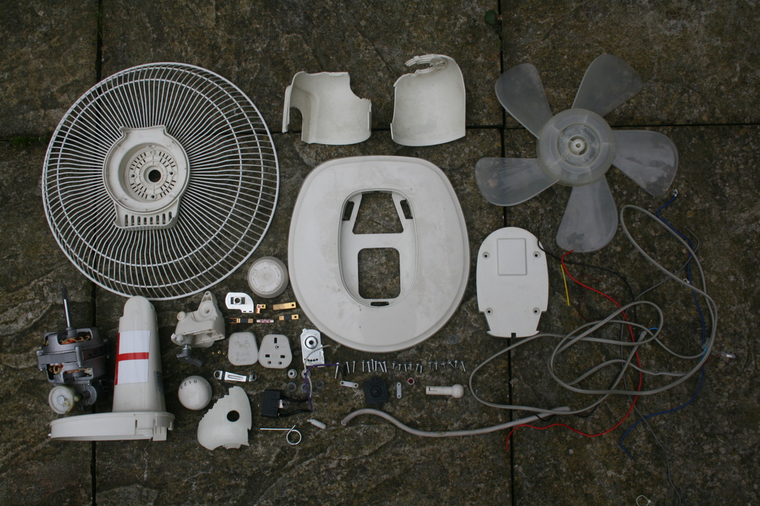
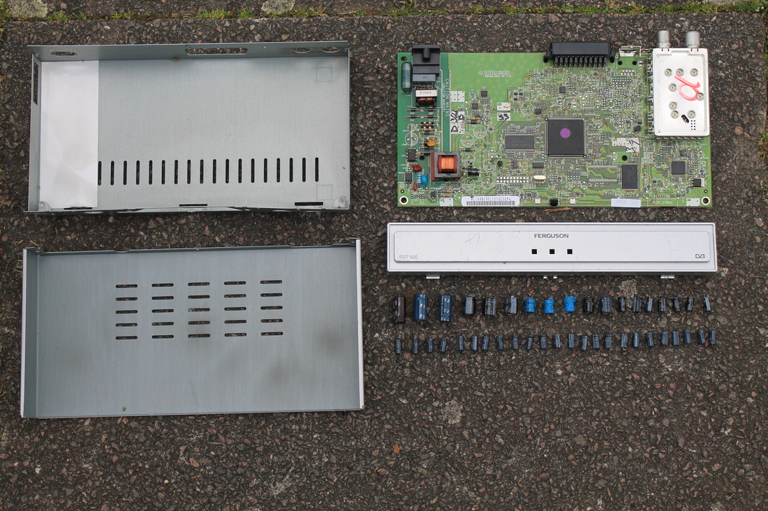
I decided to have a second response for 'The Art of Cleanup' but with something more complex, like Todd Mcellan's work. I visited my local recycling plant and found the fan as shown above. I thought that this could be interesting because it contains a lot of parts such as wires and screws. I enjoyed taking it apart because I got to explore the inside and saw how each part connected and worked together. I like the third image where all the parts were organised and put into order because it reveals how much has to be put in to work something as simple as a fan. This helps show how more work gets put into certain jobs than people may be aware about, and seeing as how many pieces are needed for just a fan, it makes you think about how many are needed for extremely complex objects such as cars or roller coasters. My response is similar to Mcellan's because I used the same process of a before 'disordered' shot and an after 'ordered' shot. I also tried to put it against a simple background so all the attention of the image could be focused on all the pieces of the fan.
|
|
|
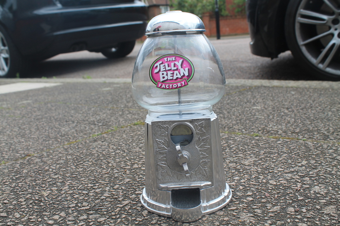
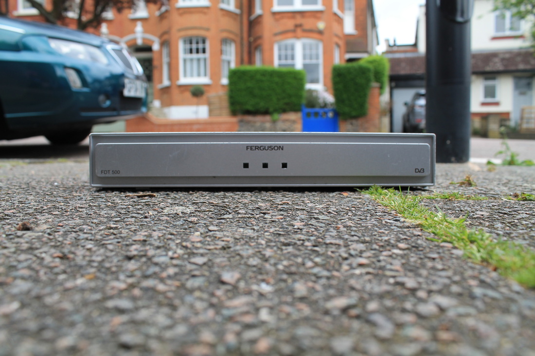
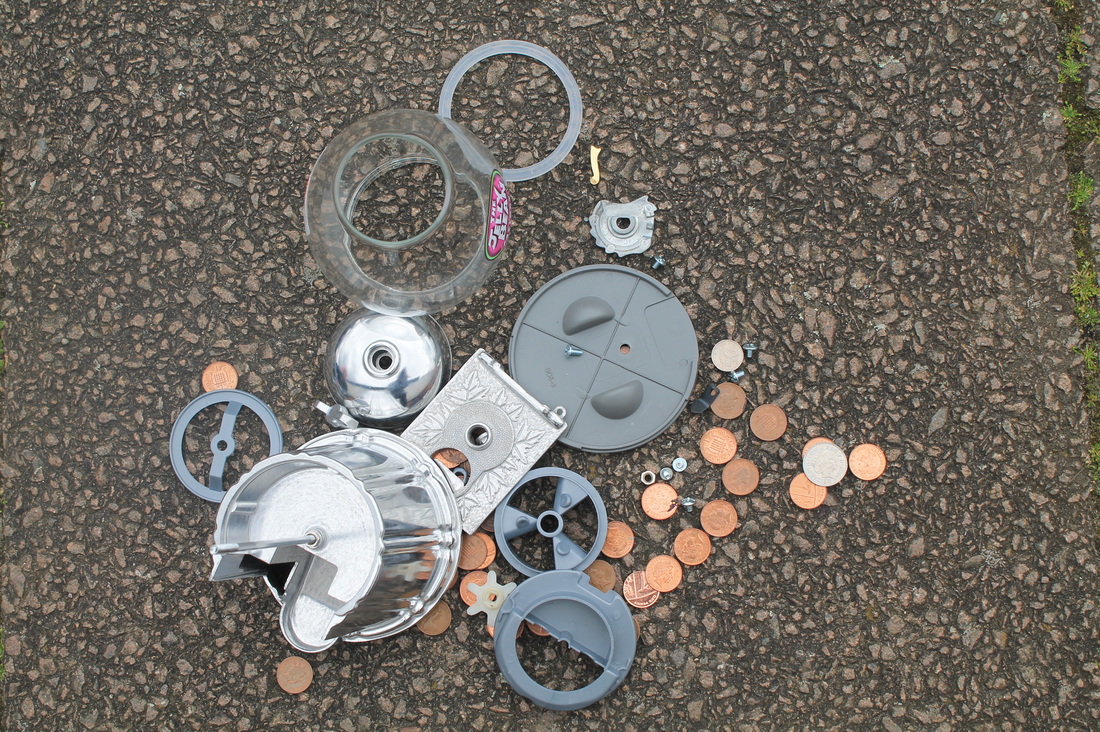
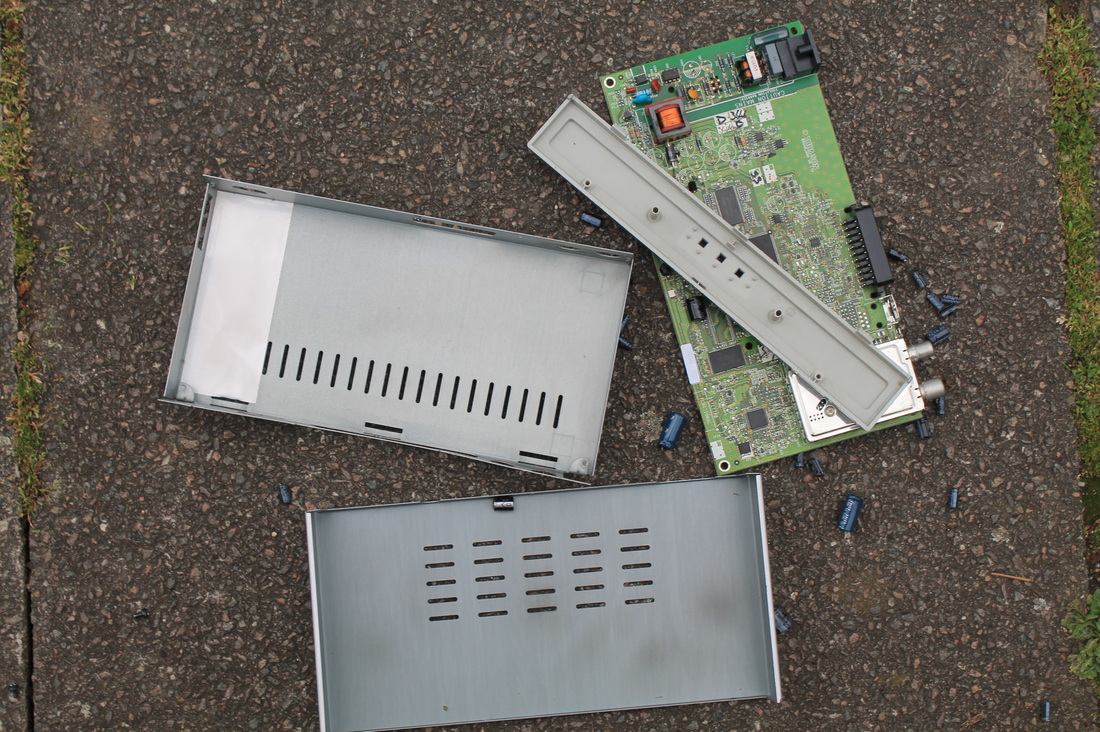
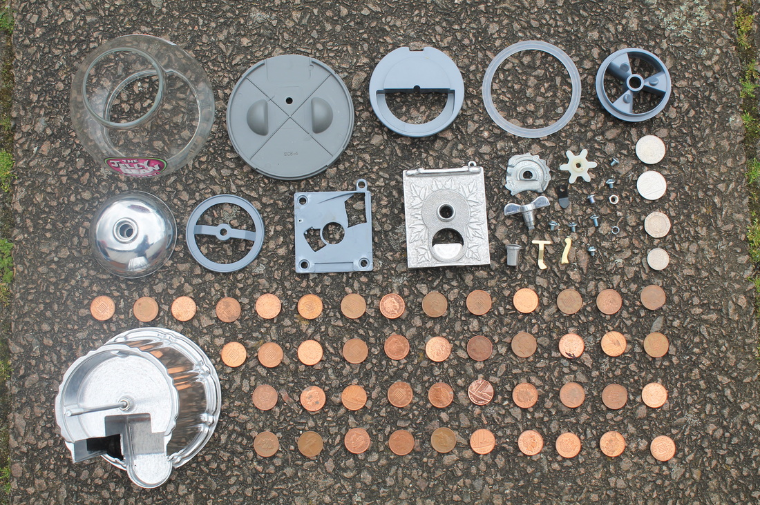
I did two more responses to Todd Mcellan's work to show order and disorder. The first response was the taking apart of a jelly bean machine, this was fairly easy to take because there were only a few large parts to it so you can see clearly in the organised image that there weren't too many parts to remove. The coins i found inside the machine dominate most of the shot and this could present disorder because in the before image theres no show of the coins and so it comes as a surprise. In the second response I took apart a device that I'm unfamiliar with because I couldn't figure out what it was. This made it interesting to take apart because i didn't know what I would find inside. Inside, there was a circuit board with batteries attached so I removed them and ordered them by size. This object was fairly simple too to take apart as there were only a few screws to undo.
Ari Versluis & Ellie Uyttenbroek - Exactitudes
|
|
|
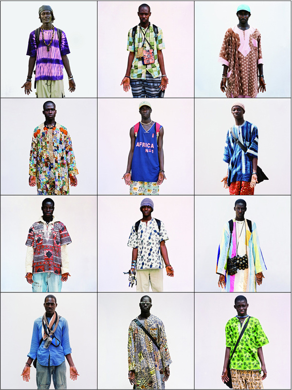
|
The project 'Exactitudes' by Ari Versluis and Ellie Uyttenbroek focuses on grouping together people of similar fashion styles. This presents order as it shows organisation and categorization of peoples apparel rather than having them all mixed together. The photographers picked people on the street with similar styles and/or accessories and asked them to pose in a certain way which added even more similarity. In addition to this, they were all photographed on a white back ground, removing all distractions which could draw away the attention from the centre. This project also has a sense of disorder as each individual style is so different from the next it produces a miss match situation.
Response
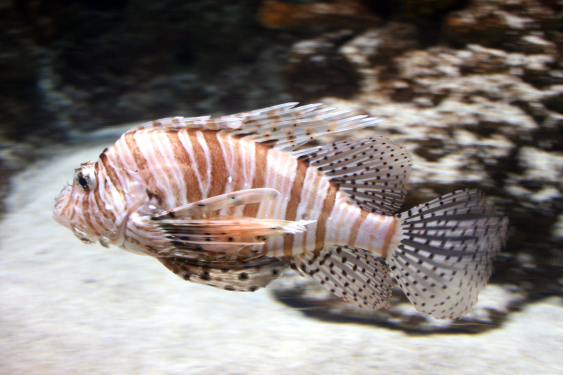
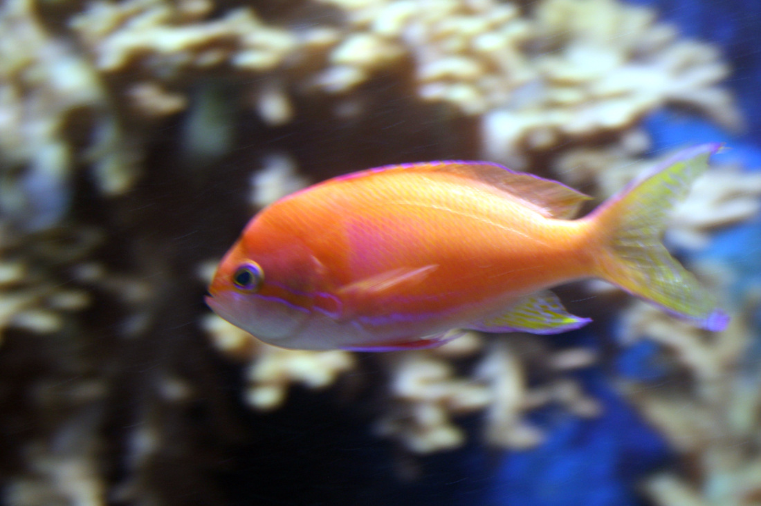
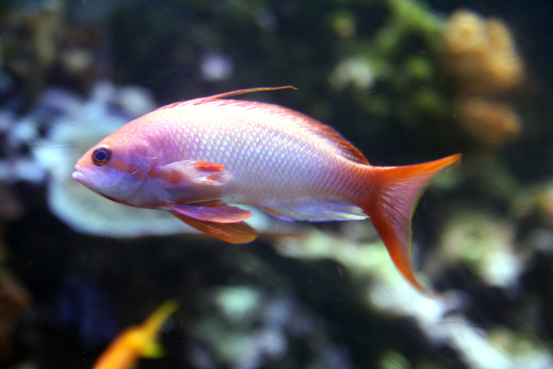
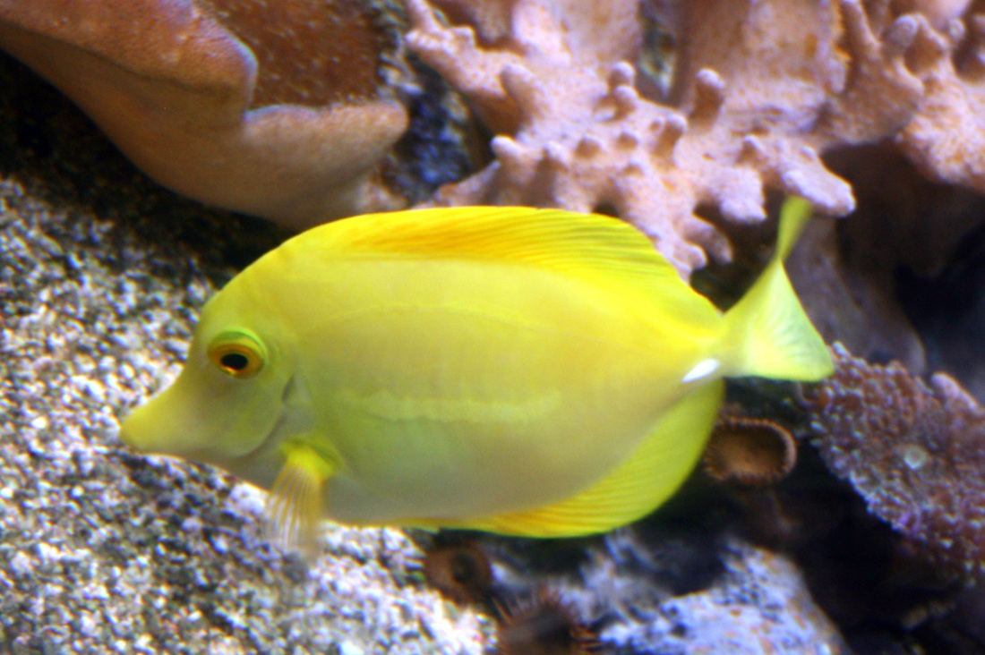
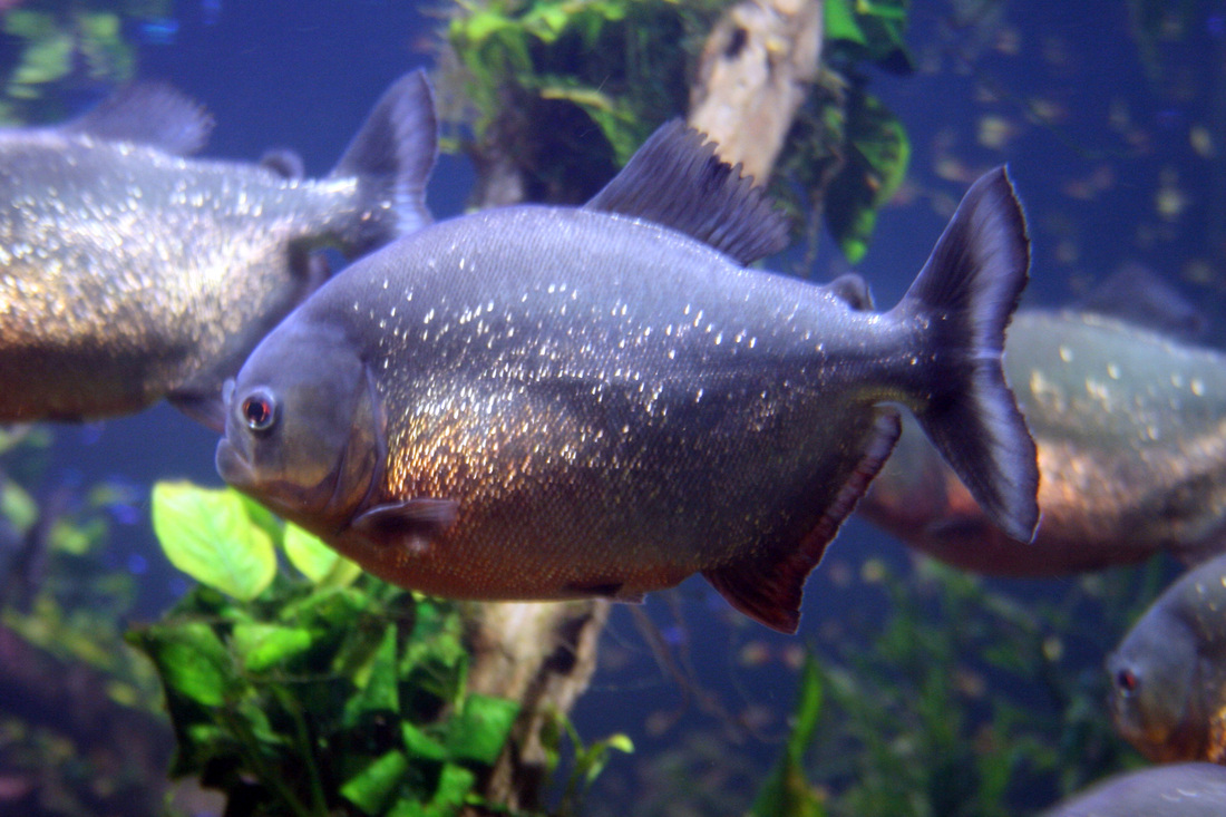
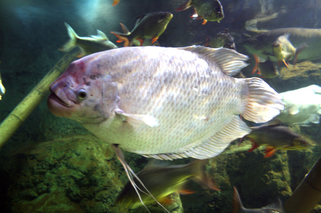
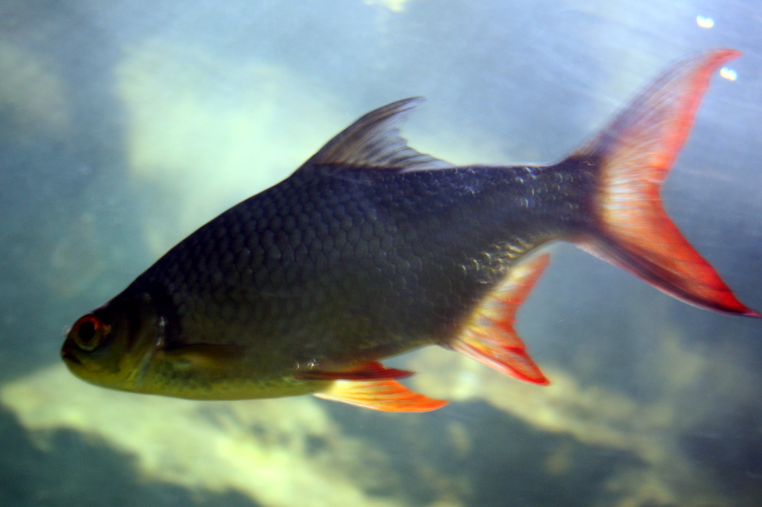
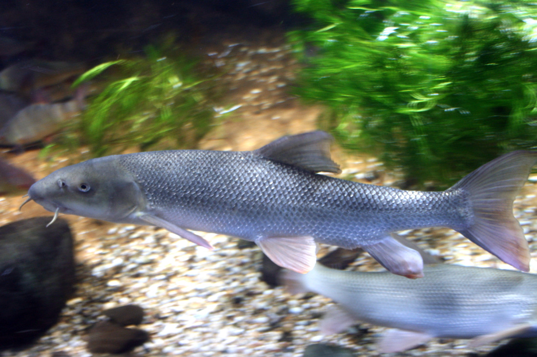
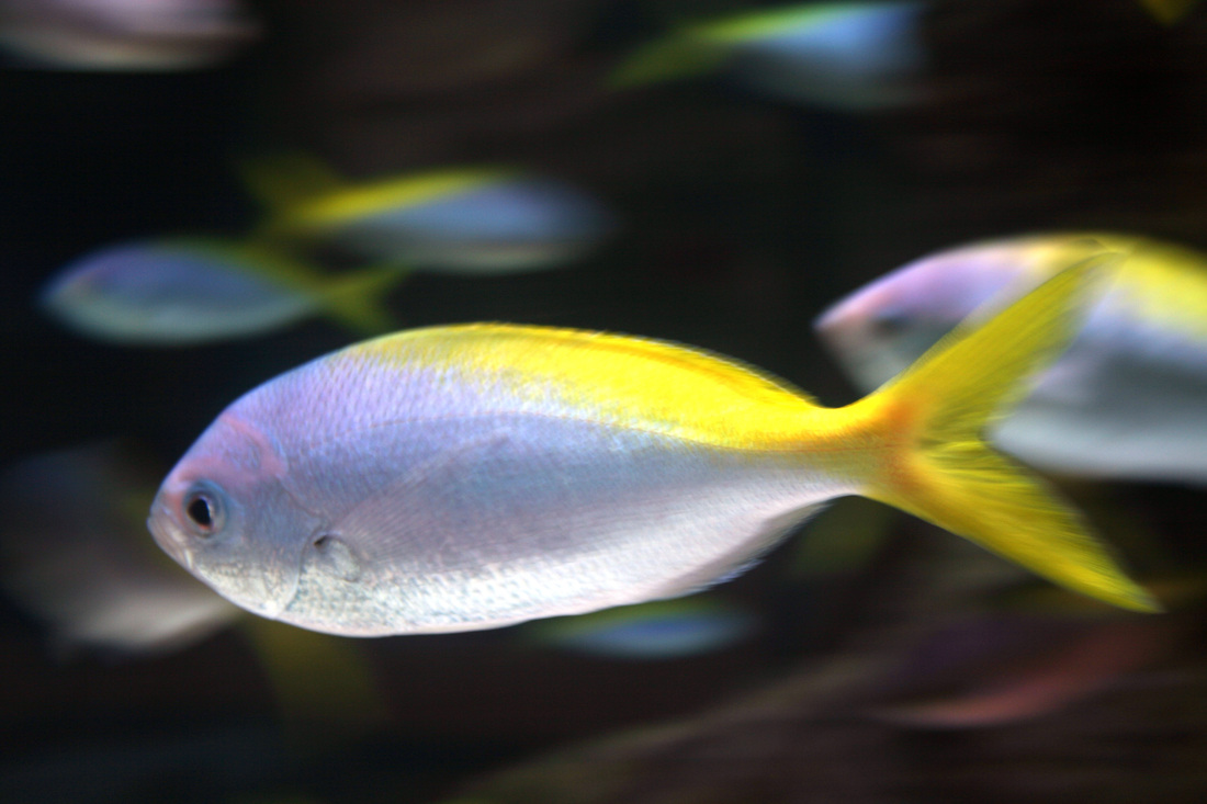
For my response I went to the aquarium and wanted to take shots of different species of fish similar to the 'Exactitudes' project, however, i wasn't able to get many pictures due to the conditions. It was very dim in the aquarium and taking pictures with flash was prohibited so I only managed to take a few clear shots with some brightness changing in photoshop.
Response
For my response I went to the aquarium and wanted to take shots of different species of fish similar to the 'Exactitudes' project, however, i wasn't able to get many pictures due to the conditions. It was very dim in the aquarium and taking pictures with flash was prohibited so I only managed to take a few clear shots with some brightness changing in photoshop.
|
|
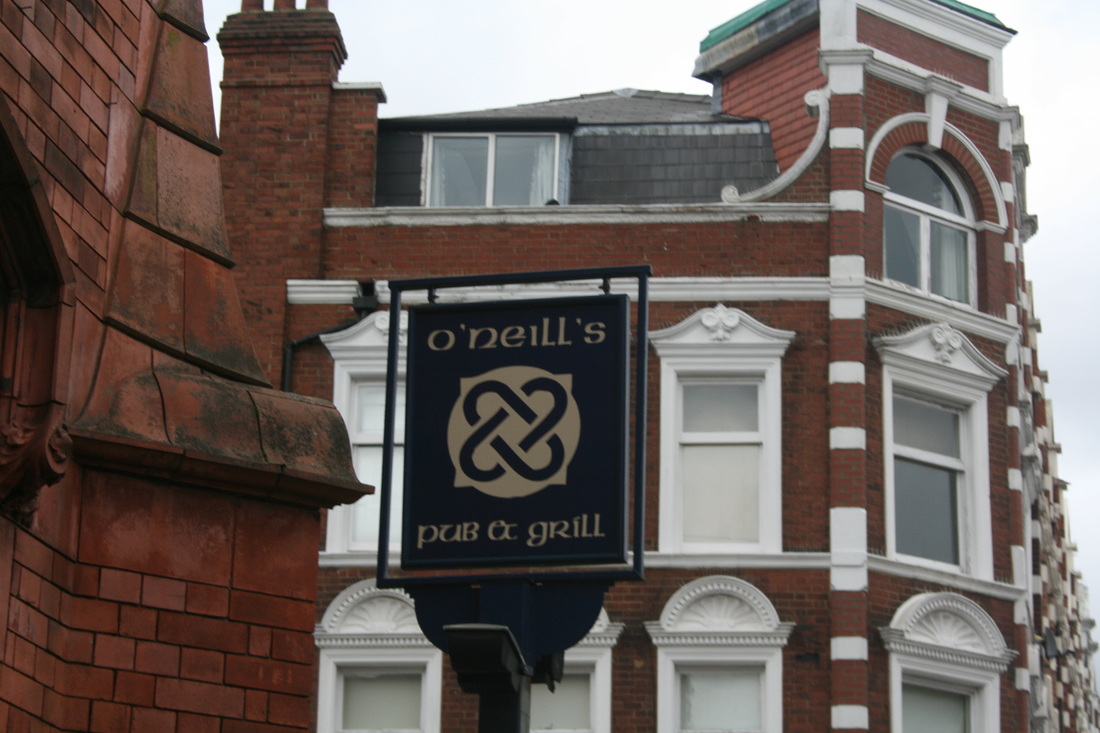
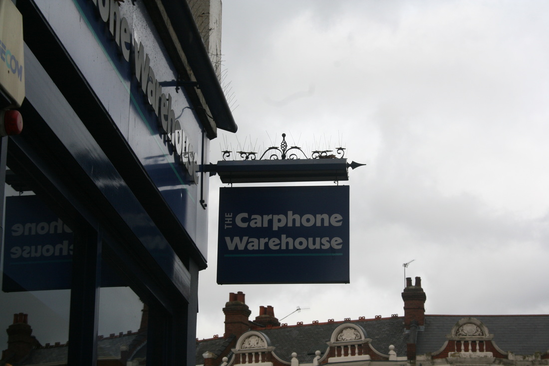
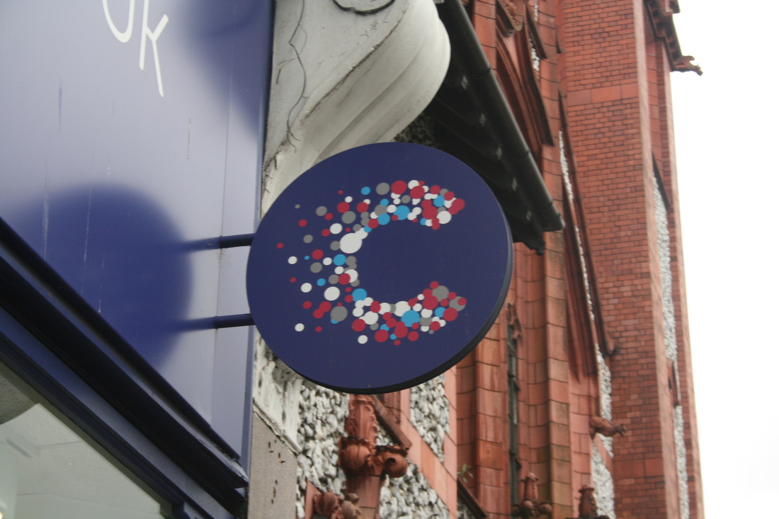
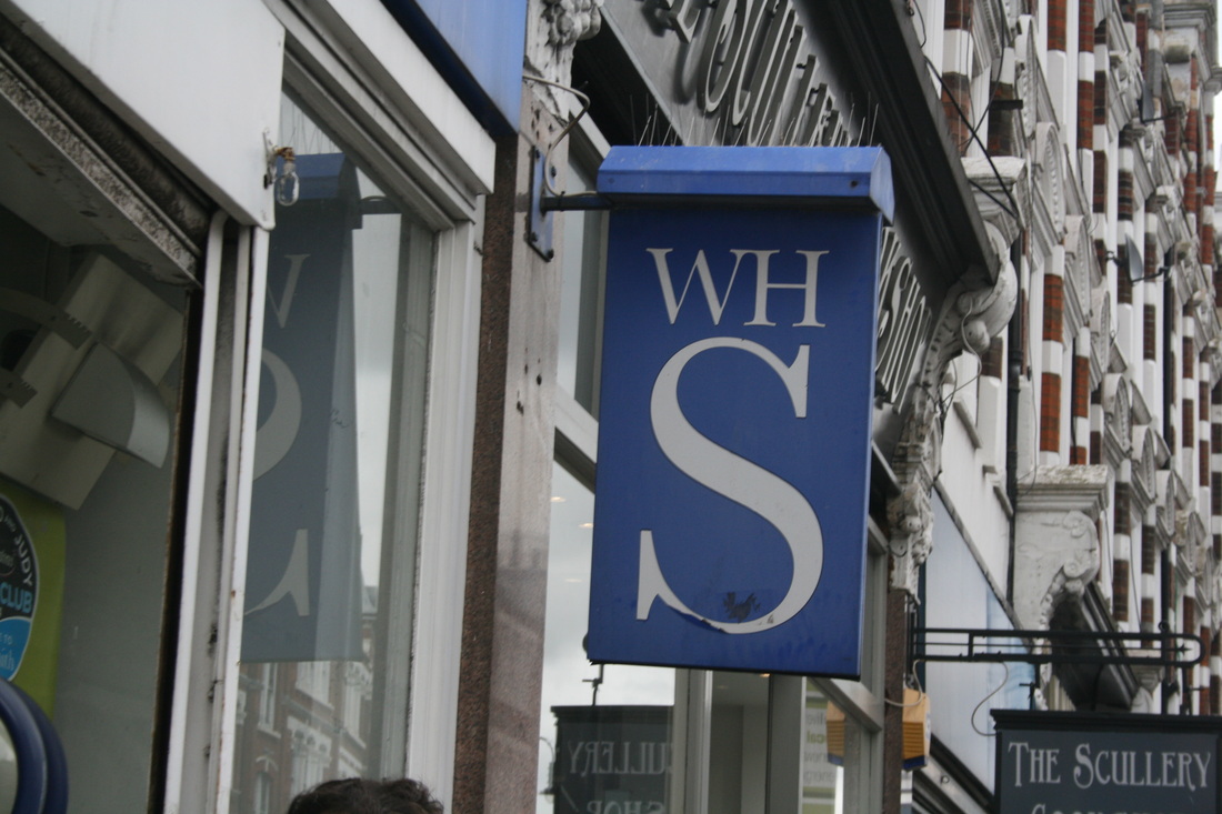
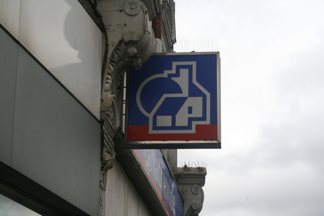
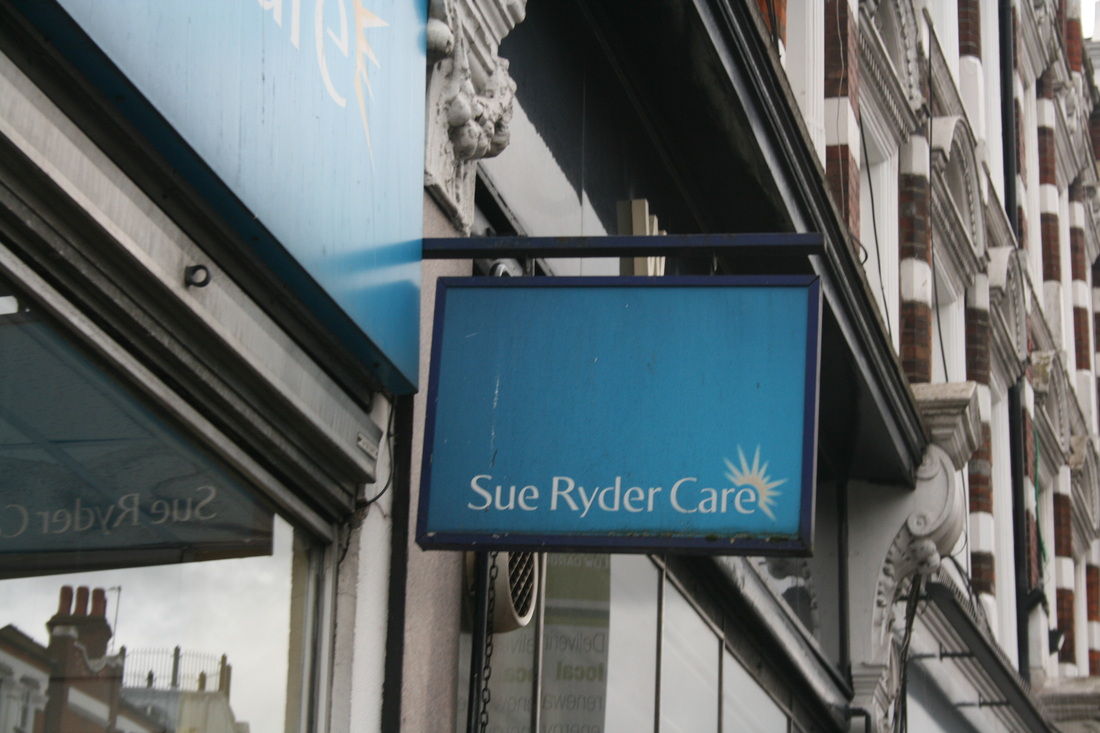
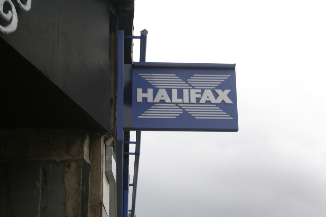
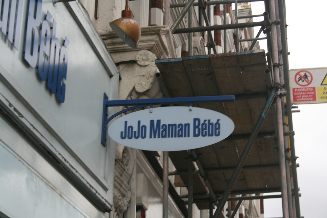
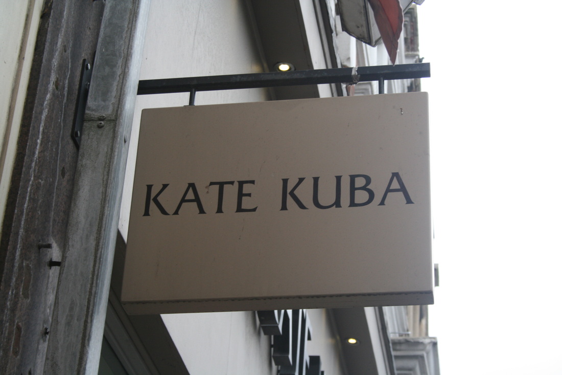
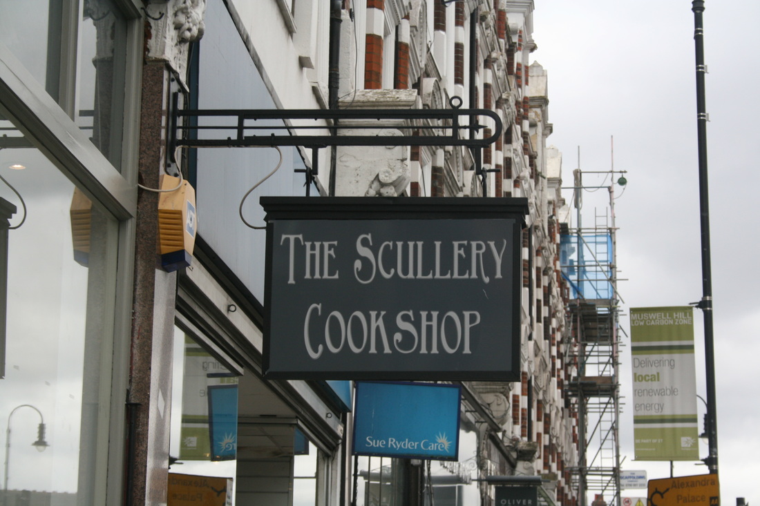
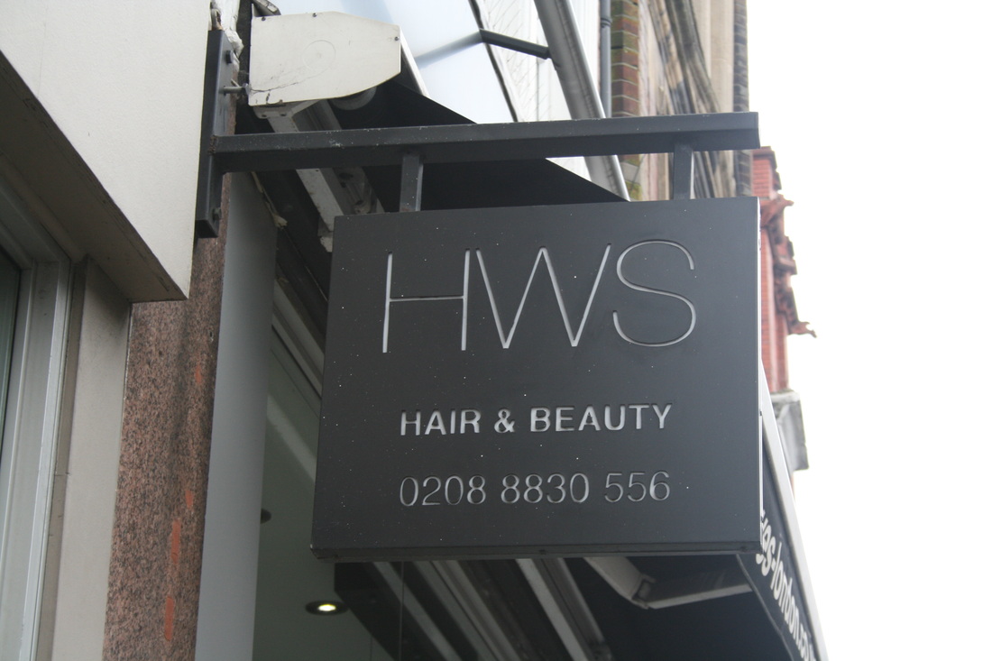
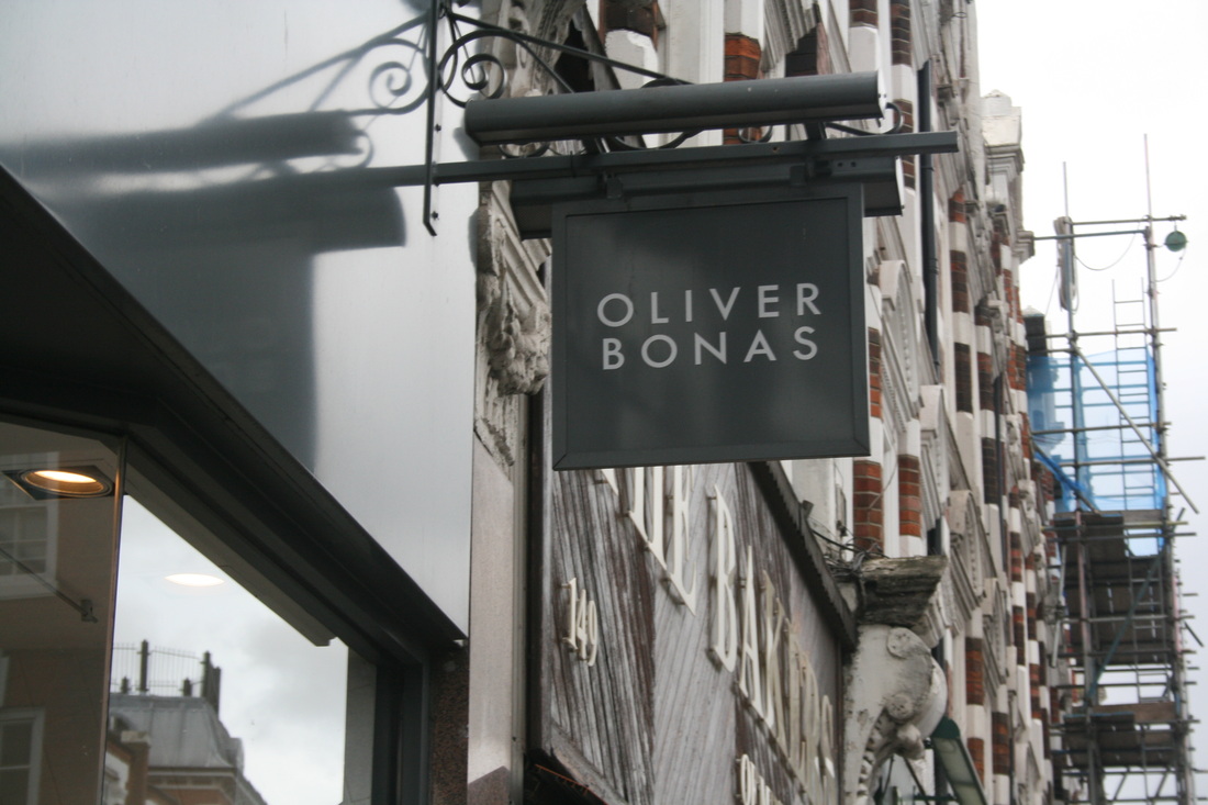
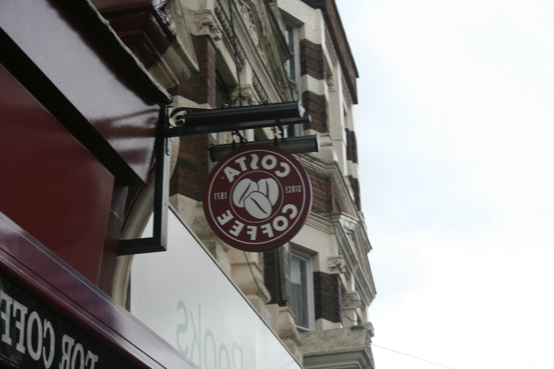
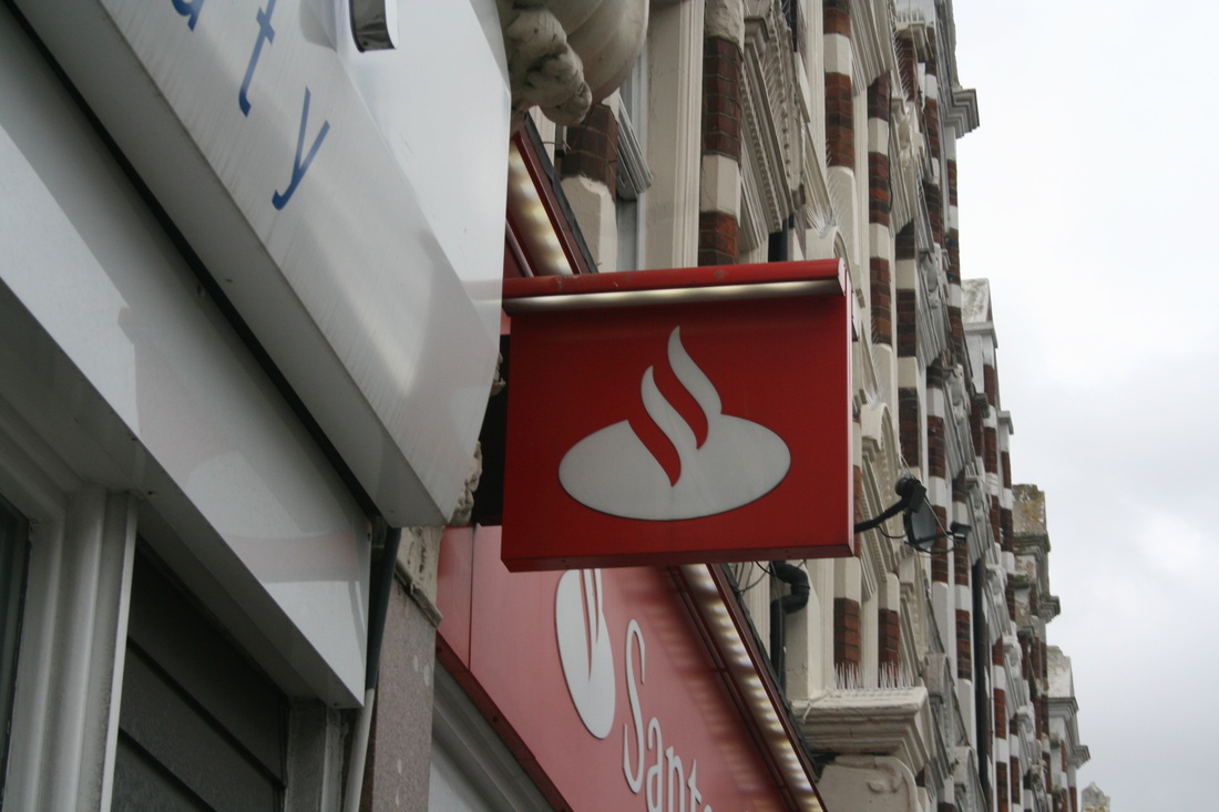
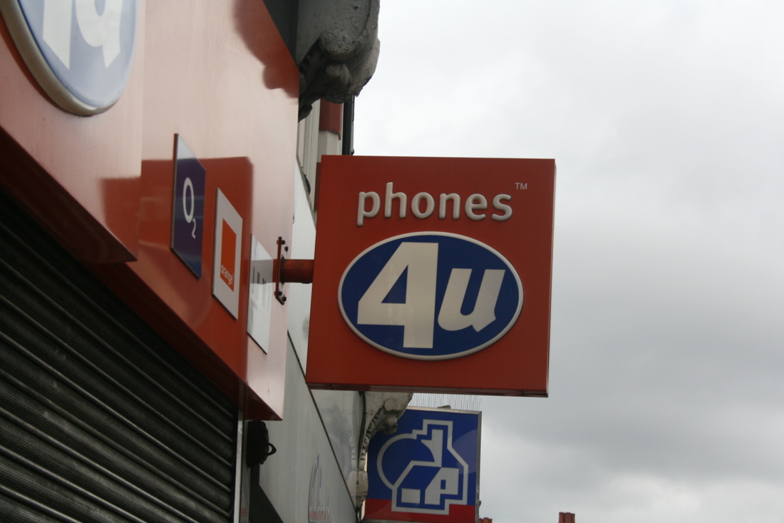
The fish gave me a good variety but i wasn't able to categorize them into different groups so i went for a different approach and took pictures of shop signs. I chose this because it was a more accessible way of classifying a certain thing. I went to my local high street and took the images below, i plan to expand on them so I can have a huge collection and can sort them into specific groups.
I organised the signs in this gallery by colour order. It starts off with blue then then white then grey then red. Grouping each sign by colour represents order because it shows that each one can go into a certain category. |
symmetric order
Jeff Van Den Houten
|
|
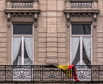
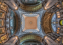
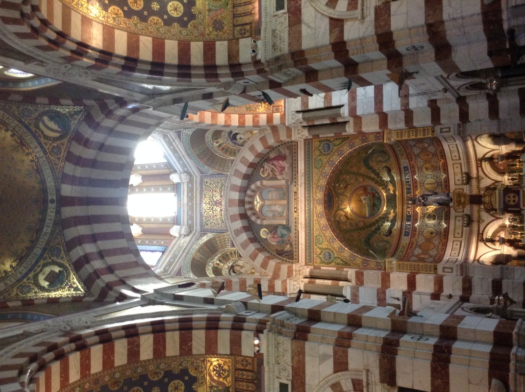
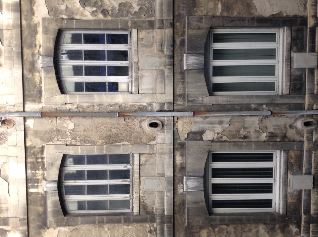
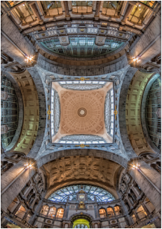
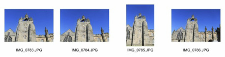
Jeff Van Den Houtens work is a good representation of Symmetrical order because each image shows an apparent theme of symmetry which creates the sense of order. The image to the far left has the impression that its symmetrical from a front on view, however, the shot was taken from an abstract angle making the picture more interesting. It shows order as each window is identical and is placed right next to each other so it also has a sense of repetition. The middle top image is taken in what look like an old building such as a church. This represents order because a church's atmosphere is usually quiet and calm showing order and peace. The ceiling here is also very symmetrical, however, still very detailed and intricate revealing the thought and hard work of the design of the architecture. The shot bottom middle also presents the theme of order because the two windows are, like the far left shot, almost identical. The bar in the middle separates the two windows making them almost seem as they're mirrored. However, it also has a sense of disorder because the flag draped across the bar disturbs the whole idea of symmetry in the image, however this element makes the picture all together more interesting due to the splash of colour it adds.
|
My response
|
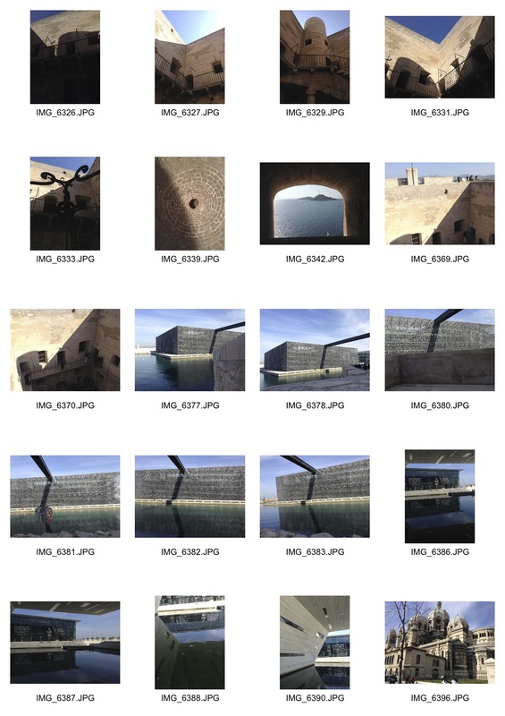
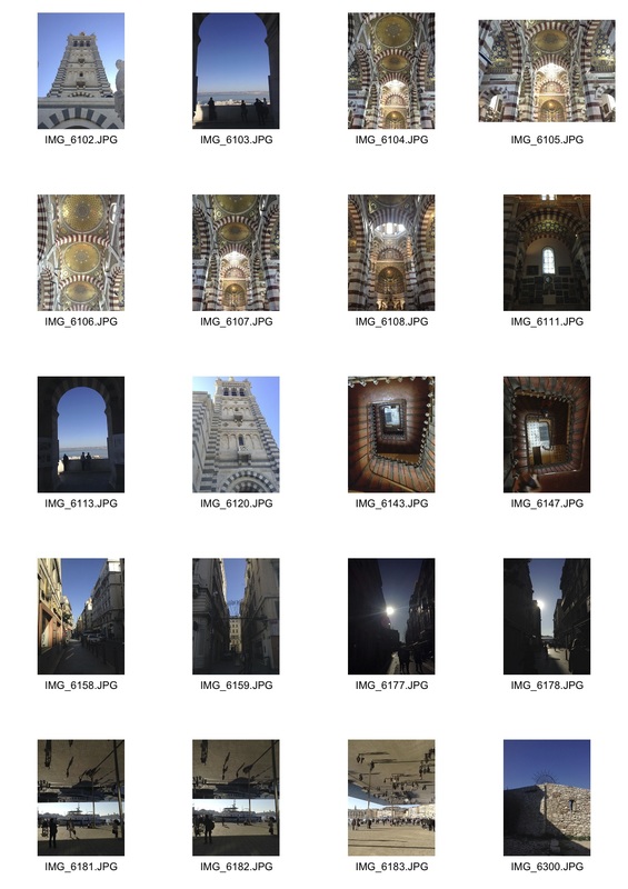
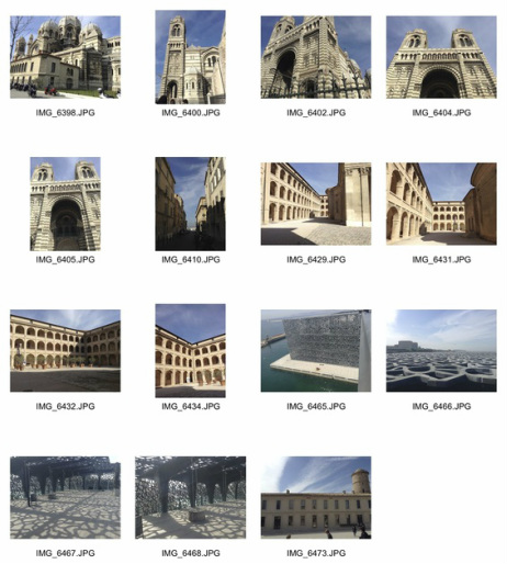
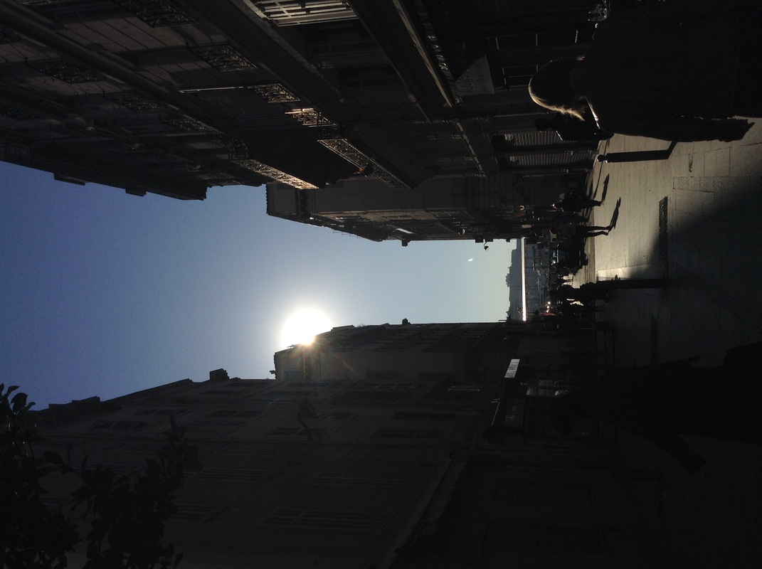
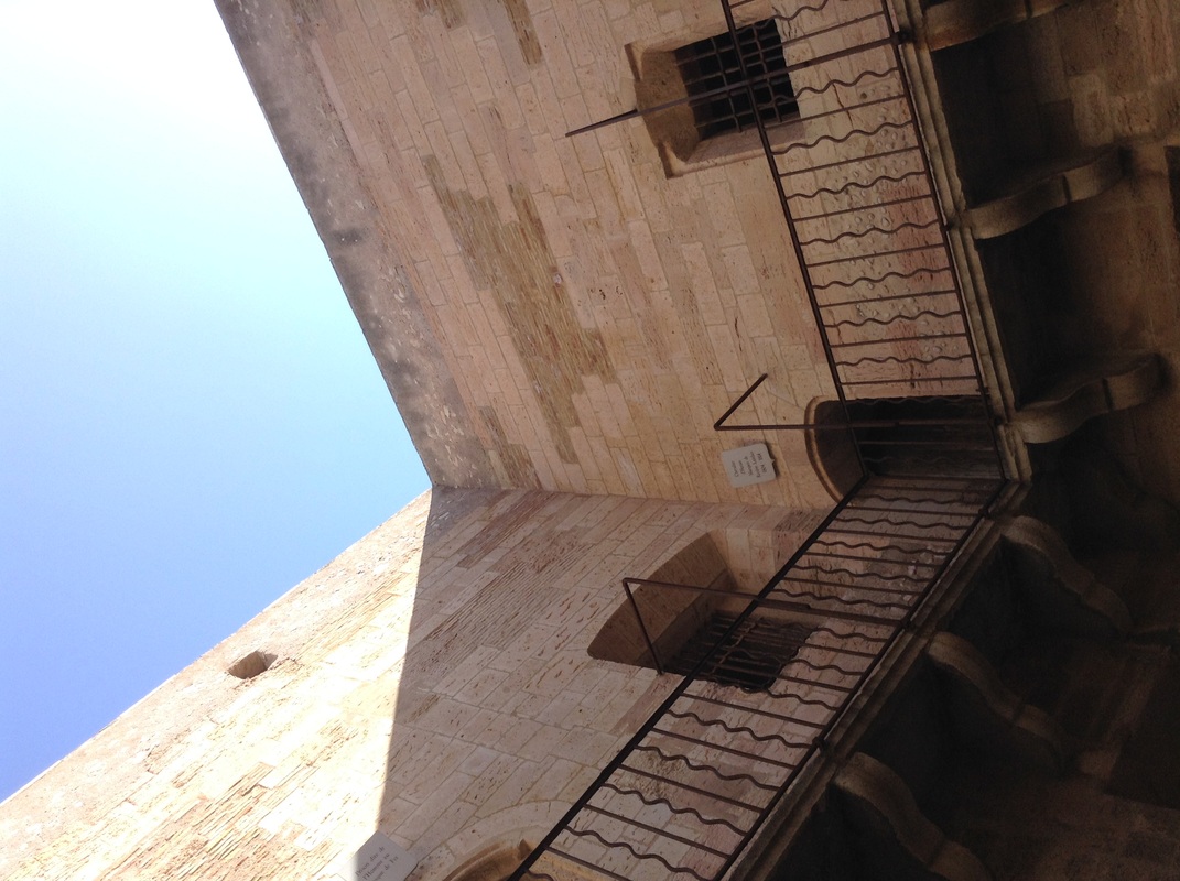
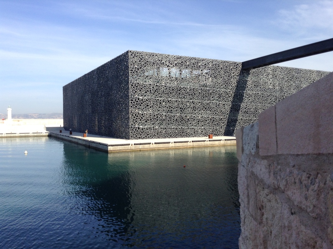
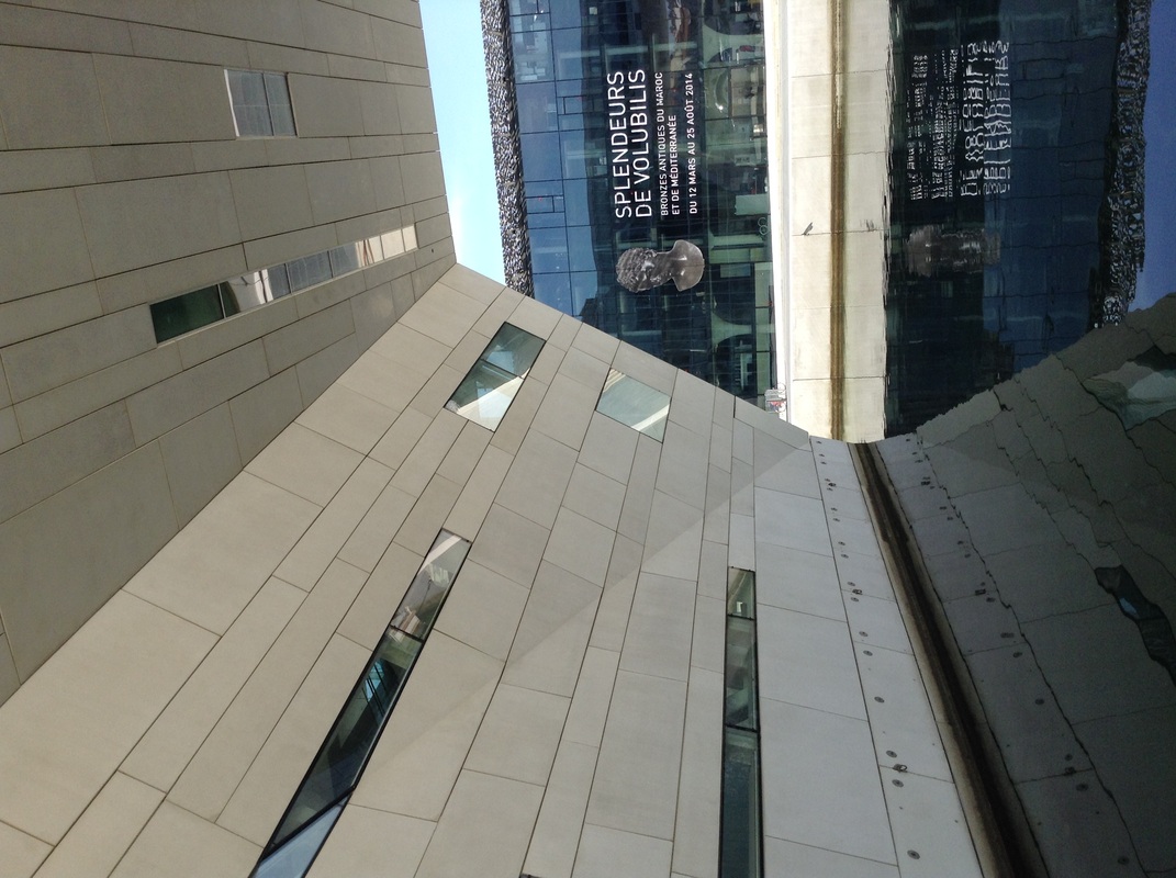
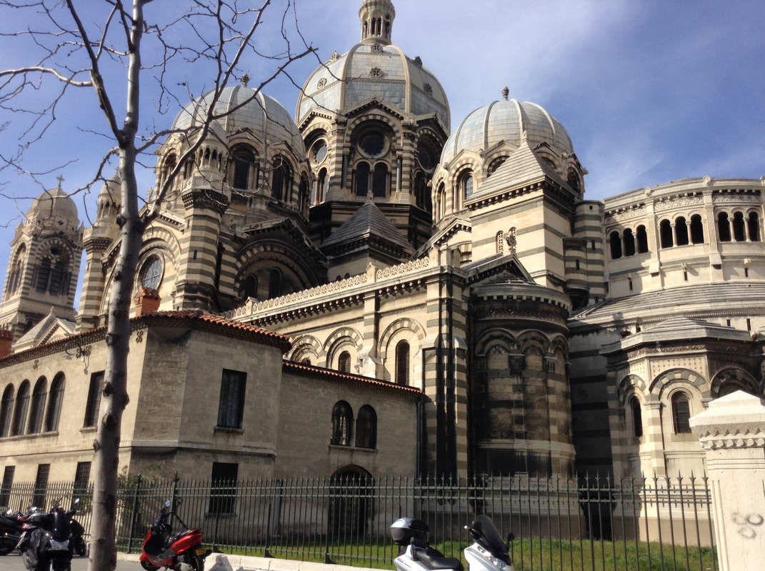
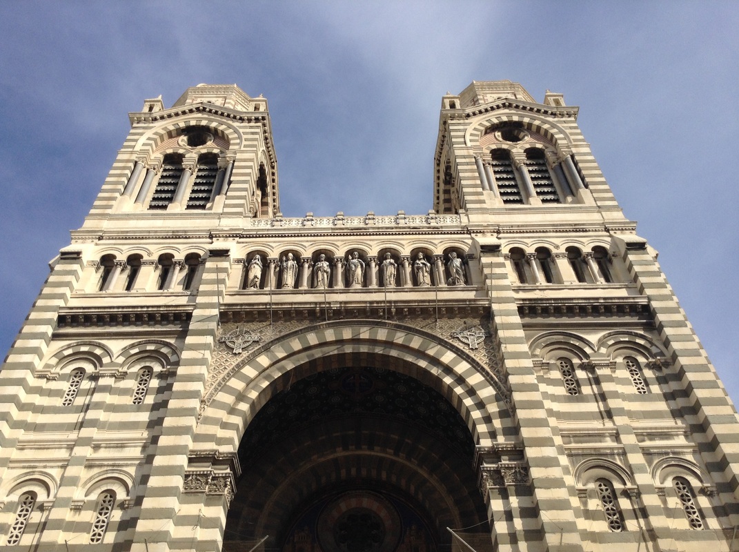
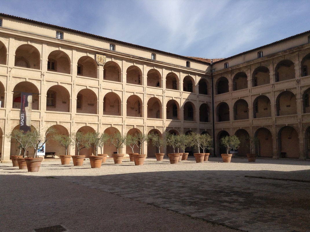
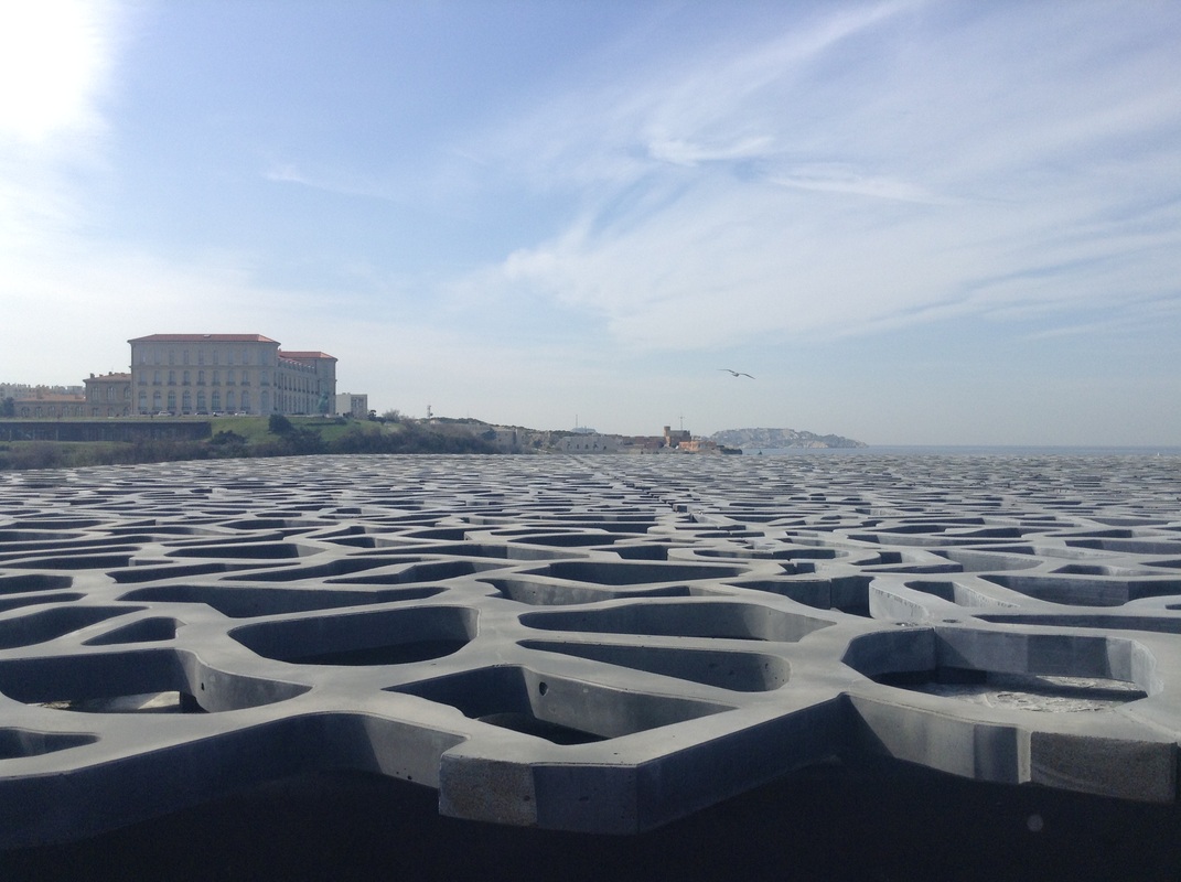
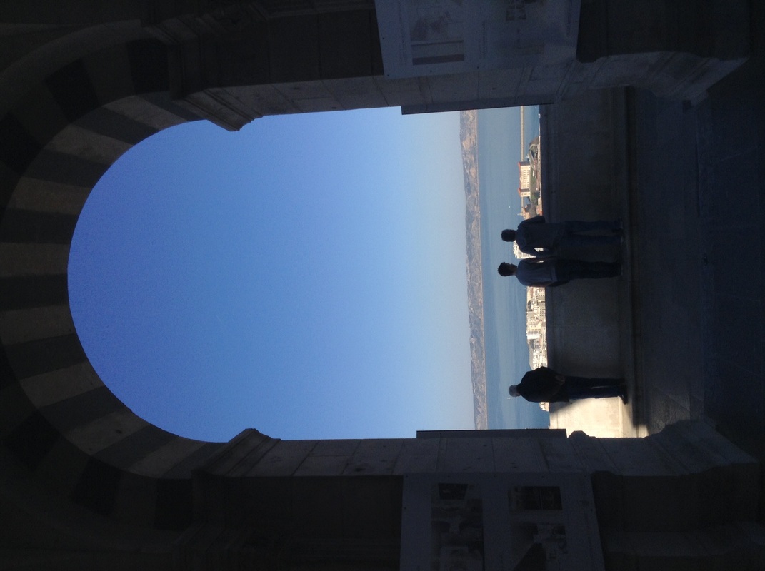
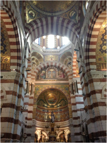
For my response, I based all my shots in Marseilles, France. This was a good place To take pictures for this strand because it had many churches and old, symmetrical buildings. Marseilles also had some more modern buildings such as museums and monuments which added some differentiation to the order. Many of streets were small and close together which offered many symmetrical shots.
|
best shots
Comparison
|
Jeff Van Den Houten's
|
My Interpretation
|
I thought that the shot I took at the Notre-Dame De La Grande In Marseilles, France was similar to Jeff Van Den Houten's image of an old traditional building. Although our shots are taken from different angles they both show a similarity in the colours. Both images have beige, orange, yellow and red shades which can be linked to religious buildings such as churches or cathedrals and this can be related to order as places such as these are known for having calm and peaceful atmospheres. Both images also show symmetry, this presents order as the buildings follow a certain pattern and there is no chaotic or modern architecture involved.
|
Development
|
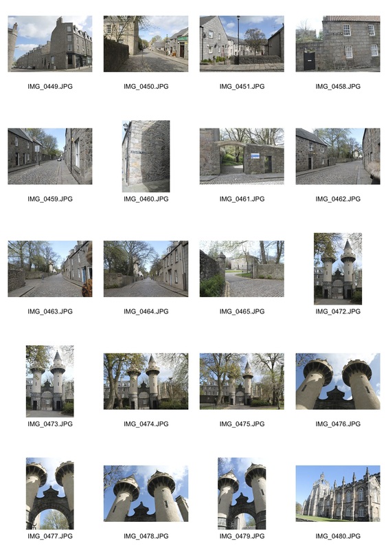
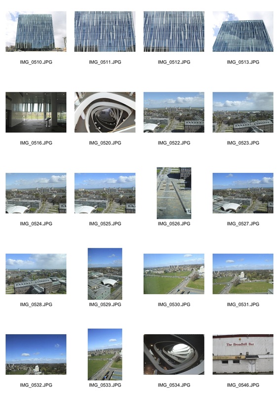
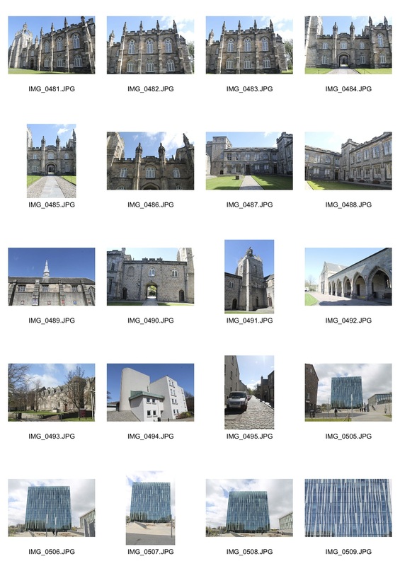
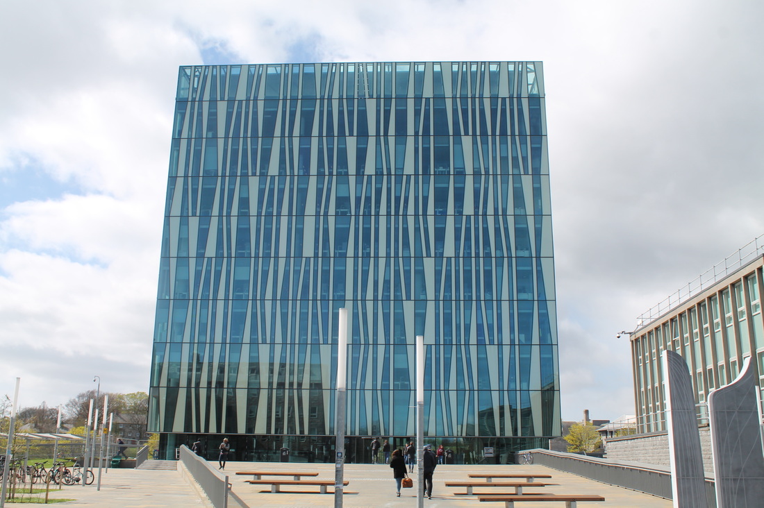
After Exploring traditional architecture such as churches, I thought it would be interesting to look for more modern buildings. For this, I went to Aberdeen, Scotland and it had a variety of both old and modern structures. Aberdeen is known as the 'granite city' which means that it has many buildings built from granite and stone which preview more traditional architecture. The reason for all the newer structures is because the town revolves around Aberdeen university so new buildings such as the 'zebra skinned' library were built.
|
|
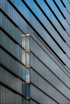
Bas Princen
|
My Interpretation
|
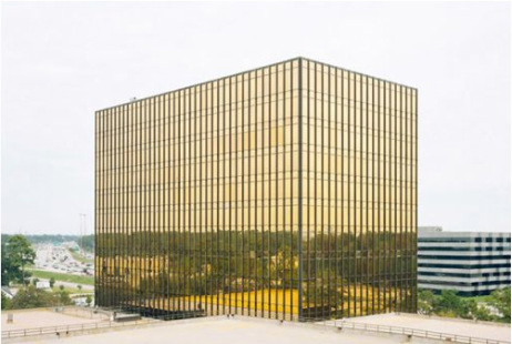
As you can see above I made a comparison between Bas Princen's and my shot. They're similar in the way that they both contain fairly new architectual designs in a 'box' shape. However, they have different colour and design. Bas Princen's image is interesting because it is taken from an angle where the skyline is reflected so it appears to be continuing. This make the building have an impression of being completely see through.
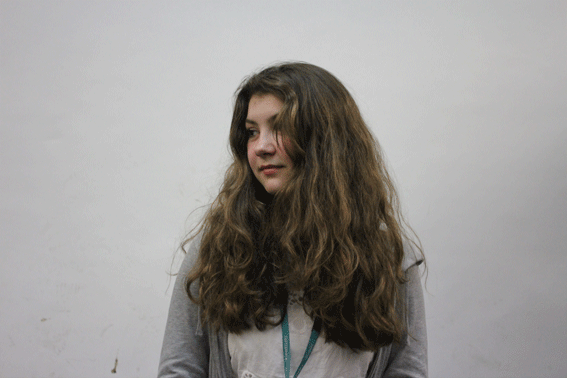
harry callahan
portraiture
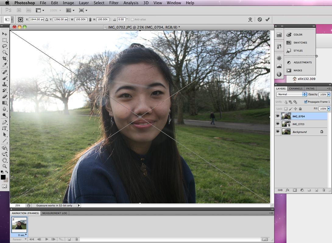
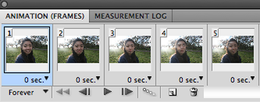
process of GIF making
|
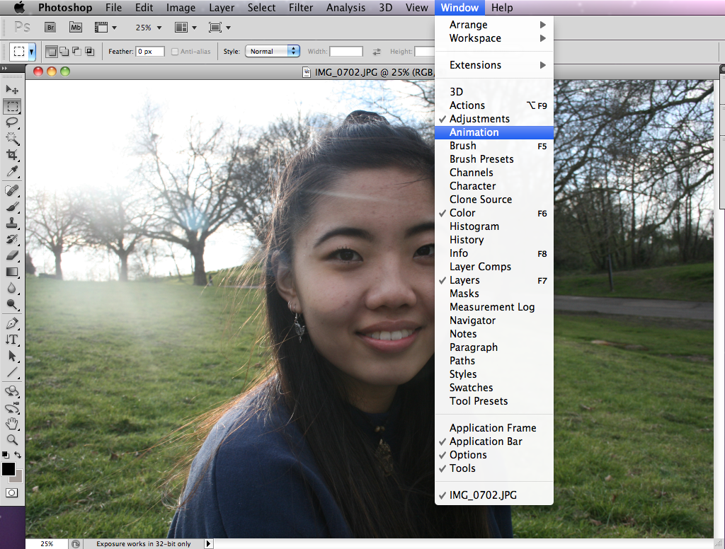
First, I opened up my beginning image. Then I selected 'Animation' under the tab 'Window'. This made the bar shown as above appear which helps create the GIF.
|
|
Then I started inserting all my images for the GIF into different layers.
|
|

|
|
|
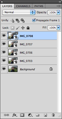
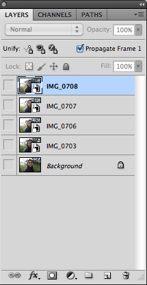
Once all the images were on separate layers, I unselected the small eye icon on the left of each image in the layers box.
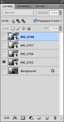
Then I added a new frame and selected the image I wanted for that frame and clicked on the eye icon for that image.
|
|
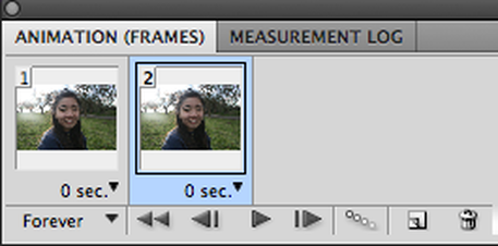
I repeated this process until I got all the images in frames.
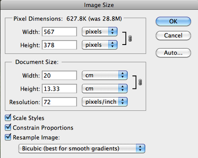
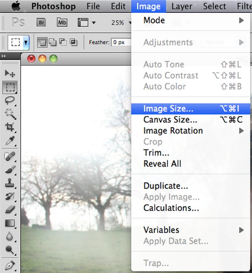
After that, I altered the image size so it would be easier to move around and transport.
|
|
|
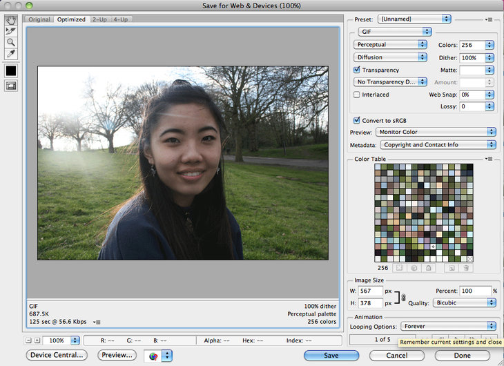
After I was pleased with a certain size for the GIF, I saved it.
|
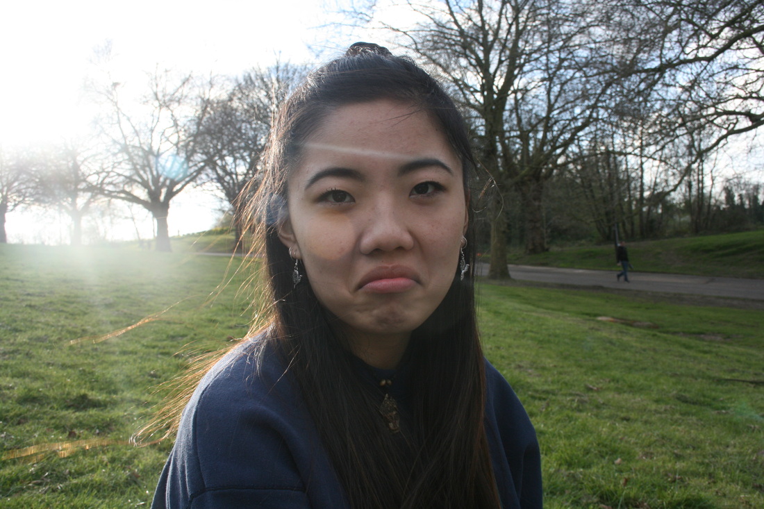
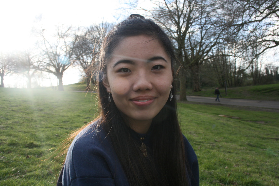
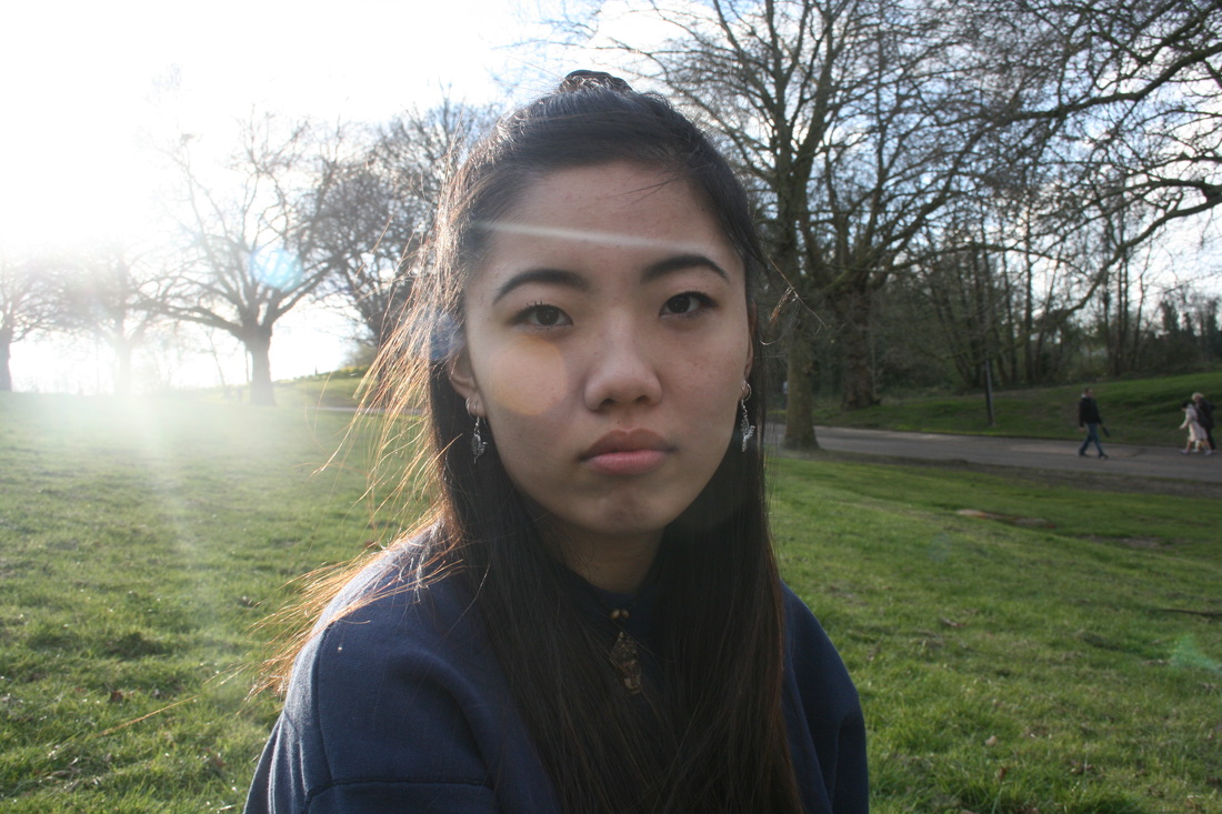
the outcome:
|
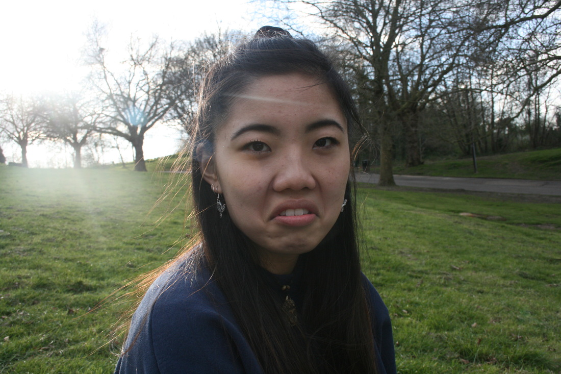
I liked the effect of this GIF because it it shows motion in a very disordered way. I asked the subject to make a different expression for each shot to present change. I then put them all into a GIF which made them look all split and discombobulated. This creates the theme of disorder as you can't see all the transitions. I liked this outcome overall, however, I would have liked it more if the back ground was still so it had a larger impact and you could notice the changes more on just the subject. I want to develop this more so I can have a more successful piece.
|
For the next four GIFs I wanted to use a blank canvas background so there is more focus on the movement of just the people.
In the two images above I just asked the subjects to move their head around freely so it made a blurry or more flowing effect. This presents disorder as it's all split up, however, it also conveys a sense of order too as it still preserves a flowing motion.
|
In the two GIFs above i got stills of each subject moving so it had more of a theme of disorder. This is because when all the images are put together they are all separate and different.
|
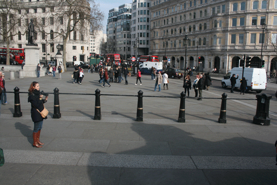
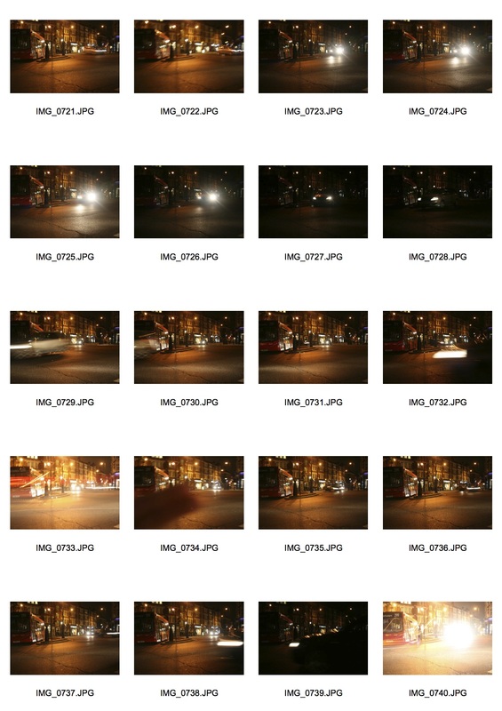
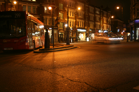
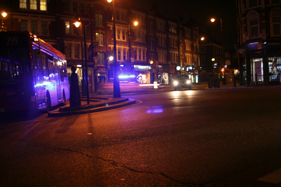
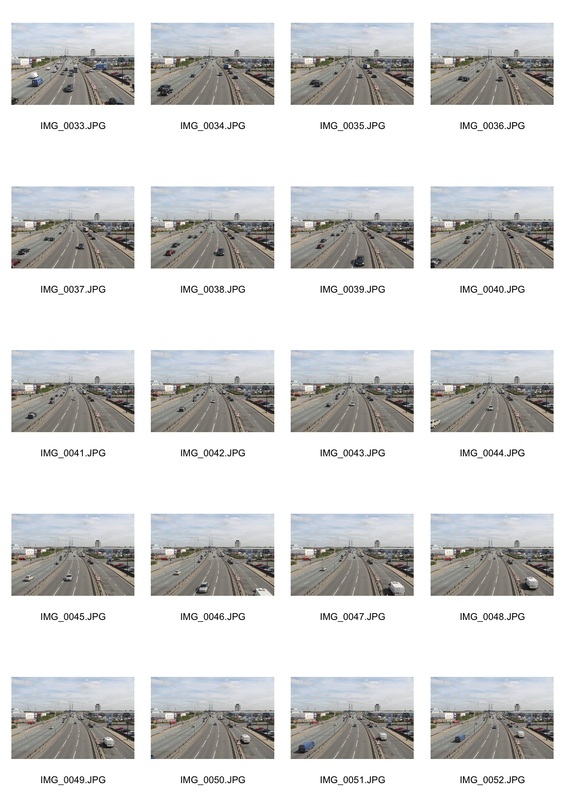
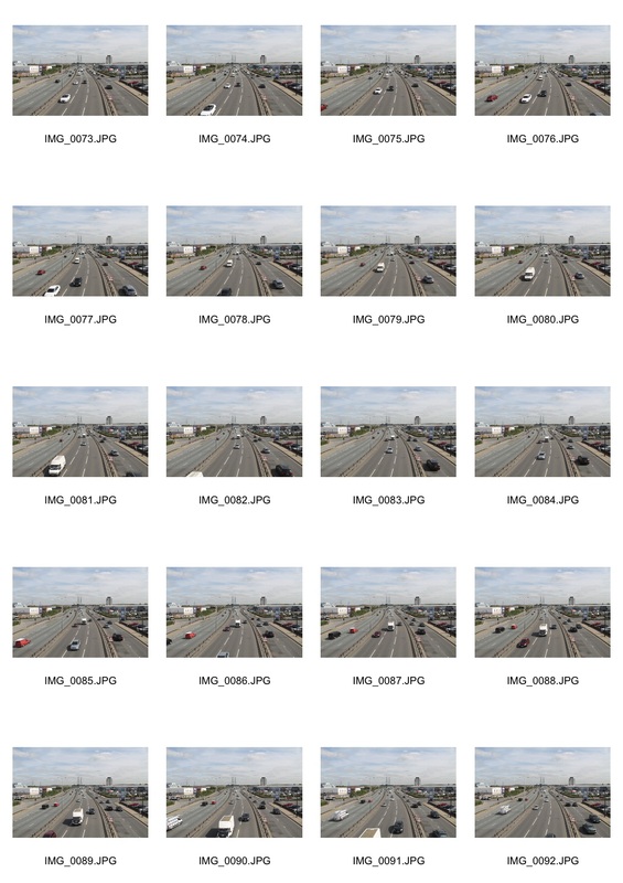
City disorder
I wanted to combine the idea of a GIF to represent one sense of disorder and also use the busy city to present human disorder. I went to Leicester square because this is a known place to be busy with both cars and people. The four GIFs below are all taken from different angles around the square.
|
|
In the two GIFs above I focused on the people aspect rather than traffic. The left image is mostly dominated by the fountain, i thought this had an interesting effect because you can just see a slip on the top of the people walking or sitting down. This creates the sense of disorder because not everyone is doing the same thing so the situation is all disorganised. The GIF on the right has a wider perspective of leicester square revealing a larger scale of human disorganisation. The building in the background is symmetrical and stays still throughout the GIF, counteracting the constant movement of people.
|
|
The two GIFS above show both human and traffic disorder. This is because so many people can be seen rushing and walking around. There is also a lot of cars and bicyclists going through the streets in no obvious order. However, it can also be seen as ordered because the cars are still following one flow of traffic and so in this sense they are organised. On the other hand though, the people have no certain rules to follow when walking around making them more disorganised than the cars. The combination of the these two factors make the GIFs overall quite disordered because it creates a very busy atmosphere.
development

|

|


|
|
|
I was overall pleased with this outcome because it shows disorder with all the fragmented and split up shots revealing the fast speed of the cars and this displays the disorganisation of the traffic in city centres. However, It also exposes a sense of order because regardless of the chaotic atmosphere none of the cars have had any contact or collisions which shows that there is an impression of management. In this GIF the lighting changes in each shot emphasising different parts of the scene. In darker shots you can only just about see the outlines of large objects and in brighter lighting you can see the whole image. This flashing creates a disordered feeling to the piece.
|
I took this GIF from the same location as the previous one, however, I had a more set and still frame which made it overall less jittery. I liked this response because it's a more clear representation of the busyness of the cars and how they appear to be disorganised but really have set tracks which make it ordered. If you look closely you can see the 'Belisha Beacons' (the lights at the zebra crossing) flashing at all different times. This relates to the lights coming from the cars and emphasises all different centres of moving light creating a disorderly image.
|
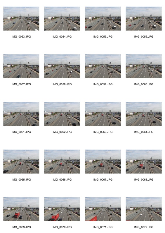
As I experimented with the disorder of cars at night, i wanted to try and get a slight contrast and get a similar result but in the day time so there would sharper images rather than the blurred ones.
|
|
The location of the shoot:
|
outcome:
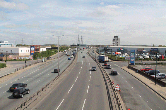
|
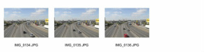
|
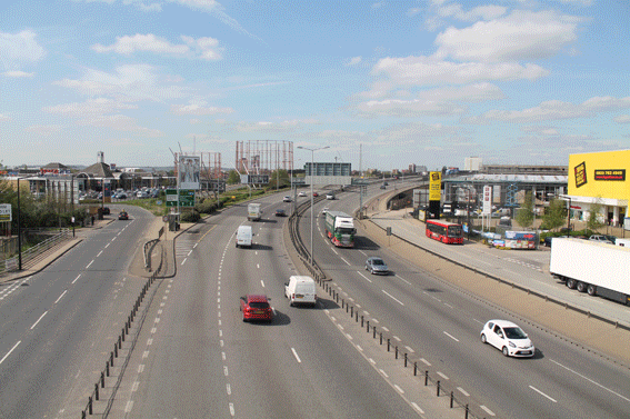
For the two GIFs above I went to a bridge in East London because it was on the A406 and I knew this could give me a good sense of movement with cars. Each GIF is on opposite sides of the bridge and if you look at both of them it almost looks like they're opposites or have been switched around which creates a sense of disorder. You can see there are three roads and on each one the movement of cars change directions and this presents order because it shows that despite the fact that all cars are moving in different ways they still manage to get through with ease which creates order. All the cars are also moving at different speeds which produces a very jumbled image and this can be seen as disorderly.
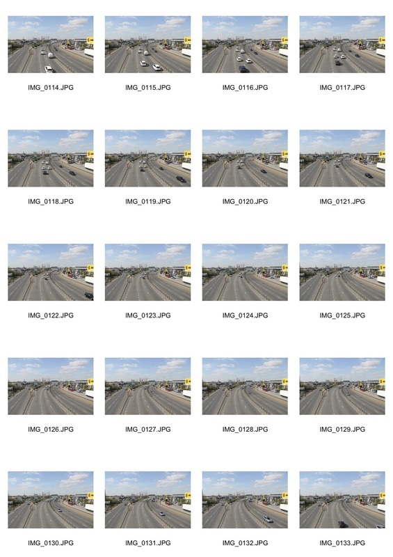
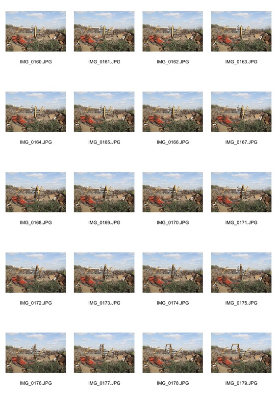
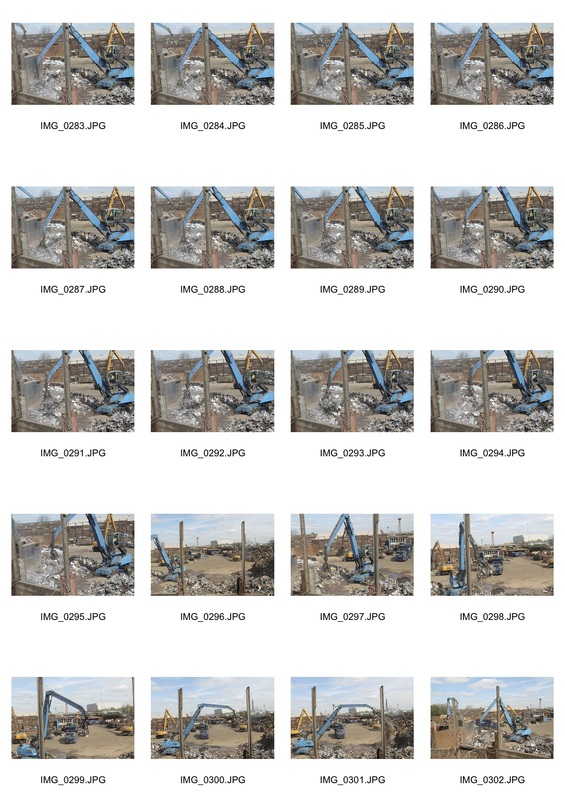
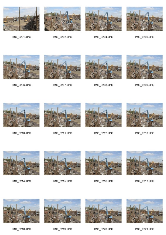
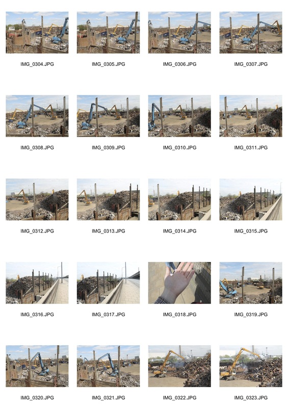
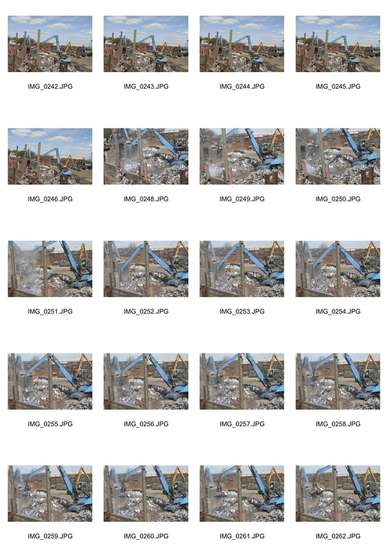
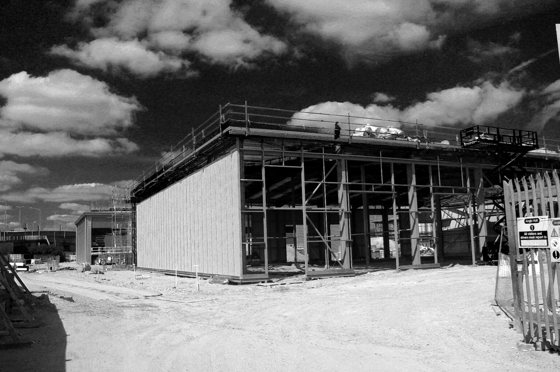
After experimenting with cars I thought it may be interesting to attempt a shoot with different vehicles such as cranes and other mechanisms to do with construction.
|
|
|
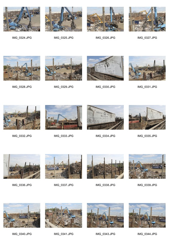
|
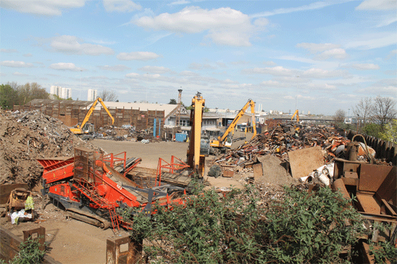
|
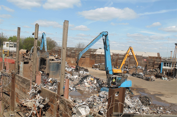
|
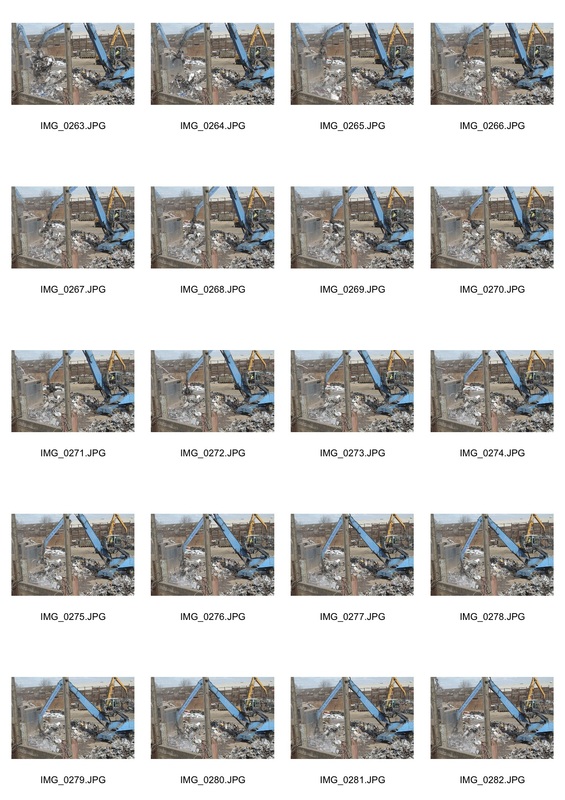
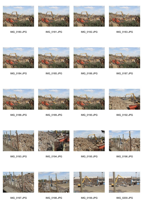
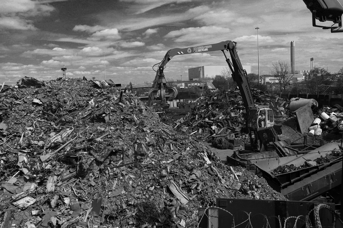
I liked both of these outcomes because there's fairly small and smooth movements in both GIFs, however, the background creates a large impact because there's so much going on. In the first GIF there's many meager movements among all the cranes and even a worker at the front. This creates a sense of disorder because there is movement across the whole image and in order to take in the whole surroundings you have to look each different section at different times. If you also look in the distance you can see a train beginning to make its way across the tracks which shows a combination of locomotives in the image and this creates variety. The GIF on the right shows very minimum movement but this gives the viewer an opportunity to take in the surroundings. The scrap metal site may be perceived as disordered because the first time you look at it it looks very disorganised and archaic but the reason for the cranes is to order the metal and so these images are very juxtapositional because they portray both order and disorder.
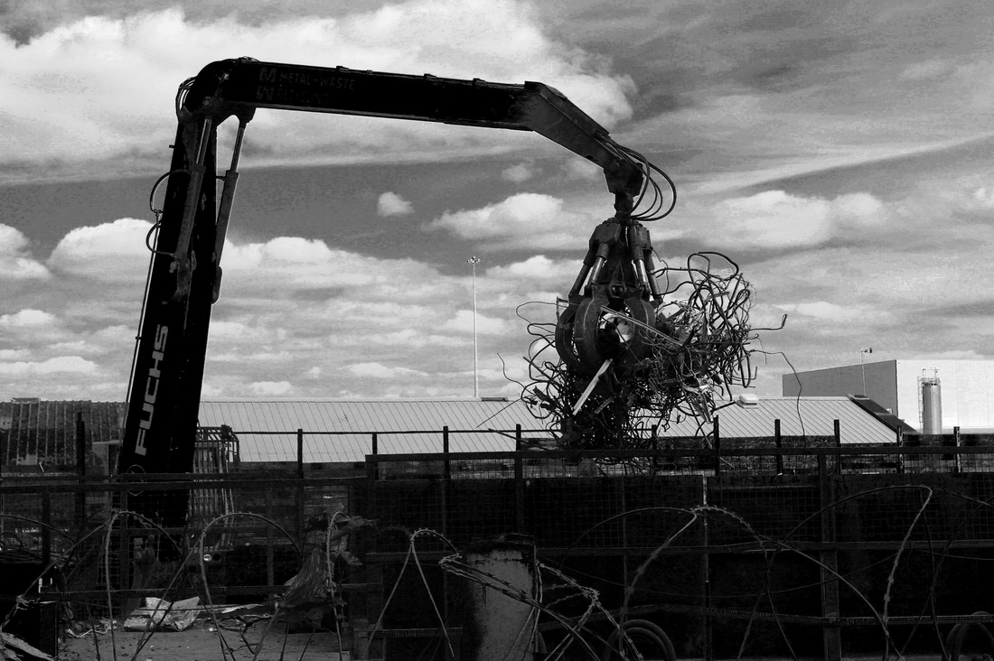
edited images
I also really liked the images I took from this shoot which weren't made to be GIFs. They create an interesting aspect of order and disorder, similar to the theme of the GIFs above. However, I edited these images on photoshop changing the contrast, converting them into monochrome and changing the presence of the colour tones in them. I think that the most intriguing part of each image is that the sky is darkened and this can be seen as disordered because the clouds in the sky give it the impression that it's daytime and so they create a confusing illusion. I find the 'grungy' theme quite interesting and I feel that I may want to use it for developing this strand more.

In order to further develop this strand I want to combine both human and traffic disorder and I think the best way to achieve this is to go into the city centre of London near London Bridge and possibly towards the south bank. Here, it's easy to find many cars and people rushing around to create a disorderly effect. However, this can be contrasted with the architecture which is very ordered and organised throughout the modern city so this creates a clear comparison.
Final Piece
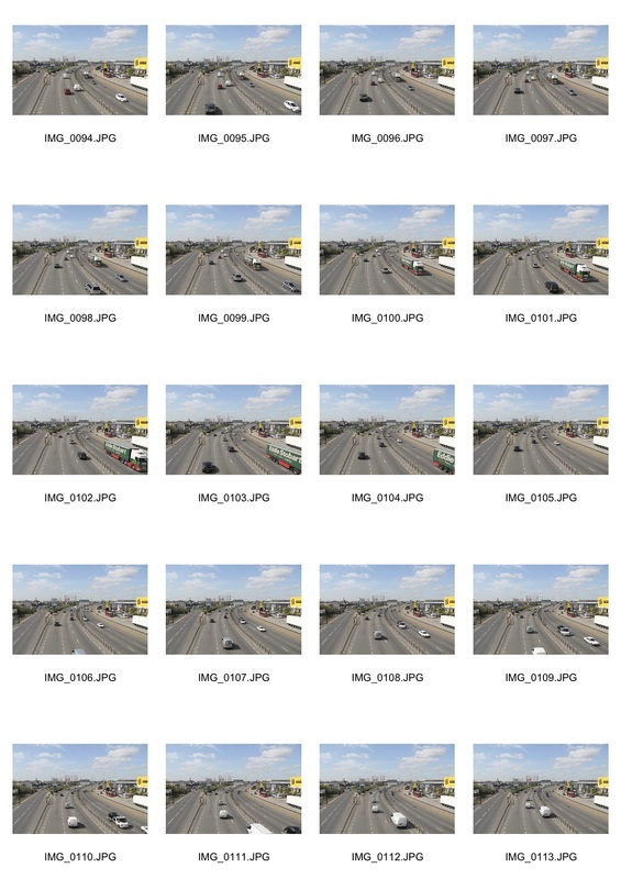
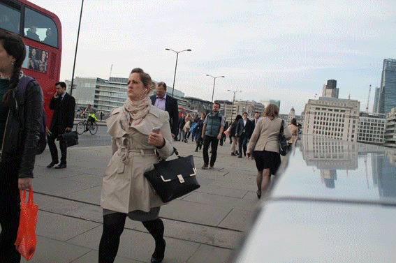
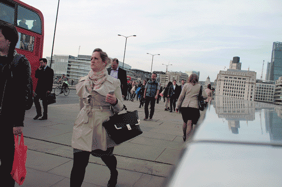
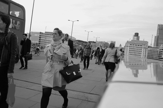
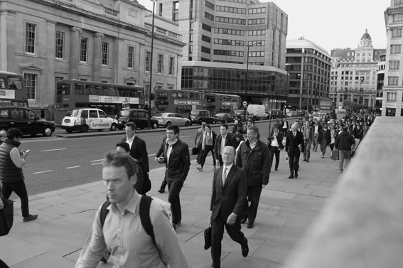
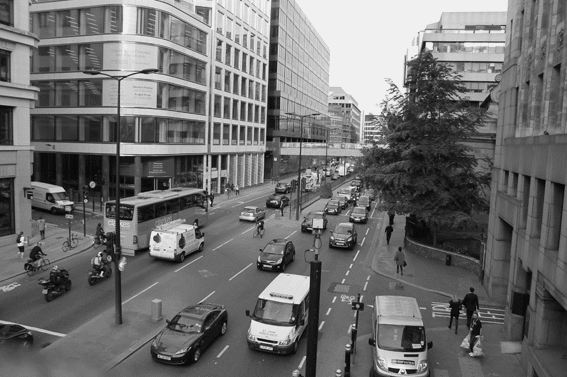
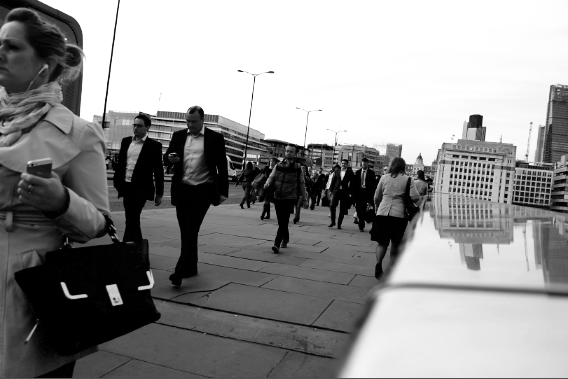
First, I explored around London bridge and found that many tourists and business people dominated the area and this created a good disorderly mix of people because they were all dressed differently and walking at different paces.
My first GIF is shown below and I felt that I could edit it to add more of a sense of order to it. I found that an absence of colour could create a more ordered image. I did a few different
My first GIF is shown below and I felt that I could edit it to add more of a sense of order to it. I found that an absence of colour could create a more ordered image. I did a few different
|
|
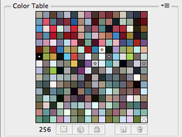
Test 1
For this attempt I used the full colour table of 256 colours available. This is the format I used for all my previous GIFs so I feel that I may want to experiment a bit more with some other colour tables. |
|
|
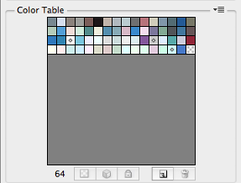
Test 2
Here, I used a colour table of 64 colours. You can see that this has a small difference compared to the the first test despite the absence of 192 colours. |
|
|
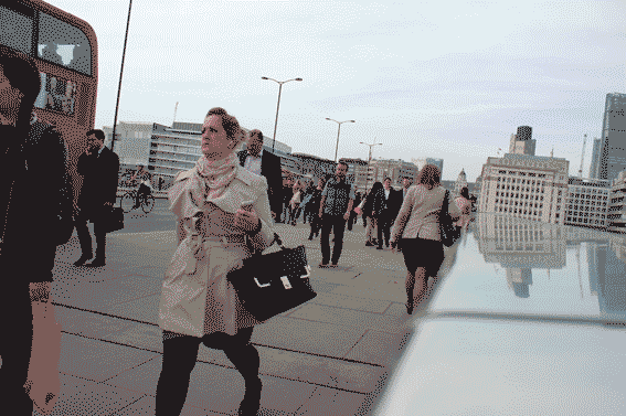
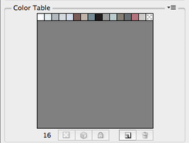
Test 3
In this test I used only 16 colours from the colour table and now if you compare this one to the top one you can see a greater change and can actually notice the absence in colour. |
|
|
Test 4
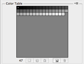
For my last test I just used the grey scale colour table with 47 colours. I liked this one the most overall because it presents a complete absence of colour. This is orderly because the image only consists of shades of only two colours so theres no mix of colours to create confusion. |
|
|
|
I took these three GIFs on London Bridge because they show a good variety of movement between both people and cars. I put all their colour tables to black and white which I think adds a sense of order because it's harder to distinguish the people and cars by their colours. Order is also created from the surroundings. As you can see along the streets there are many 'boxy' and modern symmetrical buildings similar to Jeff Van Den Houten's work as shown in the symmetric order strand above. As you progress left to right on each of the GIFs you can see that I took them further and further away showing the difference in the busyness and disorder of each one. I found that the further away from the scene you go the more ordered it can perceived as. This is because you have a broader view of the whole situation meaning that you can see the traffic and people flow.
|
Mattia Bicchi:
|
|
I have similar work to Mattia Bicchi where she went to London City to take a time lapse piece. However, Bicchi uses a video format for 'London: A time lapse video' rather than a GIF. This format is more suited to longer time lapses and more of them put together. Bicchi also has a 'hyperlapse' video which means it's taken over a very long period of time. My work is more focused on shorter periods because it presents human and traffic movement more clearly unlike Bicchi's work which focuses more on the movement of the river and movement of the sky. I feel that for my final piece I would like to change my GIFs into video format so I can have a longer piece with a larger visual perspective of the city.
|
|
|
This Video of movement around a city is also similar to what I'm working towards in the way that I want to capture people and cars around London. However, I want to work more in the day time rather than night because most business people and tourists travel around during the day so it would give me a better opportunity to capture more movement. But I like how the artist went to the busiest areas in Los Angeles to take the stop motions because it captures the most crowded areas and this shows a clear portrayal of disorder.
|
|
For this I turned the first GIF I made into a video. It looks fairly similar to the GIF so I need to speed it up a bit to make it flow better.
|
This video consists of my four GIFs shown above. For this I put them all together without any transitions to represent a swift change which could be seen as disorderly. I also sped this video up by 4x faster than the previous one.
|
To develop this further I need to take a few more pictures to lengthen my stop motion. For this I'll take pictures of a similar area.
|
Process on imovie of making a time lapse video with images:
The GIF here shows the process I went through with each stop motion and after this I put them all together and sped it by 4x. |
|
|
|
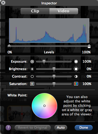
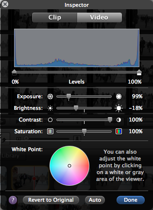
I then experimented with the images appearance. I found that I liked a fairly low exposure and brightness but a very high contrast level. I think it makes the images look more old-fashioned and as this is related to when more traditional ideas were valued it gives it a sense of order.
|
The song which I thought suited this piece most was Lost by Frank Ocean because it has a clear beat in it which could make it seem more orderly. I then found a few remixes which suited the piece a bit better and the one I chose was the bottom right one (the ISTRES remix)
|
|
|
|
Final Piece:
I was overall pleased with my final piece because it presents both order and disorder in a juxtapositional fashion. Order is created through the broader outlook on each scene, with a far away view you are able to see the flow of traffic and people and see that each movement is made towards a purpose. The monochrome colour scheme also suggests a sense of order because it shows an absence of bright, chaotic colours which may produce a confusing scene. The black and white also relates to old-fashioned movies and this constructs an ordered image because during that era traditional values were more to be more proper and organised. The old-fashioned film effect is also emphasised by the quick and jittery movements throughout the video as this was common in films like that. Disorder is contrived through scenes where the camera is angled closer to people or traffic. These images can be seen as disorderly because the camera is only placed in one spot so you cannot see any clear paths and cars and people appear to just be scattered around making the scene seem very disorganised. the contrast between the music and the appearance of the video also creates disorder because the ISTRES remix of `Lost by Frank Ocean can be seen as a more modern piece and the monochrome colour scheme of the video creates an 'older' feeling to the piece. To conclude, I feel that my final piece was a successful representation of both order and disorder.
